|
|
|
|
|
|
| |
| |
|
|
|
|
| |
| |
|
|
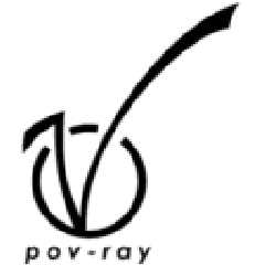
Yet another logo.
As you probably has guessed this one is inspired by Vaihtoehto's logo.
I don't think that the overall design is as nice as Vaihtoehto's logo, but
as I see it, this one has the advantage that it doesn't look like Virgin's
logo at all, and that it says "pov-ray" beneath the logo instead of just
"ray".
What do you think of it?
Greetings,
Rune
---
Updated March 15: http://rsj.mobilixnet.dk
Containing 3D images, stereograms, tutorials,
The POV Desktop Theme, 350+ raytracing jokes,
miscellaneous other things, and a lot of fun!
Post a reply to this message
Attachments:
Download '13d.gif' (2 KB)
Download '13b.gif' (1 KB)
Download '13a.gif' (1 KB)
Preview of image '13d.gif'
Preview of image '13b.gif'

Preview of image '13a.gif'
|
|
| |
| |
|
|
|
|
| |
| |
|
|
"Rune" wrote:
> this one has the advantage that it doesn't look like Virgin's
> logo at all
Arrgh!
I just visited Virgin's website, had a look at their logo, and found out
that the V in my logo looks very much like the V in Virgin's logo indeed!
I had made my logo up from scratch, and then this coincidence...
But then, they can't trademark such a simple shape, now can they?
Greetings,
Rune
---
Updated March 15: http://rsj.mobilixnet.dk
Containing 3D images, stereograms, tutorials,
The POV Desktop Theme, 350+ raytracing jokes,
miscellaneous other things, and a lot of fun!
Post a reply to this message
Attachments:
Download 'virgin.gif' (1 KB)
Preview of image 'virgin.gif'

|
|
| |
| |
|
|
|
|
| |
| |
|
|
It's in your subconscious, Rune. That's where it came from. You've seen it
before. :)
I'll be working on mine this evening, and I'll post an updated version. I
just wish more people would comment on it.
Post a reply to this message
|
|
| |
| |
|
|
|
|
| |
| |
|
|
TonyB-FSU wrote:
> I'll be working on mine this evening, and I'll post an updated version. I
> just wish more people would comment on it.
On what ?
--
Ken Tyler - 1300+ Povray, Graphics, 3D Rendering, and Raytracing Links:
http://home.pacbell.net/tylereng/index.html http://www.povray.org/links/
Post a reply to this message
|
|
| |
| |
|
|
|
|
| |
| |
|
|
"Ken" wrote:
>
> TonyB-FSU wrote:
>
> > I'll be working on mine this evening, and I'll post an updated version.
I
> > just wish more people would comment on it.
>
> On what ?
On his logo I think.
Greetings,
Rune
---
Updated March 15: http://rsj.mobilixnet.dk
Containing 3D images, stereograms, tutorials,
The POV Desktop Theme, 350+ raytracing jokes,
miscellaneous other things, and a lot of fun!
Post a reply to this message
|
|
| |
| |
|
|
|
|
| |
| |
|
|
"TonyB-FSU" wrote:
> It's in your subconscious, Rune. That's where it came from.
> You've seen it before. :)
Nah, it really doesn't require that much imagination to create a V like
that.
The point is that I saw Vaihtoehto's logo and heard both you and Vaihtoehto
say that it was much like the V in Virgin's logo, and so I simply took that
as a fact. I wanted to make a different logo that didn't look like Virgin's
but then I find out I have done the exact opposite!
Well, I also made the logo for other reasons...
> I'll be working on mine this evening, and I'll post an updated version.
> I just wish more people would comment on it.
I think it might help if you move the "/" closer to the "P", and if you
don't make them different colors.
I would like comments on my logos as well! :-)
Greetings,
Rune
---
Updated March 15: http://rsj.mobilixnet.dk
Containing 3D images, stereograms, tutorials,
The POV Desktop Theme, 350+ raytracing jokes,
miscellaneous other things, and a lot of fun!
Post a reply to this message
|
|
| |
| |
|
|
|
|
| |
| |
|
|
it has a cartoon-like fast-move feeling.
v looks like it could stand up and take a walk.
reminds me of robert crumb :)
alt
Post a reply to this message
|
|
| |
| |
|
|
|
|
| |
| |
|
|
Here are two more versions of the same thing. I tried to bring the / close
to the P in both cases. I one I actually moved it, in the other I let
shearing to the work.
Post a reply to this message
Attachments:
Download 'b&walt1.png' (4 KB)
Download 'b&walt2.png' (4 KB)
Preview of image 'b&walt1.png'

Preview of image 'b&walt2.png'

|
|
| |
| |
|
|
|
|
| |
| |
|
|
"TonyB" wrote:
> Here are two more versions of the same thing.
> I tried to bring the / close to the P in both cases.
I think it's better now.
So now you've made 3 versions.
Which of those do you want me to include?
(that may be one, two, or all three versions)
Greetings,
Rune
---
Updated March 15: http://rsj.mobilixnet.dk
Containing 3D images, stereograms, tutorials,
The POV Desktop Theme, 350+ raytracing jokes,
miscellaneous other things, and a lot of fun!
Post a reply to this message
|
|
| |
| |
|
|
|
|
| |
| |
|
|
>So now you've made 3 versions.
>Which of those do you want me to include?
>(that may be one, two, or all three versions)
I suppose that would be alternate version 2. I'll make up the images to send
to you later. Don't update anything on your site yet. (And pray to God that
I won't forget to send it to you, since I'll be very busy tommorow and might
forget).
Post a reply to this message
|
|
| |
| |
|
|
|
|
| |