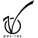
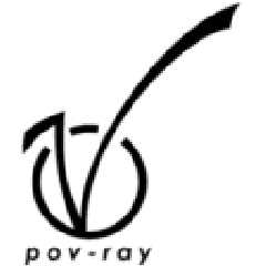
Yet another logo.
As you probably has guessed this one is inspired by Vaihtoehto's logo.
I don't think that the overall design is as nice as Vaihtoehto's logo, but
as I see it, this one has the advantage that it doesn't look like Virgin's
logo at all, and that it says "pov-ray" beneath the logo instead of just
"ray".
What do you think of it?
Greetings,
Rune
---
Updated March 15: http://rsj.mobilixnet.dk
Containing 3D images, stereograms, tutorials,
The POV Desktop Theme, 350+ raytracing jokes,
miscellaneous other things, and a lot of fun!
Post a reply to this message
Attachments:
Download '13d.gif' (2 KB)
Download '13b.gif' (1 KB)
Download '13a.gif' (1 KB)
Preview of image '13d.gif'
Preview of image '13b.gif'

Preview of image '13a.gif'
|