|
|
|
|
|
|
| |
| |
|
|
|
|
| |
| |
|
|
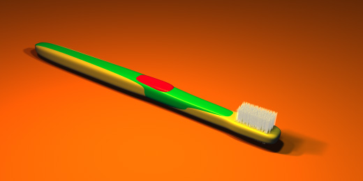
The bristles still need work, I know. The textures are temporary. Other than
this, how's it look now? I added the thumb-thing. I thinned it out as well.
I hope you like it.
PS: Notice how my most recent messages fashion small files of good quality?
It's my present to you, because I care about you. =)
Post a reply to this message
Attachments:
Download 'toothbrush2.jpg' (27 KB)
Preview of image 'toothbrush2.jpg'
|
|
| |
| |
|
|
|
|
| |
| |
|
|
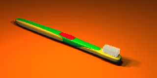
A great improvement and I even like the bristles.
Marc
--
Marc Schimmler
Post a reply to this message
|
|
| |
| |
|
|
From: Rick [Kitty5]
Subject: Re: Toothbrush update (<27kb before upload)
Date: 7 Oct 1999 08:40:49
Message: <37fc94d1@news.povray.org>
|
|
|
| |
| |
|
|
looks better, maybe for the bristles going for realism is not the answer,
try several clumps of thicker, or less translucent bristles, it would make
them stand out more..
the neck part is still to fat all round, and the handle need to be a tad
flater and wider, but your definatly getting there :)
Rick
TonyB <ben### [at] panama phoenixnet> wrote in message
news:37fc85f7@news.povray.org...
> The bristles still need work, I know. The textures are temporary. Other
than
> this, how's it look now? I added the thumb-thing. I thinned it out as
well.
> I hope you like it.
>
> PS: Notice how my most recent messages fashion small files of good
quality?
> It's my present to you, because I care about you. =)
>
>
> phoenixnet> wrote in message
news:37fc85f7@news.povray.org...
> The bristles still need work, I know. The textures are temporary. Other
than
> this, how's it look now? I added the thumb-thing. I thinned it out as
well.
> I hope you like it.
>
> PS: Notice how my most recent messages fashion small files of good
quality?
> It's my present to you, because I care about you. =)
>
>
>
Post a reply to this message
|
|
| |
| |
|
|
|
|
| |
| |
|
|
Thank you. =)
Post a reply to this message
|
|
| |
| |
|
|
|
|
| |
| |
|
|
>looks better, maybe for the bristles going for realism is not the answer,
You mean I should make them look fake?
>try several clumps of thicker, or less translucent bristles, it would make
>them stand out more.
Yes, that is the next step.
>the neck part is still to fat all round, and the handle needs to be a tad
>flater and wider, but your definatly getting there :)
The green part did that. I'll have to modify that. About the handle, I'm
happy with it, and it's not going to change. Sorry.
Post a reply to this message
|
|
| |
| |
|
|
|
|
| |
| |
|
|
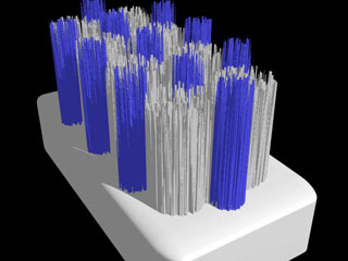
Tony,
Are you using separate objects for each bristle - or are you using a
heightfield?
Here is an test I did some time ago using HFs - one for all of the white
bristles & one for all of the blue bristles.
[Image]
Post a reply to this message
Attachments:
Download 'us-ascii' (1 KB)
Download 'c:\windows\temp\nsmail1f.jpeg.jpg' (20 KB)
Preview of image 'c:\windows\temp\nsmail1f.jpeg.jpg'
|
|
| |
| |
|
|
|
|
| |
| |
|
|
Nice bristles!
I'm sure the plural shouldn't be spelt like that, anyone?
Tony Vigil wrote:
>
> Tony,
>
> Are you using separate objects for each bristle - or are
> you using a heightfield?
>
> Here is an test I did some time ago using HFs - one for
> all of the white bristles & one for all of the blue
> bristles.
>
> [Image]
--
Cheers
Steve email mailto:sjl### [at] ndirectcouk
%HAV-A-NICEDAY Error not enough coffee 0 pps.
web http://www.ndirect.co.uk/~sjeln/
or http://start.at/zero-pps
Post a reply to this message
|
|
| |
| |
|
|
From: Larry Fontaine
Subject: Re: Toothbrush update (<27kb before upload)
Date: 9 Oct 1999 14:20:04
Message: <37FF8547.297E1116@isd.net>
|
|
|
| |
| |
|
|
The bristles still don't convince me. They seem to perfectly fill a small box
shape, but real toothbrushes' bristles have different length tufts and are
rounded at the top, like say you have rows of four bristles, at the top there
would be a row of two or three. The tops of the bristles depends on the type of
brush (whether the end or the center tufts are longest).
Otherwise nice :-)
TonyB wrote:
> The bristles still need work, I know. The textures are temporary. Other than
> this, how's it look now? I added the thumb-thing. I thinned it out as well.
> I hope you like it.
>
> PS: Notice how my most recent messages fashion small files of good quality?
> It's my present to you, because I care about you. =)
>
> [Image]
Post a reply to this message
|
|
| |
| |
|
|
|
|
| |