 |
|
|
|
|
|
| |
| |
|
|
|
|
| |
| |
|
|
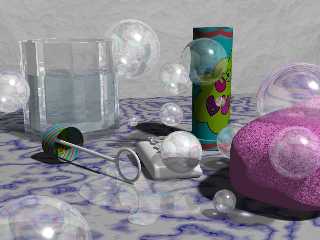
Thank you all for all your comments!
I changed a bit my pic trying to follow your suggestions.
Is it a bit better, now?
Post a reply to this message
Attachments:
Download 'soap.jpg' (39 KB)
Preview of image 'soap.jpg'
|
|
| |
| |
|
|
|
|
| |
| |
|
|
Yeah, this is really neat. Looks like the bubble blower lost its soap
film though, can't make it out if there is a 'disc' there or not. If you
left one in maybe it needs enhancing over the other soup films, perhaps
a slight reflection of light showing in it.
Speaking of that, afraid the highlights might be too intense or wide
rather, wish I had mentioned that before. In all actuality what would be
best is a bright "area" with central full intensity and fading out at
edges, you would need a "ceiling" with point source light near to it.
And cut down the specular hilighting counting on more the reflection
instead. There's also too much refraction, to fake the hollowness you'd
have to lower the ior almost down to 1.
Mogwai wrote:
>
> Thank you all for all your comments!
> I changed a bit my pic trying to follow your suggestions.
> Is it a bit better, now?
>
> ------------------------------------------------------------------------
> [Image]
--
omniVERSE: beyond the universe
http://members.aol.com/inversez/POVring.htm
mailto:inv### [at] aol com?PoV com?PoV
Post a reply to this message
|
|
| |
| |
|
|
|
|
| |
| |
|
|
Mogwai wrote:
>
> Thank you all for all your comments!
> I changed a bit my pic trying to follow your suggestions.
> Is it a bit better, now?
I liked the first one and this one is even better. I have no more
suggestions to make. Nice fix on the soap puddle.
--
Ken Tyler
mailto://tylereng@pacbell.net
Post a reply to this message
|
|
| |
| |
|
|
|
|
| |
| |
|
|
One suggestion to add to those already made..... change the counter top(?)
Mogwai wrote:
> Thank you all for all your comments!
> I changed a bit my pic trying to follow your suggestions.
> Is it a bit better, now?
>
> ------------------------------------------------------------------------
> [Image]
Post a reply to this message
|
|
| |
| |
|
|
|
|
| |
| |
|
|
A really nice second image, I like this very much. Perhaps a different
light setting ? (I'm fond of dark rooms with sparse illumination, due to
the nice light effects I get. (Hey' where's that photon... Ok, I won't
get agressive here :-)
good img. !
Mogwai wrote:
>
> Thank you all for all your comments!
> I changed a bit my pic trying to follow your suggestions.
> Is it a bit better, now?
>
> ------------------------------------------------------------------------
> [Image]
--
//Spider
( spi### [at] bahnhofse ) [ http://www.bahnhof.se/~spider/ ]
#declare life = rand(seed(42))*sqrt(-1);
Post a reply to this message
|
|
| |
| |
|
|
|
|
| |
| |
|
|
Mogwai schrieb in Nachricht <36D445D1.90E4689C@imola.nettuno.it>...
>Thank you all for all your comments!
>I changed a bit my pic trying to follow your suggestions.
>Is it a bit better, now?
>
No.
(It's perfect! not a bit, a lot!)
No kidding, this is a really well done picture, which has a high grade of
reality. The two bubbles I mentioned are clustering perfectly now. The rest
was good already. The puddle of water is much better than the brownish
puddle of soap.
--
Rudy Velthuis
Post a reply to this message
|
|
| |
| |
|
|
|
|
| |
| |
|
|
Mogwai wrote in message <36D445D1.90E4689C@imola.nettuno.it>...
>Thank you all for all your comments!
>I changed a bit my pic trying to follow your suggestions.
>Is it a bit better, now?
>
First I want to say I really like this image...
Just one little nit to pick... It looks like the name on the soap bar is
sticking kinda far out...
I would say either make it thinner, or use a difference to make it carved
out of the top of the soap instead. Just my 2 cents anyway (though my 2
cents are usually worth more around 1 penny if anything at all)
Ciao!
Post a reply to this message
|
|
| |
| |
|
|
|
|
| |


