 |
|
|
|
|
|
| |
| |
|
|
|
|
| |
| |
|
|
Update with CSG mantel, fireplace tools, CSG card table, and a few other minor
fixes. Working on the more complex furniture now...
Post a reply to this message
Attachments:
Download 'secretpassage.png' (834 KB)
Preview of image 'secretpassage.png'
|
|
| |
| |
|
|
|
|
| |
| |
|
|
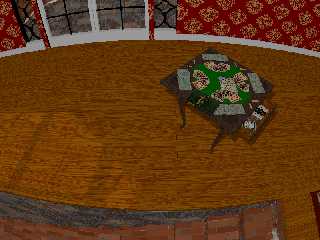
Table top rotates 45 degrees and table leaves fold out.
Drawer opens, with card game stuff inside.
Post a reply to this message
Attachments:
Download 'secretpassage_cardtable2.png' (608 KB)
Preview of image 'secretpassage_cardtable2.png'
|
|
| |
| |
|
|
|
|
| |
| |
|
|
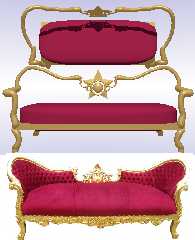
Working on a rudimentary framework for the sofa.
Could use some constructive (<--- Ha! :D ) feedback on how to go about
creating the curved back, the dimples in the rear cushion {can I use multiple
black hole warps?), less rounded profiles, and the general ornate cruftwork.
Ja, Ich liebe das musik band "Kruftwerk"!
Post a reply to this message
|
|
| |
| |
|
|
|
|
| |
| |
|
|
Post a reply to this message
Attachments:
Download 'sofawip.png' (372 KB)
Preview of image 'sofawip.png'
|
|
| |
| |
|
|
|
|
| |
| |
|
|
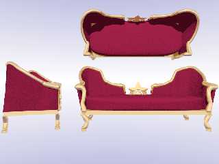
I got a lot of the sofa worked out - this spline business can be confusing as
all get-out for me sometimes.
There's still a few small issues with coverage, but it looks good from where my
camera is located... ;)
Made entirely with CSG: hand-coded sphere sweeps, splines, blobs, cylinders,
boxes and a superellipsoid.
Post a reply to this message
Attachments:
Download 'sofa_q9.png' (257 KB)
Preview of image 'sofa_q9.png'
|
|
| |
| |
|
|
|
|
| |
| |
|
|
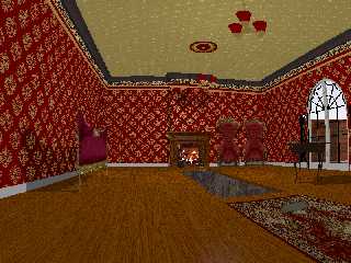
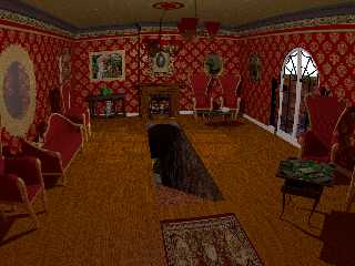
Current state of the WIP:
CSG Sofa and chairs
Mirrors and frames
Sepia-toned (in POV-Ray) photos with some speckled masking
CSG tables
CSG mantel and tools
Lots of minor tweaks in construction and texturing
Rendered on 1024 x 768 aa0.3 and using radiosity
I must admit - the radiosity is a very nice lighting enhancement, and really
makes the tunnel look much better and gives much better definition to many of
the objects in the room.
Some of the objects still are dull / washed out/ fuzzy / flat as compared to
when rendered as an include file WIP in empty space with only a bright sky
sphere - so I'm guessing that maybe I'll have to do some serious lighting work
to provide what is lacking.
Please chime in with constructive criticism - I think I have something perfectly
adequate and acceptable, but I'd honestly have to give much of the credit to all
of the contributors to the POV-Ray project - providing the tools to make POV-Ray
do what it can do - not due to any innate talent of mine.
So, I'm looking to hear about what I can do to really raise the level of quality
since I think I'm done modeling the bulk of the _things_ and can begin shifting
more of my focus to the crafting of textures normals and finishes, camera angle,
lighting, radiosity, HDRI lighting, media, etc.
Thanks so much to everyone so far - I'm starting to "get" a lot more of this.
Post a reply to this message
Attachments:
Download 'secretpassage_radiosity.png' (1293 KB)
Preview of image 'secretpassage_radiosity.png'
|
|
| |
| |
|
|
|
|
| |
| |
|
|
This is coming on very nicely indeed. Good progress!
I have a couple of (minor) comments.
- Nitpicking. The rod from the farthest ceiling fixture aligns too well
with the frame edge of the portrait over the mantelpiece. This is not
vital but it catches the eyes (mine at least). just shift the camera, or
the frame, or the lamp a little bit, whichever is best.
- The big mirror over the couch seem a bit flat to me.
- the carpet could use a bit of (more) thickness/fluffiness.
- The lighting of the scene. Much better than before but I am not sure
where the light is coming from now. Somewhere in between the two light
fixtures? In the final version I suppose you will light the lamps
themselves?
- The tunnel entrance. Shouldn't there not be some way to show /how/ the
entrance is closed? I suppose there should be some notches along the
edges for the missing boards. Nitpicking: The floor boards being aligned
parallel to the entrance, the closing lid must be especially reinforced
in order to remain rigid when somebody walks over it ;-)
- Detail. Could you give the painting of the lady with the flowers some
painterly aspect? It looks too much like a photograph to me but that
might be the effect of the distance. Impressionism would be the way to
go for the time period and the subject matter.
Thomas
Post a reply to this message
|
|
| |
| |
|
|
|
|
| |
| |
|
|
"Bald Eagle" <cre### [at] netscape net> wrote:
> I must admit - the radiosity is a very nice lighting enhancement, and really
> makes the tunnel look much better and gives much better definition to many of
> the objects in the room.
Radiosity is almost always a dramatic improvement. It gives depth to shadowed
areas. Ambient occlusion (which falls out of radiosity) is a part of life, and
scenes look flat without it.
> Please chime in with constructive criticism - [snip]
>
> So, I'm looking to hear about what I can do to really raise the level of quality
> since I think I'm done modeling the bulk of the _things_ and can begin shifting
> more of my focus to the crafting of textures normals and finishes, camera angle,
> lighting, radiosity, HDRI lighting, media, etc.
The mirror on the left is too flush with the wall, and the reflection is too
cloudy (unless you intend it to be a very dingy mirror).
If that's sunlight coming through the door on the right, it needs to be /a lot/
stronger.
With the floor flush with the walls of the passage, how does the lid support
itself? net> wrote:
> I must admit - the radiosity is a very nice lighting enhancement, and really
> makes the tunnel look much better and gives much better definition to many of
> the objects in the room.
Radiosity is almost always a dramatic improvement. It gives depth to shadowed
areas. Ambient occlusion (which falls out of radiosity) is a part of life, and
scenes look flat without it.
> Please chime in with constructive criticism - [snip]
>
> So, I'm looking to hear about what I can do to really raise the level of quality
> since I think I'm done modeling the bulk of the _things_ and can begin shifting
> more of my focus to the crafting of textures normals and finishes, camera angle,
> lighting, radiosity, HDRI lighting, media, etc.
The mirror on the left is too flush with the wall, and the reflection is too
cloudy (unless you intend it to be a very dingy mirror).
If that's sunlight coming through the door on the right, it needs to be /a lot/
stronger.
With the floor flush with the walls of the passage, how does the lid support
itself?
Post a reply to this message
|
|
| |
| |
|
|
|
|
| |
| |
|
|
Thomas de Groot <tho### [at] degrootorg> wrote:
>The rod from the farthest ceiling fixture...
I'll see what I can do about that.
> - The big mirror over the couch seem a bit flat to me.
It does, doesn't it. It actually does have depth, but for some reason this
camera angle makes it look bad.
> - the carpet could use a bit of (more) thickness/fluffiness.
Yes, I need to do something with that for sure.
> - The lighting of the scene. Much better than before but I am not sure
> where the light is coming from now. Somewhere in between the two light
> fixtures? In the final version I suppose you will light the lamps
> themselves?
Correct. My "WIP light". I'm going to take a stab at getting those ceiling
lamps illuminated from within and see what sort of light they throw.
> - The tunnel entrance. Shouldn't there not be some way to show /how/ the
> entrance is closed? I suppose there should be some notches along the
> edges for the missing boards.
It is a bit mirky as to the mechanism - and there certainly aren't any visual
cues to suggest that where the entrance IS, the carpet USED TO BE.
Here and there I considered doing SOMETHING - I just haven't really latched onto
WHAT.
"Notches" - like tongue-and-groove?
> Nitpicking: The floor boards being aligned
> parallel to the entrance, the closing lid must be especially reinforced
> in order to remain rigid when somebody walks over it ;-)
It's about 2 full inches thick, so I figured that maybe there were
through-dowels or threaded rods or something.
There's actually a small ledge of stone on either side of the tunnel that the
sliding floor panel rests on - I suppose I ought to accentuate that, put a rail,
some rollers, a latch - something
> - Detail. Could you give the painting of the lady with the flowers some
> painterly aspect? It looks too much like a photograph to me but that
> might be the effect of the distance. Impressionism would be the way to
> go for the time period and the subject matter.
Good instinct - I felt it far too "clean" as well - and I like the simu-paint
idea. I'll have to go back and look over that recent thread.
I hadn't the energy to mess with it prior to rendering it with radiosity since I
had only just emerged from a long and arduous debugging of my
Frame-plus-mirror/picture code.
It still seems a bit lacking and likely needs an overhaul.
Lesson learned: missing or flat-out wrong parentheses and curly braces are
annoying. MISPLACED curly braces that allow the scene to render but don't give
you what you want can make you question your eyesight and sanity.
Post a reply to this message
|
|
| |
| |
|
|
|
|
| |
| |
|
|
"Cousin Ricky" <rickysttATyahooDOTcom> wrote:
> The mirror on the left is too flush with the wall, and the reflection is too
> cloudy (unless you intend it to be a very dingy mirror).
I don't know why that is, since it should be exactly the same texture as the
mirror in the back left corner.
From an earlier state:
http://postimg.org/image/omlhifip1/
> If that's sunlight coming through the door on the right, it needs to be /a lot/
> stronger.
Yes, lighting is indeed something that's only been done with makeshift
"worklights" up until now - and so begins a whole new phase of learning and
experimentation.
> With the floor flush with the walls of the passage, how does the lid support
> itself?
"CG magic." ;)
(See above - it has an inadequately visible ledge.)
Post a reply to this message
|
|
| |
| |
|
|
|
|
| |


