 |
 |
|
 |
|
 |
|  |
|  |
|
 |
|
 |
|  |
|  |
|
 |
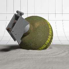
Here's a CGSphere WIP that I'm about 75% done with. I still need to work on the sand
texture and
throw some grass and twigs around the scene. I want to add some overlaying shadows as
well, such as
from a nearby tree. I think I'm pretty much done with the grenade at this point.
BTW, It's all
POV-Ray CSG.
I've been a little distracted, working on other things this past week, but hope to get
back on this
project and finish it soon.
Anyway, I'm looking for comments and criticisms on the progress so far.
Thanks.
Kyle
Post a reply to this message
Attachments:
Download 'CGSphere.jpg' (84 KB)
Preview of image 'CGSphere.jpg'

|
 |
|  |
|  |
|
 |
|
 |
|  |
|  |
|
 |
Nice! Since you covered the grid plane with sand, I think it would make a
good joke to "carve" in the grid lines into the sand.
Post a reply to this message
|
 |
|  |
|  |
|
 |
|
 |
|  |
|  |
|
 |
Fifteen days and only one comment? Thanks Michael for replying.
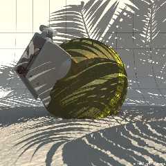
Anyway, I added a sun and sky using Lightsys IV, worked on the sand a little and added
a palm tree
from a macro I wrote a while back for the shadow. I was going to do more, but I've
become a little
disinterested in the image. Actually, I spent a while modeling a small plant for the
scene, but
didn't like it and trashed it in the end.
The final image is now posted at CGSphere, titled "Trbl-n-Pdse" for "Trouble in
Paradise". The
title is limited to fifteen characters, hence the cropped name.
Kyle
Post a reply to this message
Attachments:
Download 'CGSphere.jpg' (84 KB)
Preview of image 'CGSphere.jpg'

|
 |
|  |
|  |
|
 |
|
 |
|  |
|  |
|
 |
Oops, wrong image. Here's the right one...
Kyle
Post a reply to this message
Attachments:
Download 'TroubleInParadise.jpg' (457 KB)
Preview of image 'TroubleInParadise.jpg'

|
 |
|  |
|  |
|
 |
|
 |
|  |
|  |
|
 |
Kyle <hob### [at] gate net> wrote:
> Fifteen days and only one comment? Thanks Michael for replying.
>
> Anyway, I added a sun and sky using Lightsys IV, worked on the sand a little and
added a palm tree
> from a macro I wrote a while back for the shadow. I was going to do more, but I've
become a little
> disinterested in the image. Actually, I spent a while modeling a small plant for
the scene, but
> didn't like it and trashed it in the end.
>
> The final image is now posted at CGSphere, titled "Trbl-n-Pdse" for "Trouble in
Paradise". The
> title is limited to fifteen characters, hence the cropped name.
>
>
> Kyle
Well, I guess everyone's jaw dropped. Mine certainly did. The grenade is
perfect, as far as I can tell. The only thing I find to pick is the sand:
so close you should be able to distinguish single grains, instead it looks
like it's some sort of goo.
The tree shadow is great too, but it totally kills the pic, IMHO. Because of
it, making out the details becomes very hard. I would move or alter the
shadow so that it leaves the grenade in the sun. The shades combined with
the focal blur have also the side effect of making the sand that's in the
sun look even more goo-like.
As it is, I prefer the first pic. net> wrote:
> Fifteen days and only one comment? Thanks Michael for replying.
>
> Anyway, I added a sun and sky using Lightsys IV, worked on the sand a little and
added a palm tree
> from a macro I wrote a while back for the shadow. I was going to do more, but I've
become a little
> disinterested in the image. Actually, I spent a while modeling a small plant for
the scene, but
> didn't like it and trashed it in the end.
>
> The final image is now posted at CGSphere, titled "Trbl-n-Pdse" for "Trouble in
Paradise". The
> title is limited to fifteen characters, hence the cropped name.
>
>
> Kyle
Well, I guess everyone's jaw dropped. Mine certainly did. The grenade is
perfect, as far as I can tell. The only thing I find to pick is the sand:
so close you should be able to distinguish single grains, instead it looks
like it's some sort of goo.
The tree shadow is great too, but it totally kills the pic, IMHO. Because of
it, making out the details becomes very hard. I would move or alter the
shadow so that it leaves the grenade in the sun. The shades combined with
the focal blur have also the side effect of making the sand that's in the
sun look even more goo-like.
As it is, I prefer the first pic.
Post a reply to this message
|
 |
|  |
|  |
|
 |
|
 |
|  |
|  |
|
 |
On Sun, 18 Mar 2007 16:20:24 EST, "Grassblade" <nomail@nomail> wrote:
>Well, I guess everyone's jaw dropped. Mine certainly did. The grenade is
>perfect, as far as I can tell.
Wow, thanks for the compliment! :-D
>The only thing I find to pick is the sand:
>so close you should be able to distinguish single grains, instead it looks
>like it's some sort of goo.
Yes, I've definitely had problems in trying to getting the sand right. It got to a
point where I decided it was as good as I was going to get it. I'm not sure how to
get that "individual grain"
look. I'm currently using a height field with a color map and normal applied. Any
suggestions on how to get the "individual grain" look?
>The tree shadow is great too, but it totally kills the pic, IMHO. Because of
>it, making out the details becomes very hard. I would move or alter the
>shadow so that it leaves the grenade in the sun. The shades combined with
>the focal blur have also the side effect of making the sand that's in the
>sun look even more goo-like.
Hmm, maybe I'll try to move it around some more...
Kyle
Post a reply to this message
|
 |
|  |
|  |
|
 |
|
 |
|  |
|  |
|
 |
"Kyle" <hob### [at] gate net> schreef in bericht
news:9cvsv21b14u54ke8t9tdkap8q2gois0e3t@4ax.com...
> Yes, I've definitely had problems in trying to getting the sand right. It
> got to a point where I decided it was as good as I was going to get it.
> I'm not sure how to get that "individual grain"
> look. I'm currently using a height field with a color map and normal
> applied. Any suggestions on how to get the "individual grain" look?
>
Look at the texture used in 'isocacti.pov' that is in the scenes directory
of POV-Ray. That would do the trick I think. The secret is 'micro normals'
but also even more a pigment_ or color_map with enough contrast, very
strongly scaled down.
By the way: concerning the tree shadows in your image: try to make the tree
cast shadows only on the sand, not on the background (using light_group).
That might be an interesting approach.
Thomas net> schreef in bericht
news:9cvsv21b14u54ke8t9tdkap8q2gois0e3t@4ax.com...
> Yes, I've definitely had problems in trying to getting the sand right. It
> got to a point where I decided it was as good as I was going to get it.
> I'm not sure how to get that "individual grain"
> look. I'm currently using a height field with a color map and normal
> applied. Any suggestions on how to get the "individual grain" look?
>
Look at the texture used in 'isocacti.pov' that is in the scenes directory
of POV-Ray. That would do the trick I think. The secret is 'micro normals'
but also even more a pigment_ or color_map with enough contrast, very
strongly scaled down.
By the way: concerning the tree shadows in your image: try to make the tree
cast shadows only on the sand, not on the background (using light_group).
That might be an interesting approach.
Thomas
Post a reply to this message
|
 |
|  |
|  |
|
 |
|
 |
|  |
|  |
|
 |
On Mon, 19 Mar 2007 13:32:01 +0100, "Thomas de Groot" <t.d### [at] inter nlDOTnet>
wrote:
>Look at the texture used in 'isocacti.pov' that is in the scenes directory
>of POV-Ray. That would do the trick I think. The secret is 'micro normals'
>but also even more a pigment_ or color_map with enough contrast, very
>strongly scaled down.
Cool. I'll check that out later tonight.
>By the way: concerning the tree shadows in your image: try to make the tree
>cast shadows only on the sand, not on the background (using light_group).
>That might be an interesting approach.
That's a good idea that I hadn't though of. Maybe by moving the shadow to not obscure
the grenade so much, and using light groups as you suggested, I can get a better
effect.
Thanks for the ideas!!!
Kyle nlDOTnet>
wrote:
>Look at the texture used in 'isocacti.pov' that is in the scenes directory
>of POV-Ray. That would do the trick I think. The secret is 'micro normals'
>but also even more a pigment_ or color_map with enough contrast, very
>strongly scaled down.
Cool. I'll check that out later tonight.
>By the way: concerning the tree shadows in your image: try to make the tree
>cast shadows only on the sand, not on the background (using light_group).
>That might be an interesting approach.
That's a good idea that I hadn't though of. Maybe by moving the shadow to not obscure
the grenade so much, and using light groups as you suggested, I can get a better
effect.
Thanks for the ideas!!!
Kyle
Post a reply to this message
|
 |
|  |
|  |
|
 |
|
 |
|  |
|  |
|
 |
Kyle wrote:
> Oops, wrong image. Here's the right one...
Not sure of the CGSphere rules, but I'd like to see the grid be
transparent and not have shadows cast on it .. it makes the grid become
so much more part of the image rather than just there as a reference.
I don't mind the 'gooey' sand .. though to me the ripples make the
grenade look enourmous.
The textures are great, though I'd prefer if the shadow didn't interfere
with that lovely rust on the spring and the texture on the trigger part
isn't quite right.
The other thing with the sharp shadow is that it loses the impression of
texture on the green parts of the grenade. I'd prefer a slightly
softened shadow.
It only just occurred to me that the pin had been pulled. Maybe
emphasize that by showing the pin on the ground?
Thanks for posting!
Rick Measham
Post a reply to this message
|
 |
|  |
|  |
|
 |
|
 |
|  |
|  |
|
 |
Rick Measham wrote:
> The other thing with the sharp shadow
I don't think the shadow seen from that close up would be that sharp,
either.
--
Darren New / San Diego, CA, USA (PST)
"Let the wine breathe" does not mean to blow bubbles.
Trust me: your wine does not need CPR.
Post a reply to this message
|
 |
|  |
|  |
|
 |
|
 |
|  |


![]()