 |
 |
|
 |
|
 |
|  |
|  |
|
 |
|
 |
|  |
|  |
|
 |
Photon and Light settings :
global_settings {
assumed_gamma 1
max_trace_level 35
ambient_light rgb< 0,0,0>
photons {
spacing 0.01
autostop 0
}
}
light_source {<-9,33,-13>
color rgb <1,1,1>*6000
fade_distance 1
fade_power 2
photons {
refraction on
reflection on
}
}
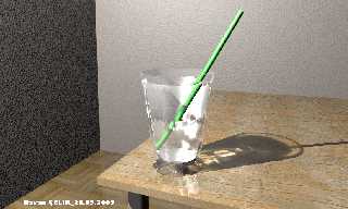
What can Imake for more realism?
Regards all.
Post a reply to this message
Attachments:
Download 'glass.jpg' (300 KB)
Preview of image 'glass.jpg'

|
 |
|  |
|  |
|
 |
|
 |
|  |
|  |
|
 |
Hasan3 wrote:
> What can Imake for more realism?
One thing I've said before, is that any room scene becomes more
realistic by adding a simple architrave around the bottom of the wall
(where it meets the floor).
I normally intersect a plane with a box so the top isn't parallel to the
floor, though a curve might look nicer ... check your house :)
w
a
l
l
|
|\<-- plane on an angle (nowhere near as steep as this of course)
| |<-- box
| |
|_|______floor
Also, the light seems a bit harsh .. the back of the straw should not be
black and the front not white.
Cheers!
Rick Measham
Post a reply to this message
|
 |
|  |
|  |
|
 |
|
 |
|  |
|  |
|
 |
As Rick, also mentioned, your lighting is harsh. I recommend you
experiment with adding radiosity. An HDRI map will not only provide
realistic, soft light, but also provide some very nice reflections for
your glass. Keep your point light source for the photons though, but
try to orient the HDRI map so that its bright side lines up with the
point light.
Skip
Post a reply to this message
|
 |
|  |
|  |
|
 |
|
 |
|  |
|  |
|
 |
Hasan3 nous apporta ses lumieres en ce 2005-09-27 08:21:
>
> Photon and Light settings :
>
> global_settings {
> assumed_gamma 1
> max_trace_level 35
> ambient_light rgb< 0,0,0>
>
> photons {
> spacing 0.01
> autostop 0
> }
> }
>
>
> light_source {<-9,33,-13>
> color rgb <1,1,1>*6000
> fade_distance 1
> fade_power 2
> photons {
> refraction on
> reflection on
> }
> }
>
>
> What can Imake for more realism?
> Regards all.
>
>
> ------------------------------------------------------------------------
>
You use a point light, try an area_light. This will soften the edges of the shadows.
If you sue
adaptive the render time increase will stay reasonable even with high density arays
like 33*33.
Start with adaptive 0 and increase if you get artefacts. Using circular and orient let
you simulate
a spherical light. It also dispense you from bothering with the actual orientation of
the aray (a
cheap trick).
Adding some dispersion can help. Typical values are normaly small like 1.01 to 1.1.
It's placed in
the interior block.
Try rounding the edge of the glass, it looks very sharp.
Also, the edge of the table looks sharp. It to can be rounded, even if the rounding
have a very
small radius.
--
Alain
-------------------------------------------------
Methodist: It's not so bad if shit happens, as long as you serve grape juice with it.
Post a reply to this message
|
 |
|  |
|  |
|
 |
|
 |
|  |
|  |
|
 |
"Hasan3" <PRO### [at] Yahoo com> wrote:
> What can Imake for more realism?
> Regards all.
Is there a reason your straw breaks within the liquid? com> wrote:
> What can Imake for more realism?
> Regards all.
Is there a reason your straw breaks within the liquid?
Post a reply to this message
|
 |
|  |
|  |
|
 |
|
 |
|  |
|  |
|
 |
Mienai wrote:
> Is there a reason your straw breaks within the liquid?
that's what straws do .. and anything else .. when placed in water ..
it's just an illusion because of the IOR difference between air and
water. Grab a glass and have a look.
Cheers!
Rick Measham
Post a reply to this message
|
 |
|  |
|  |
|
 |
|
 |
|  |
|  |
|
 |
Rick Measham wrote:
> Mienai wrote:
>
>> Is there a reason your straw breaks within the liquid?
>
>
> that's what straws do .. and anything else .. when placed in water ..
> it's just an illusion because of the IOR difference between air and
> water. Grab a glass and have a look.
>
> Cheers!
> Rick Measham
Yeah except it happens twice. The surface of the water is near the top
of glass, but the straw breaks midway down. I'm guessing this is caused
by the IOR of the glass taking over at this position, probably do to
coinciding surfaces. Notice the jagged patter to the left of the break,
probably the mesh (if it is a mesh) where the surfaces intersect. Also
notice, how the glass clips the bottom end of the straw unnaturally.
Its funny the things you notice when you give an image a second look.
Skip
Post a reply to this message
|
 |
|  |
|  |
|
 |
|
 |
|  |
|  |
|
 |
Skip Talbot wrote:
> Yeah except it happens twice. The surface of the water is near the top
> of glass, but the straw breaks midway down. I'm guessing this is caused
> by the IOR of the glass taking over at this position, probably do to
> coinciding surfaces. Notice the jagged patter to the left of the break,
> probably the mesh (if it is a mesh) where the surfaces intersect.
I thought that was due to the shape of the glass .. notice that at
table-level the glass isn't a circle, but has corrugations. I assumed
that these started at the point of the second break..
> Also
> notice, how the glass clips the bottom end of the straw unnaturally. Its
> funny the things you notice when you give an image a second look.
Once again, I think this is the same .. the corrugation near the end of
the straw hides it, and so it looks unnatural.
If the OP is reading this, can you comment? (And possibly post a version
without the water .. (and I guess photons won't matter either :)))
Cheers!
Rick Measham
Post a reply to this message
|
 |
|  |
|  |
|
 |
|
 |
|  |
|  |
|
 |
Rick Measham <rickm*at%isite.net.au> wrote:
> Skip Talbot wrote:
> > Yeah except it happens twice. The surface of the water is near the top
> > of glass, but the straw breaks midway down. I'm guessing this is caused
> > by the IOR of the glass taking over at this position, probably do to
> > coinciding surfaces. Notice the jagged patter to the left of the break,
> > probably the mesh (if it is a mesh) where the surfaces intersect.
>
> I thought that was due to the shape of the glass .. notice that at
> table-level the glass isn't a circle, but has corrugations. I assumed
> that these started at the point of the second break..
>
> > Also
> > notice, how the glass clips the bottom end of the straw unnaturally. Its
> > funny the things you notice when you give an image a second look.
>
> Once again, I think this is the same .. the corrugation near the end of
> the straw hides it, and so it looks unnatural.
>
> If the OP is reading this, can you comment? (And possibly post a version
> without the water .. (and I guess photons won't matter either :)))
>
> Cheers!
> Rick Measham
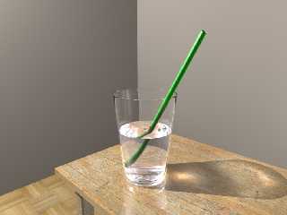
Ooo , Everybody are commented:)
I understand this mistake like Rich's topics. The surface of glass and water
are coincidet and suface problems or render bug. The glass model is made
from Mesh2 object. And probably I wasn't calculate normals of surfaces
correctly. So I changed glass model to SOR object. And ior value : water
:1.33 , glass :1.5 But this values are making different more effect in the
Beta.09. I must filled sor object.
I use point light, because the area light is very slow in this sample. I'm
posting two scenes (in povray 3.6 and 3.7 Beta.9)
How can I make filled solid glass or cuve vs object like the following
figure? (without the difference method)
This scene is rendered v:6, Because v:7.Beta9 is very slow...
Refraction Chart Index:
Material Index
Vacuum 1.00000
Air 1.0003
Cinnamon Cat 1.136
Carbon Dioxide, Liquid 1.200
Ice 1.309
Water 1.333
Acetone 1.360
Ethyl Alcohol 1.360
Sugar Solution (30%) 1.380
Alcohol 1.329
Flourite 1.434
Quartz, Fused 1.460
Calspar2 1.486
Sugar Solution (80%) 1.490
Glass 1.500
Glass, Zinc Crown 1.517
Glass, Crown 1.520
Sodium Chloride 1.530
Sodium Chloride (Salt) 1 1.544
Polystyrene 1.550
Quartz 2 1.553
Emerald 1.570
Glass, Light Flint 1.575
Lapis Lazuli 1.610
Topaz 1.610
Carbon Bisulfide 1.630
Quartz 1 1.644
Sodium Chloride (Salt) 2 1.644
Glass, Heavy Flint 1.650
Calspar1 1.660
Glass, Dense Flint 1.660
Methylene Iodide 1.740
Ruby 1.770
Sapphire 1.770
Glass, Heaviest Flint 1.890
Crystal 2.000
Diamond 2.417
Chromium Oxide 2.705
Copper Oxide 2.705
Amorphous Selenium 2.920
Dougbrainium 3.039
Iodine Crystal 3.340
Post a reply to this message
Attachments:
Download 'glass1.jpg' (179 KB)
Preview of image 'glass1.jpg'

|
 |
|  |
|  |
|
 |
|
 |
|  |
|  |
|
 |
One things that does not fit there is the table texture indicates it is
a rough wood surface but it is perfectly reflecting the glass.
Apart from that it is quite convincing. Of course the wall textures
need work.
Christoph
--
POV-Ray tutorials, include files, Landscape of the week:
http://www.tu-bs.de/~y0013390/ (Last updated 24 Jul. 2005)
MegaPOV with mechanics simulation: http://megapov.inetart.net/
Post a reply to this message
|
 |
|  |
|  |
|
 |
|
 |
|  |


![]()