|
|
|
|
|
|
| |
| |
|
|
|
|
| |
| |
|
|
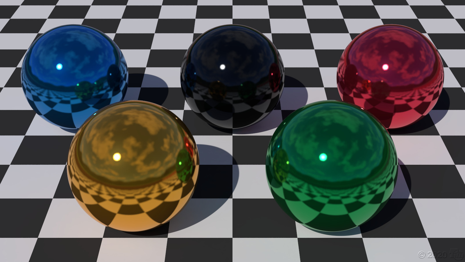
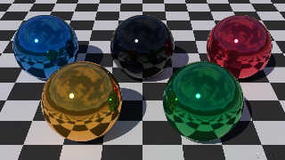
An image by Oskar Bertrand from 2004 inspired me to render theses
Olympic Spheres On a Checkered Plane. I went through the trouble of
looking up the official colors.
----------[BEGIN CODE EXCERPT]----------
// The official Olympic colors are from fairspielen.de. For sable,
// an RGB equivalent of PMS 426C is used because the official #000000
// (pure black) is generally unsuitable for 3-D ray traced objects.
// The other colors are the official RGB values.
#declare c_Olympic_colors = array[5]
{ srgb <0, 129, 200> / 255, // azure
srgb <252, 177, 49> / 255, // or
srgb <37, 40, 42> / 255, // sable via Pantone.com calculator
srgb <0, 166, 81> / 255, // vert
srgb <238, 51, 78> / 255, // gules
}
-----------[END CODE EXCERPT]-----------
Post a reply to this message
Attachments:
Download 'osocp-1600.jpg' (210 KB)
Preview of image 'osocp-1600.jpg'
|
|
| |
| |
|
|
|
|
| |
| |
|
|
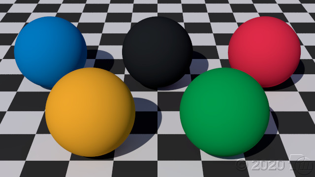
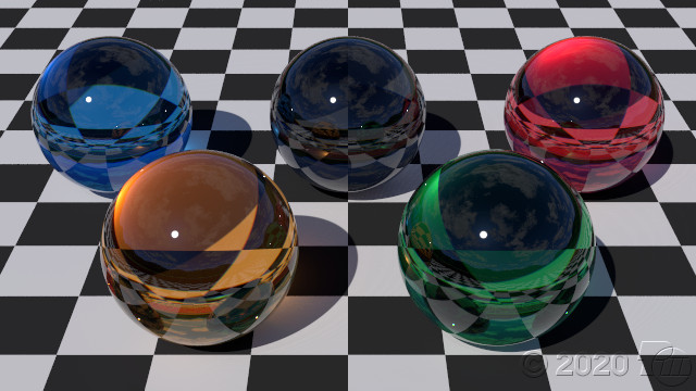
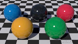
Here are some other materials: matte, glossy, and crystal.
Post a reply to this message
Attachments:
Download 'osocp1.jpg' (44 KB)
Download 'osocp2.jpg' (57 KB)
Download 'osocp5.jpg' (75 KB)
Preview of image 'osocp1.jpg'

Preview of image 'osocp2.jpg'
Preview of image 'osocp5.jpg'
|
|
| |
| |
|
|
|
|
| |
| |
|
|
Op 07/03/2020 om 02:34 schreef Cousin Ricky:
> Here are some other materials: matte, glossy, and crystal.
>
Very nice indeed. I didn't even know that there were /Olympic/ colors! ;-)
--
Thomas
Post a reply to this message
|
|
| |
| |
|
|
|
|
| |
| |
|
|
Le 2020-03-06 à 20:30, Cousin Ricky a écrit :
> An image by Oskar Bertrand from 2004 inspired me to render theses
> Olympic Spheres On a Checkered Plane. I went through the trouble of
> looking up the official colors.
>
> ----------[BEGIN CODE EXCERPT]----------
> // The official Olympic colors are from fairspielen.de. For sable,
> // an RGB equivalent of PMS 426C is used because the official #000000
> // (pure black) is generally unsuitable for 3-D ray traced objects.
> // The other colors are the official RGB values.
> #declare c_Olympic_colors = array[5]
> { srgb <0, 129, 200> / 255, // azure
> srgb <252, 177, 49> / 255, // or
> srgb <37, 40, 42> / 255, // sable via Pantone.com calculator
> srgb <0, 166, 81> / 255, // vert
> srgb <238, 51, 78> / 255, // gules
> }
> -----------[END CODE EXCERPT]-----------
I see that they are using the heraldic names, and there are two that are
incorrect.
«vert» should be «sinople» and means green, and «gules» should be
«gueule» and stand for red.
Post a reply to this message
|
|
| |
| |
|
|
|
|
| |
| |
|
|
Alain Martel <kua### [at] videotron ca> wrote:
> Le 2020-03-06 à 20:30, Cousin Ricky a écrit :
> > An image by Oskar Bertrand from 2004 inspired me to render theses
> > Olympic Spheres On a Checkered Plane. I went through the trouble of
> > looking up the official colors.
> >
> > ----------[BEGIN CODE EXCERPT]----------
> > // The official Olympic colors are from fairspielen.de. For sable,
> > // an RGB equivalent of PMS 426C is used because the official #000000
> > // (pure black) is generally unsuitable for 3-D ray traced objects.
> > // The other colors are the official RGB values.
> > #declare c_Olympic_colors = array[5]
> > { srgb <0, 129, 200> / 255, // azure
> > srgb <252, 177, 49> / 255, // or
> > srgb <37, 40, 42> / 255, // sable via Pantone.com calculator
> > srgb <0, 166, 81> / 255, // vert
> > srgb <238, 51, 78> / 255, // gules
> > }
> > -----------[END CODE EXCERPT]-----------
>
> I see that they are using the heraldic names, and there are two that are
> incorrect.
>
> «vert» should be «sinople» and means green, and «gules» should be
> «gueule» and stand for red.
My cent:
Until the early fourteenth century, the term sinople was used in French
literature as a poetic designation of the color red. This word derived from
sinope, sinopis, Latin words that in classical antiquity usually referred to
red, in allusion to a kind of much appreciated red ocher that was extracted in
Cappadocia and exported from the port of Sinope, in Anatolia. Even after its
adoption by heraldry with the meaning of "green," Sinople retained its literary
meaning of "red" for about two more centuries.
B. Gimeno ca> wrote:
> Le 2020-03-06 à 20:30, Cousin Ricky a écrit :
> > An image by Oskar Bertrand from 2004 inspired me to render theses
> > Olympic Spheres On a Checkered Plane. I went through the trouble of
> > looking up the official colors.
> >
> > ----------[BEGIN CODE EXCERPT]----------
> > // The official Olympic colors are from fairspielen.de. For sable,
> > // an RGB equivalent of PMS 426C is used because the official #000000
> > // (pure black) is generally unsuitable for 3-D ray traced objects.
> > // The other colors are the official RGB values.
> > #declare c_Olympic_colors = array[5]
> > { srgb <0, 129, 200> / 255, // azure
> > srgb <252, 177, 49> / 255, // or
> > srgb <37, 40, 42> / 255, // sable via Pantone.com calculator
> > srgb <0, 166, 81> / 255, // vert
> > srgb <238, 51, 78> / 255, // gules
> > }
> > -----------[END CODE EXCERPT]-----------
>
> I see that they are using the heraldic names, and there are two that are
> incorrect.
>
> «vert» should be «sinople» and means green, and «gules» should be
> «gueule» and stand for red.
My cent:
Until the early fourteenth century, the term sinople was used in French
literature as a poetic designation of the color red. This word derived from
sinope, sinopis, Latin words that in classical antiquity usually referred to
red, in allusion to a kind of much appreciated red ocher that was extracted in
Cappadocia and exported from the port of Sinope, in Anatolia. Even after its
adoption by heraldry with the meaning of "green," Sinople retained its literary
meaning of "red" for about two more centuries.
B. Gimeno
Post a reply to this message
|
|
| |
| |
|
|
|
|
| |
| |
|
|
On 2020-03-07 12:23 PM (-4), Alain Martel wrote:
> Le 2020-03-06 à 20:30, Cousin Ricky a écrit :
>>
>> ----------[BEGIN CODE EXCERPT]----------
>> // The official Olympic colors are from fairspielen.de. For sable,
>> // an RGB equivalent of PMS 426C is used because the official #000000
>> // (pure black) is generally unsuitable for 3-D ray traced objects.
>> // The other colors are the official RGB values.
>> #declare c_Olympic_colors = array[5]
>> { srgb <0, 129, 200> / 255, // azure
>> srgb <252, 177, 49> / 255, // or
>> srgb <37, 40, 42> / 255, // sable via Pantone.com calculator
>> srgb <0, 166, 81> / 255, // vert
>> srgb <238, 51, 78> / 255, // gules
>> }
>> -----------[END CODE EXCERPT]-----------
>
> I see that they are using the heraldic names,
The heraldic names were my idea, not theirs. (I'm sure that the IOC
knows nothing of POV-Ray SDL.) I used them because the colors were said
to represent those of the flags of the participant countries.
> and there are two that are
> incorrect.
>
> «vert» should be «sinople» and means green, and «gules» should be
> «gueule» and stand for red.
I used the only names I have ever seen for heraldic colors.
Post a reply to this message
|
|
| |
| |
|
|
|
|
| |
| |
|
|
> Alain Martel <kua### [at] videotronca> wrote:
>> Le 2020-03-06 à 20:30, Cousin Ricky a écrit :
>>> An image by Oskar Bertrand from 2004 inspired me to render theses
>>> Olympic Spheres On a Checkered Plane. I went through the trouble of
>>> looking up the official colors.
>>>
>>> ----------[BEGIN CODE EXCERPT]----------
>>> // The official Olympic colors are from fairspielen.de. For sable,
>>> // an RGB equivalent of PMS 426C is used because the official #000000
>>> // (pure black) is generally unsuitable for 3-D ray traced objects.
>>> // The other colors are the official RGB values.
>>> #declare c_Olympic_colors = array[5]
>>> { srgb <0, 129, 200> / 255, // azure
>>> srgb <252, 177, 49> / 255, // or
>>> srgb <37, 40, 42> / 255, // sable via Pantone.com calculator
>>> srgb <0, 166, 81> / 255, // vert
>>> srgb <238, 51, 78> / 255, // gules
>>> }
>>> -----------[END CODE EXCERPT]-----------
>>
>> I see that they are using the heraldic names, and there are two that are
>> incorrect.
>>
>> «vert» should be «sinople» and means green, and «gules» should be
>> «gueule» and stand for red.
>
> My cent:
>
> Until the early fourteenth century, the term sinople was used in French
> literature as a poetic designation of the color red. This word derived from
> sinope, sinopis, Latin words that in classical antiquity usually referred to
> red, in allusion to a kind of much appreciated red ocher that was extracted in
> Cappadocia and exported from the port of Sinope, in Anatolia. Even after its
> adoption by heraldry with the meaning of "green," Sinople retained its literary
> meaning of "red" for about two more centuries.
>
> B. Gimeno
>
else than heraldric green.
Metals :
Silver = white
Gold = yellow
Noble colours :
Sable = black
Gueule = red
Azure = blue
Sinople = green
Lesser colours or semi-metals :
Tan = tan or beige
Carne = pink
Furs :
Vair, contre-vair and hermine
There are several more that I don't remember.
Post a reply to this message
|
|
| |
| |
|
|
|
|
| |
| |
|
|
Le 07/03/2020 à 20:35, Cousin Ricky a écrit :
> On 2020-03-07 12:23 PM (-4), Alain Martel wrote:
>> Le 2020-03-06 à 20:30, Cousin Ricky a écrit :
>>>
>>> ----------[BEGIN CODE EXCERPT]----------
>>> // The official Olympic colors are from fairspielen.de. For sable,
>>> // an RGB equivalent of PMS 426C is used because the official #000000
>>> // (pure black) is generally unsuitable for 3-D ray traced objects.
>>> // The other colors are the official RGB values.
>>> #declare c_Olympic_colors = array[5]
>>> { srgb <0, 129, 200> / 255, // azure
>>> srgb <252, 177, 49> / 255, // or
>>> srgb <37, 40, 42> / 255, // sable via Pantone.com calculator
>>> srgb <0, 166, 81> / 255, // vert
>>> srgb <238, 51, 78> / 255, // gules
>>> }
>>> -----------[END CODE EXCERPT]-----------
>>
>> I see that they are using the heraldic names,
>
> The heraldic names were my idea, not theirs. (I'm sure that the IOC
> knows nothing of POV-Ray SDL.) I used them because the colors were said
> to represent those of the flags of the participant countries.
>
>> and there are two that are incorrect.
>>
>> «vert» should be «sinople» and means green, and «gules» should be
>> «gueule» and stand for red.
>
> I used the only names I have ever seen for heraldic colors.
And for English speaker (of Heraldry), you were correct.
Gueules (fr) = Gules (en) = red
Sinople (fr) = Vert (en) = green
As far as heraldic is concerned, the name is about the concept (there is
no right srgb values, and no wrong either as long as it can be recognised)
That's totally different of vexillology (about flags), where each colour
in a flag is specific.
If you take the "blue" of France, Luxembourg, Netherlands, it is NOT the
same.
And they are also painful about the ratio of partition (and globally).
(including the usage of flags at sea or in land)
Compare the 10:19 of USA's flag (nearly twice as long as high) to the
ratio of Switzerland (1:1 a square!)
Inland France is equal strips, on 2:3 ratio.
But navy of France use 30:33:37 proportions.
Post a reply to this message
|
|
| |
| |
|
|
|
|
| |
| |
|
|
Le 2020-03-10 à 15:50, Le_Forgeron a écrit :
> Le 07/03/2020 à 20:35, Cousin Ricky a écrit :
>> On 2020-03-07 12:23 PM (-4), Alain Martel wrote:
>>> Le 2020-03-06 à 20:30, Cousin Ricky a écrit :
>>>>
>>>> ----------[BEGIN CODE EXCERPT]----------
>>>> // The official Olympic colors are from fairspielen.de. For sable,
>>>> // an RGB equivalent of PMS 426C is used because the official #000000
>>>> // (pure black) is generally unsuitable for 3-D ray traced objects.
>>>> // The other colors are the official RGB values.
>>>> #declare c_Olympic_colors = array[5]
>>>> { srgb <0, 129, 200> / 255, // azure
>>>> srgb <252, 177, 49> / 255, // or
>>>> srgb <37, 40, 42> / 255, // sable via Pantone.com calculator
>>>> srgb <0, 166, 81> / 255, // vert
>>>> srgb <238, 51, 78> / 255, // gules
>>>> }
>>>> -----------[END CODE EXCERPT]-----------
>>>
>>> I see that they are using the heraldic names,
>>
>> The heraldic names were my idea, not theirs. (I'm sure that the IOC
>> knows nothing of POV-Ray SDL.) I used them because the colors were said
>> to represent those of the flags of the participant countries.
>>
>>> and there are two that are incorrect.
>>>
>>> «vert» should be «sinople» and means green, and «gules» should be
>>> «gueule» and stand for red.
>>
>> I used the only names I have ever seen for heraldic colors.
>
> And for English speaker (of Heraldry), you were correct.
>
> Gueules (fr) = Gules (en) = red
> Sinople (fr) = Vert (en) = green
>
> As far as heraldic is concerned, the name is about the concept (there is
> no right srgb values, and no wrong either as long as it can be recognised)
>
> That's totally different of vexillology (about flags), where each colour
> in a flag is specific.
> If you take the "blue" of France, Luxembourg, Netherlands, it is NOT the
> same.
> And they are also painful about the ratio of partition (and globally).
> (including the usage of flags at sea or in land)
> Compare the 10:19 of USA's flag (nearly twice as long as high) to the
> ratio of Switzerland (1:1 a square!)
>
> Inland France is equal strips, on 2:3 ratio.
> But navy of France use 30:33:37 proportions.
>
>
That last one is the proportional area of each colours in %.
Red for 30% of the length, then white for 33% and blue for the last 37%.
This makes all colours visually equal on a flag in normal low wind
conditions.
Post a reply to this message
|
|
| |
| |
|
|
|
|
| |
| |
|
|
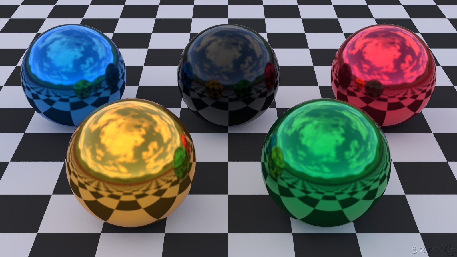
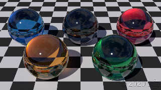
On 2020-03-06 9:30 PM (-4), Cousin Ricky wrote:
> An image by Oskar Bertrand from 2004 inspired me to render theses
> Olympic Spheres On a Checkered Plane. I went through the trouble of
> looking up the official colors.
The sun moved behind a cloud. I had to increase the exposure and the
white point temperature to get a good color balance. No light probe was
used; my prefab checkered plane environment can increase the light
source intensity and sky finish emission.
Oh, BTW, if you shoot photons from behind an opaque cloud, trying to
reload the consequently nonexistent photon file will cause a parse error.
Post a reply to this message
Attachments:
Download 'osocp-cloudy1600.jpg' (233 KB)
Preview of image 'osocp-cloudy1600.jpg'

|
|
| |
| |
|
|
|
|
| |
|
|