|
|
|
|
|
|
| |
| |
|
|
|
|
| |
| |
|
|
On 9-9-2017 15:48, Jim Holsenback wrote:
> ... i think it looks like cast brass that's been worked a bit.
Yes, very good indeed.
--
Thomas
Post a reply to this message
|
|
| |
| |
|
|
|
|
| |
| |
|
|
Jim Holsenback <spa### [at] nothanks net> wrote:
> On 9/7/2017 9:33 PM, Norbert Kern wrote:
> > I like the brass texture too.
> > In fact I tried to reproduce it - here is my attempt...
>
> i used your rmf definition then tweaked the normal map for this version ...
>
> ... i think it looks like cast brass that's been worked a bit.
Yes, it looks patinated.
Personally I love metal materials, but it's difficult to predict their behavior
in several scene setups.
Metals depend on their environment, reflections are more important than diffuse
settings. Metals show sharp contrasts between shadows and highlights.
Therefore I prefer hdr lighting or at least a combination of a normal
lightsource and hdr.
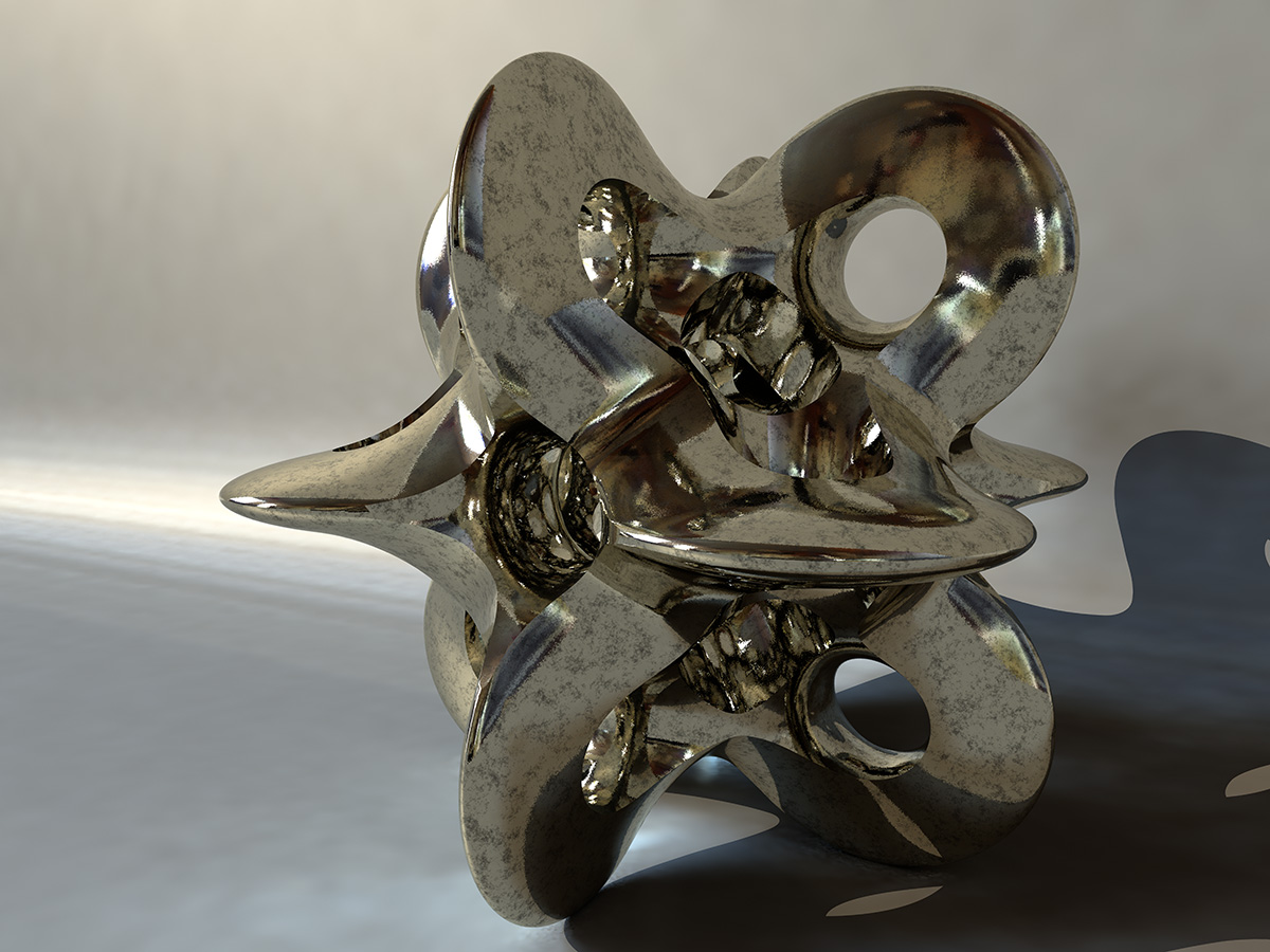
Here I took the nice rolly_sphere together with a more polished silvery metal
material:
#declare mtex =
texture {
pigment {color rgb <1,0.952,0.818>}
normal {facets coords 0.024 scale 0.1}
finish {
brilliance 2
specular 0.5
roughness 0.01
metallic
reflection {0.8 metallic}
ambient 0
diffuse 0.05
conserve_energy
}
}
#declare dtex =
texture {
pigment {color rgb 1}
normal {bumps 0.2 sine_wave scale 0.01}
finish {
brilliance 1
specular 0.3
roughness 0.03
reflection {0, 0.8 fresnel on}
ambient 0
diffuse 0.15
conserve_energy
}
}
#declare unnamed_material_ =
material {
texture {
pigment_pattern {
average
pigment_map {
[1 wrinkles scale 0.02]
[1 wrinkles scale 0.063]
[1 wrinkles scale 0.2]
}
}
texture_map {
[0.5 mtex]
[1 dtex]
}
}
interior {ior 2.5}
scale 10
}
Norbert net> wrote:
> On 9/7/2017 9:33 PM, Norbert Kern wrote:
> > I like the brass texture too.
> > In fact I tried to reproduce it - here is my attempt...
>
> i used your rmf definition then tweaked the normal map for this version ...
>
> ... i think it looks like cast brass that's been worked a bit.
Yes, it looks patinated.
Personally I love metal materials, but it's difficult to predict their behavior
in several scene setups.
Metals depend on their environment, reflections are more important than diffuse
settings. Metals show sharp contrasts between shadows and highlights.
Therefore I prefer hdr lighting or at least a combination of a normal
lightsource and hdr.
Here I took the nice rolly_sphere together with a more polished silvery metal
material:
#declare mtex =
texture {
pigment {color rgb <1,0.952,0.818>}
normal {facets coords 0.024 scale 0.1}
finish {
brilliance 2
specular 0.5
roughness 0.01
metallic
reflection {0.8 metallic}
ambient 0
diffuse 0.05
conserve_energy
}
}
#declare dtex =
texture {
pigment {color rgb 1}
normal {bumps 0.2 sine_wave scale 0.01}
finish {
brilliance 1
specular 0.3
roughness 0.03
reflection {0, 0.8 fresnel on}
ambient 0
diffuse 0.15
conserve_energy
}
}
#declare unnamed_material_ =
material {
texture {
pigment_pattern {
average
pigment_map {
[1 wrinkles scale 0.02]
[1 wrinkles scale 0.063]
[1 wrinkles scale 0.2]
}
}
texture_map {
[0.5 mtex]
[1 dtex]
}
}
interior {ior 2.5}
scale 10
}
Norbert
Post a reply to this message
Attachments:
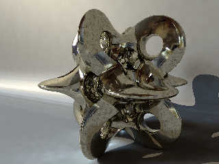
Download 'rolly_sphere_pov_scene2.jpg' (267 KB)
Preview of image 'rolly_sphere_pov_scene2.jpg'
|
|
| |
| |
|
|
|
|
| |
| |
|
|
Am 12.09.2017 um 13:53 schrieb Norbert Kern:
> Here I took the nice rolly_sphere together with a more polished silvery metal
> material:
Holy moly!
That looks... quite good.
Post a reply to this message
|
|
| |
| |
|
|
|
|
| |
| |
|
|
clipka <ano### [at] anonymousorg> wrote:
> Holy moly!
> That looks... quite good.
Ok for a quick test render...
Norbert
Post a reply to this message
|
|
| |
| |
|
|
|
|
| |
| |
|
|
On 12-9-2017 18:42, Norbert Kern wrote:
> clipka <ano### [at] anonymousorg> wrote:
>
>> Holy moly!
>> That looks... quite good.
>
>
> Ok for a quick test render...
>
More than that! It is /quite/ good.
--
Thomas
Post a reply to this message
|
|
| |
| |
|
|
|
|
| |
| |
|
|
On 13/09/2017 07:57, Thomas de Groot wrote:
> On 12-9-2017 18:42, Norbert Kern wrote:
>> clipka <ano### [at] anonymousorg> wrote:
>>
>>> Holy moly!
>>> That looks... quite good.
>>
>>
>> Ok for a quick test render...
>>
>
> More than that! It is /quite/ good.
>
>
Yes, it is not bad. :-)
--
Regards
Stephen
Post a reply to this message
|
|
| |
| |
|
|
|
|
| |
| |
|
|
Stephen wrote on 13/09/2017 09:06:
> On 13/09/2017 07:57, Thomas de Groot wrote:
>> On 12-9-2017 18:42, Norbert Kern wrote:
>>> clipka <ano### [at] anonymousorg> wrote:
>>>
>>>> Holy moly!
>>>> That looks... quite good.
>>>
>>>
>>> Ok for a quick test render...
>>>
>>
>> More than that! It is /quite/ good.
>>
>>
>
> Yes, it is not bad. :-)
>
It seems very /real/
Paolo
Post a reply to this message
|
|
| |
| |
|
|
|
|
| |
| |
|
|
Jim Holsenback <spa### [at] nothanksnet> wrote:
> On 9/7/2017 9:33 PM, Norbert Kern wrote:
> > Jim Holsenback <spa### [at] nothanksnet> wrote:
> >
> >> nope ... it's procedural. the underlying pigment is a single color with
> >> a touch of irid ( also changed irid_wavelength in global_settings to
> >> that color ) for the normal i used f_ridged_mf
> >
> > I like the brass texture too.
> > In fact I tried to reproduce it - here is my attempt...
> >
> > Perhaps you want to correct my mistakes?
>
> lol ... i see no mistakes in fact i think you've improved it!
>
> > normal {
> > average
> > normal_map {
> > [1 bumps
> > scale 0.0175
> > bump_size 0.2
> > ]
> > [1 bumps
> > scale 0.35
> > bump_size 0.2
> > ]
> > [1 function {(f_ridged_mf ((4+x)/0.3, y/0.3, z/0.3, 0.5, 2.7, 4,
> > 1, 1.5, 0)-1.8)*0.5}
> > scale 0.35
> > bump_size 0.3
> > slope_map {
> > [0 <0,1>]
> > [0.25 <1,0>]
> > [1 <1,0>]
> > }
> > ]
> > }
> > accuracy 0.003
> > }
>
> excellent variant ... I think I'll give it a go in my scene
It's improved only in the small sharp dented marks to me, but from afar I still
prefer the setting of your turbulence, making it look more like it has been
somewhat applied, or polished, looks more like it has a history of being
crafted, yet, combining the two would be perfect both for distant and close ups!
I hop I will be able to get a hand on the final code version so that if you guys
agree, I can share it here:
https://wiki.blender.org/index.php/Extensions:2.6/Py/Scripts/Render/POV-Ray/Sample_Materials
Along the other great POV textures?
Post a reply to this message
|
|
| |
| |
|
|
|
|
| |
| |
|
|
On 9/12/2017 7:53 AM, Norbert Kern wrote:
> Personally I love metal materials, but it's difficult to predict their behavior
> in several scene setups.
> Metals depend on their environment, reflections are more important than diffuse
> settings. Metals show sharp contrasts between shadows and highlights.
>
> Therefore I prefer hdr lighting or at least a combination of a normal
> lightsource and hdr
yep i'm a metal materials fan as well ... and yes you are correct adding
hdr is definitely the way to go because it makes for plenty of eye candy
in the reflections
> Here I took the nice rolly_sphere together with a more polished silvery metal
> material:
lol ... i have a silver version too. copper looks pretty cool as well.
i'm working on a glass version but there have been some challenges.
something opaque behaves better in that the shape of the object isn't
lost. to that end i've been working on a milk glass version ... i'll
post if i'm able to produce something worthy. thanks for sharing!!!
Post a reply to this message
|
|
| |
| |
|
|
|
|
| |
| |
|
|
On 9/12/2017 7:53 AM, Norbert Kern wrote:
> Therefore I prefer hdr lighting or at least a combination of a normal
> lightsource and hdr.
here's a link to some pretty good hdr images:
http://www.hdrlabs.com/sibl/archive.html
i've been getting a lot of mileage out of papermill ruins E but playa is
also pretty cool. the apartment at the top of the list is great for an
inside env.
i prefer the ones where you can actually see the sun or light source.
basically here's how i place the light source. with the image on a small
sphere and the camera somewhere -z ... i rotate the sphere until the sun
spot lines up with 0*y then i use a crude grid at <0,0,0> that i rotate
in the x dir to get the elevation. a few hints ... the papermill ruins E
lines up at y*33 and x*30.5 so i use those as offsets in my env and
light source setup:
#declare Environment =
sphere { 0, 1 hollow on
material {
texture { uv_mapping
pigment {
image_map {
hdr "PaperMill_E_3k.hdr"
map_type 0
interpolate 2
once
}
}
finish { ... }
}
interior { ior 1.0 }
}
rotate y*33
no_shadow
}
#local R_Fact = 30;
#local S_Fact = 30;
considering the above the light source is initially placed <0,0,-29.9>
then transformed like this:
object { Environment scale S_Fact rotate y*R_Fact }
object { Key_Light rotate x*30.5 rotate y*R_Fact }
Post a reply to this message
|
|
| |
| |
|
|
|
|
| |