|
|
|
|
|
|
| |
| |
|
|
|
|
| |
| |
|
|
On 9/7/2017 9:33 PM, Norbert Kern wrote:
> Jim Holsenback <spa### [at] nothanks net> wrote:
>
>> nope ... it's procedural. the underlying pigment is a single color with
>> a touch of irid ( also changed irid_wavelength in global_settings to
>> that color ) for the normal i used f_ridged_mf
>
> I like the brass texture too.
> In fact I tried to reproduce it - here is my attempt...
>
> Perhaps you want to correct my mistakes?
lol ... i see no mistakes in fact i think you've improved it!
> normal {
> average
> normal_map {
> [1 bumps
> scale 0.0175
> bump_size 0.2
> ]
> [1 bumps
> scale 0.35
> bump_size 0.2
> ]
> [1 function {(f_ridged_mf ((4+x)/0.3, y/0.3, z/0.3, 0.5, 2.7, 4,
> 1, 1.5, 0)-1.8)*0.5}
> scale 0.35
> bump_size 0.3
> slope_map {
> [0 <0,1>]
> [0.25 <1,0>]
> [1 <1,0>]
> }
> ]
> }
> accuracy 0.003
> }
excellent variant ... i think i'll give it a go in my scene net> wrote:
>
>> nope ... it's procedural. the underlying pigment is a single color with
>> a touch of irid ( also changed irid_wavelength in global_settings to
>> that color ) for the normal i used f_ridged_mf
>
> I like the brass texture too.
> In fact I tried to reproduce it - here is my attempt...
>
> Perhaps you want to correct my mistakes?
lol ... i see no mistakes in fact i think you've improved it!
> normal {
> average
> normal_map {
> [1 bumps
> scale 0.0175
> bump_size 0.2
> ]
> [1 bumps
> scale 0.35
> bump_size 0.2
> ]
> [1 function {(f_ridged_mf ((4+x)/0.3, y/0.3, z/0.3, 0.5, 2.7, 4,
> 1, 1.5, 0)-1.8)*0.5}
> scale 0.35
> bump_size 0.3
> slope_map {
> [0 <0,1>]
> [0.25 <1,0>]
> [1 <1,0>]
> }
> ]
> }
> accuracy 0.003
> }
excellent variant ... i think i'll give it a go in my scene
Post a reply to this message
|
|
| |
| |
|
|
|
|
| |
| |
|
|
Am 08.09.2017 um 09:20 schrieb Thomas de Groot:
> Oooooh!!! Nice!
>
"Shiny!" is the proper exclamation in this context I guess :)
Post a reply to this message
|
|
| |
| |
|
|
|
|
| |
| |
|
|
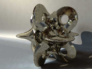
On 9/7/2017 9:33 PM, Norbert Kern wrote:
> I like the brass texture too.
> In fact I tried to reproduce it - here is my attempt...
i used your rmf definition then tweaked the normal map for this version ...
normal {
average
normal_map {
[1 bumps scale 0.175 bump_size 0.15]
[1 bumps scale 0.35 bump_size 0.15]
[1 function { RMF(x, y, z) } scale 0.1 bump_size 0.125 slope_map
{ [0 <0,1>] [0.25 <1,0>] [1 <1,0>] }]
}
accuracy 1e-3
scale 0.05
}
... i think it looks like cast brass that's been worked a bit.
Post a reply to this message
Attachments:
Download 'rollysphere.png' (697 KB)
Preview of image 'rollysphere.png'
|
|
| |
| |
|
|
|
|
| |
| |
|
|
On 9/9/2017 9:48 AM, Jim Holsenback wrote:
> ... i think it looks like cast brass that's been worked a bit.
i also played some more with irid ...
irid { 0.1 thickness 0.25 turbulence 1 }
it's subtle but you can see it in a several places
Post a reply to this message
|
|
| |
| |
|
|
|
|
| |
| |
|
|
On 9-9-2017 15:48, Jim Holsenback wrote:
> ... i think it looks like cast brass that's been worked a bit.
Yes, very good indeed.
--
Thomas
Post a reply to this message
|
|
| |
| |
|
|
|
|
| |
| |
|
|
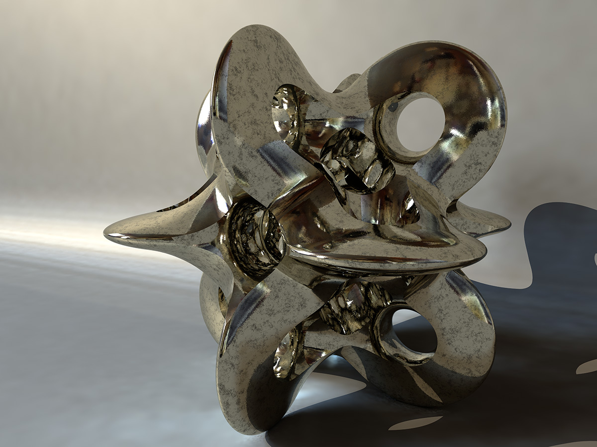
Jim Holsenback <spa### [at] nothanksnet> wrote:
> On 9/7/2017 9:33 PM, Norbert Kern wrote:
> > I like the brass texture too.
> > In fact I tried to reproduce it - here is my attempt...
>
> i used your rmf definition then tweaked the normal map for this version ...
>
> ... i think it looks like cast brass that's been worked a bit.
Yes, it looks patinated.
Personally I love metal materials, but it's difficult to predict their behavior
in several scene setups.
Metals depend on their environment, reflections are more important than diffuse
settings. Metals show sharp contrasts between shadows and highlights.
Therefore I prefer hdr lighting or at least a combination of a normal
lightsource and hdr.
Here I took the nice rolly_sphere together with a more polished silvery metal
material:
#declare mtex =
texture {
pigment {color rgb <1,0.952,0.818>}
normal {facets coords 0.024 scale 0.1}
finish {
brilliance 2
specular 0.5
roughness 0.01
metallic
reflection {0.8 metallic}
ambient 0
diffuse 0.05
conserve_energy
}
}
#declare dtex =
texture {
pigment {color rgb 1}
normal {bumps 0.2 sine_wave scale 0.01}
finish {
brilliance 1
specular 0.3
roughness 0.03
reflection {0, 0.8 fresnel on}
ambient 0
diffuse 0.15
conserve_energy
}
}
#declare unnamed_material_ =
material {
texture {
pigment_pattern {
average
pigment_map {
[1 wrinkles scale 0.02]
[1 wrinkles scale 0.063]
[1 wrinkles scale 0.2]
}
}
texture_map {
[0.5 mtex]
[1 dtex]
}
}
interior {ior 2.5}
scale 10
}
Norbert
Post a reply to this message
Attachments:
Download 'rolly_sphere_pov_scene2.jpg' (267 KB)
Preview of image 'rolly_sphere_pov_scene2.jpg'
|
|
| |
| |
|
|
|
|
| |
| |
|
|
Am 12.09.2017 um 13:53 schrieb Norbert Kern:
> Here I took the nice rolly_sphere together with a more polished silvery metal
> material:
Holy moly!
That looks... quite good.
Post a reply to this message
|
|
| |
| |
|
|
|
|
| |
| |
|
|
clipka <ano### [at] anonymousorg> wrote:
> Holy moly!
> That looks... quite good.
Ok for a quick test render...
Norbert
Post a reply to this message
|
|
| |
| |
|
|
|
|
| |
| |
|
|
On 12-9-2017 18:42, Norbert Kern wrote:
> clipka <ano### [at] anonymousorg> wrote:
>
>> Holy moly!
>> That looks... quite good.
>
>
> Ok for a quick test render...
>
More than that! It is /quite/ good.
--
Thomas
Post a reply to this message
|
|
| |
| |
|
|
|
|
| |
| |
|
|
On 13/09/2017 07:57, Thomas de Groot wrote:
> On 12-9-2017 18:42, Norbert Kern wrote:
>> clipka <ano### [at] anonymousorg> wrote:
>>
>>> Holy moly!
>>> That looks... quite good.
>>
>>
>> Ok for a quick test render...
>>
>
> More than that! It is /quite/ good.
>
>
Yes, it is not bad. :-)
--
Regards
Stephen
Post a reply to this message
|
|
| |
| |
|
|
|
|
| |