 |
 |
|
 |
|
 |
|  |
|  |
|
 |
|
 |
|  |
|  |
|
 |
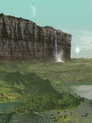
I was long in doubt about what I was going to do for this round of the
TC-RTC. Finally, I opted for revisiting an older scene from 2005/2006,
with major changes, not the least by rewriting the scene to version 3.7.
So not entirely original and yet new. I hope you like it.
Thomas
Post a reply to this message
Attachments:
Download 'alien cliff_2014_final.png' (1199 KB)
Preview of image 'alien cliff_2014_final.png'

|
 |
|  |
|  |
|
 |
|
 |
|  |
|  |
|
 |
Thomas de Groot <tho### [at] degroot org> wrote:
> I was long in doubt about what I was going to do for this round of the
> TC-RTC. Finally, I opted for revisiting an older scene from 2005/2006,
> with major changes, not the least by rewriting the scene to version 3.7.
>
> So not entirely original and yet new. I hope you like it.
>
> Thomas
Looks good. However, bottom half doesn't look as realistic as the top half. Not
quite sure why. Maybe add more foliage?
eg Jaime's amazonas
http://news.povray.org/povray.binaries.images/attachment/%3C4bee520e%40news.povray.org%3E/amazonas-05.jpg?ttop=348389&t
off=50
http://news.povray.org/povray.binaries.images/attachment/%3C4bf2762a%40news.povray.org%3E/amazonas-07.jpg?ttop=348389&t
off=50 org> wrote:
> I was long in doubt about what I was going to do for this round of the
> TC-RTC. Finally, I opted for revisiting an older scene from 2005/2006,
> with major changes, not the least by rewriting the scene to version 3.7.
>
> So not entirely original and yet new. I hope you like it.
>
> Thomas
Looks good. However, bottom half doesn't look as realistic as the top half. Not
quite sure why. Maybe add more foliage?
eg Jaime's amazonas
http://news.povray.org/povray.binaries.images/attachment/%3C4bee520e%40news.povray.org%3E/amazonas-05.jpg?ttop=348389&t
off=50
http://news.povray.org/povray.binaries.images/attachment/%3C4bf2762a%40news.povray.org%3E/amazonas-07.jpg?ttop=348389&t
off=50
Post a reply to this message
|
 |
|  |
|  |
|
 |
|
 |
|  |
|  |
|
 |
On 29-3-2014 1:39, jhu wrote:
> Looks good. However, bottom half doesn't look as realistic as the top half. Not
> quite sure why. Maybe add more foliage?
>
I agree with you about the foreground. Imo, mainly due to the slope
angle test for vegetation. I consider adding loose rocks in that area.
Probably the isosurface too looks more artificial in close up but there
is not much I can do about that...
However, the scene should /not/ look like Jaime's Amazonas ;-) It is
/not/ a jungle environment.
Thomas
Post a reply to this message
|
 |
|  |
|  |
|
 |
|
 |
|  |
|  |
|
 |
Thomas de Groot <tho### [at] degroot org> wrote:
> I was long in doubt about what I was going to do for this round of the
> TC-RTC. Finally, I opted for revisiting an older scene from 2005/2006,
> with major changes, not the least by rewriting the scene to version 3.7.
>
> So not entirely original and yet new. I hope you like it.
>
> Thomas
Hi Thomas,
A great image, the rock face looks good, I think maybe the contours/edges of the
ground are a bit too sharp. The image reminds me of some of gerberc's works
which I always loved.
Sean org> wrote:
> I was long in doubt about what I was going to do for this round of the
> TC-RTC. Finally, I opted for revisiting an older scene from 2005/2006,
> with major changes, not the least by rewriting the scene to version 3.7.
>
> So not entirely original and yet new. I hope you like it.
>
> Thomas
Hi Thomas,
A great image, the rock face looks good, I think maybe the contours/edges of the
ground are a bit too sharp. The image reminds me of some of gerberc's works
which I always loved.
Sean
Post a reply to this message
|
 |
|  |
|  |
|
 |
|
 |
|  |
|  |
|
 |
> I was long in doubt about what I was going to do for this round of the
> TC-RTC. Finally, I opted for revisiting an older scene from 2005/2006,
> with major changes, not the least by rewriting the scene to version 3.7.
>
> So not entirely original and yet new. I hope you like it.
>
> Thomas
Good work, I like the waterfall. A great landscape.
--
Do not judge my words, judge my actions.
---
http://www.avast.com
Post a reply to this message
|
 |
|  |
|  |
|
 |
|
 |
|  |
|  |
|
 |
On 1-4-2014 0:41, s.day wrote:
> A great image, the rock face looks good, I think maybe the contours/edges of the
> ground are a bit too sharp. The image reminds me of some of gerberc's works
> which I always loved.
Yes, gerberc comes to mind indeed now that you mention it. I also loved
his work.
I agree about the contours and am not sure how to amend that. I probably
would need to add a function to make it more random at the edges while
the flats remain... flat.
Thomas
Post a reply to this message
|
 |
|  |
|  |
|
 |
|
 |
|  |
|  |
|
 |
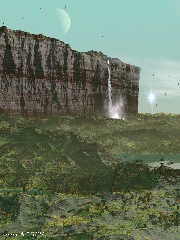
I worked on the function to get it a bit rougher and made a couple of
other improvements. I increased the vegetation to 70k trees (was 50k)
and restricted the 'grass' a bit more spatially. Still, 200k of those
planted, which was a bit backbreaking indeed ;-) This should be it.
Thomas
Post a reply to this message
Attachments:
Download 'supernova2.jpg' (271 KB)
Preview of image 'supernova2.jpg'

|
 |
|  |
|  |
|
 |
|
 |
|  |
|  |
|
 |
Hi(gh)!
On 29.03.2014 01:39, jhu wrote:
> Looks good. However, bottom half doesn't look as realistic as the top half. Not
> quite sure why. Maybe add more foliage?
Or perhaps it is because of the probably not much modified ridged
multifractal function for the foothills' isosurface! That looks somewhat
artificial, not like a natural terrain relief...
See you in Khyberspace!
Yadgar
Now playing: The Musical Box (Genesis)
Post a reply to this message
|
 |
|  |
|  |
|
 |
|
 |
|  |
|  |
|
 |
Hi(gh)!
On 29.03.2014 09:21, Thomas de Groot wrote:
> I agree with you about the foreground. Imo, mainly due to the slope
> angle test for vegetation. I consider adding loose rocks in that area.
> Probably the isosurface too looks more artificial in close up but there
> is not much I can do about that...
This is a problem which also occupied me during my (someday to be
resumed) Ghurghusht project in 2010 - how do I get a realistic
small-to-intermediate scale valley network based on isosurfaces? And how
may I integrate these valley network structures into a global-scale
isosurface relief of an entire planet?
See you in Khyberspace!
Yadgar
Now playing: The Return Of The Giant Hogweed (Genesis)
Post a reply to this message
|
 |
|  |
|  |
|
 |
|
 |
|  |
|  |
|
 |
> Or perhaps it is because of the probably not much modified ridged
> multifractal function for the foothills' isosurface! That looks somewhat
> artificial, not like a natural terrain relief...
>
You may have seen now my second final. I indeed tweaked the parameters
of the f_ridged_mf function used for the foothills to get a more
natural-looking terrain. However, I had to be careful, in particular
with H, because when too close to 0.0 it broke down the trace() function
for the vegetation. A assume a max_gradient issue but I am not sure.
Anyway, I am satisfied with the latest render.
Thomas
Post a reply to this message
|
 |
|  |
|  |
|
 |
|
 |
|  |


![]()