|
 |
"Norbert Kern" <nor### [at] t-online de> wrote:
> I think, it's the same impression, which lended me to use the "incorrect" value
> 2.2 for assumed_gamma - at least for outdoor scenes.
>
> In some art books or composition guides you can read that you should not use
> mid tones - either use dark or bright tones. For the same reasons you should use
> either deep or really pale colors. Never use bright or dark colors together with
> midtones for the main objects.
> Of course this is only true if you aren't a genius...
>
> So I decided to go for visually pleasent images, which are easier to generate
> with higher gamma values.
>
>
> Norbert Kern
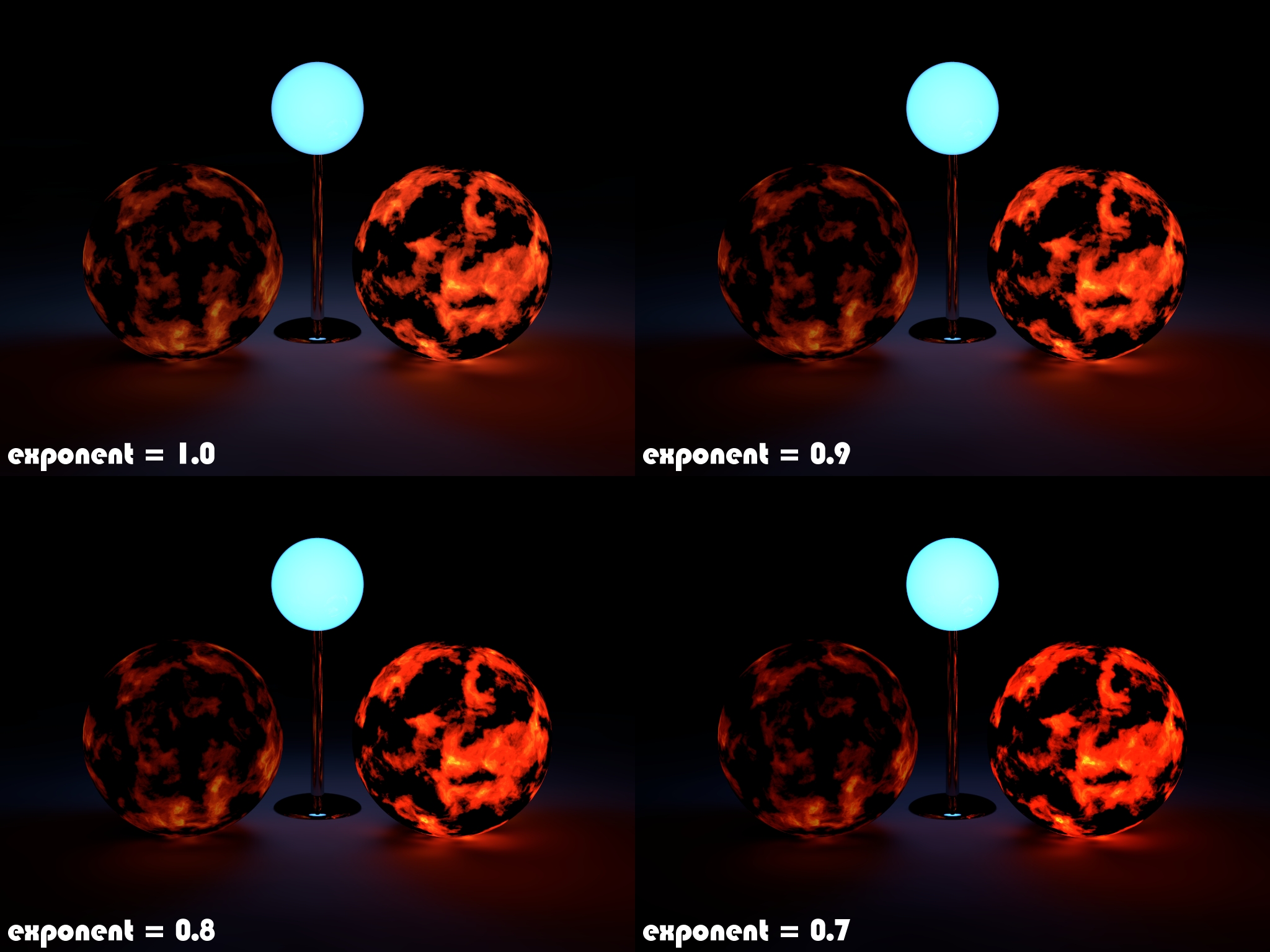
Here's another example scene where tone mapping, although using it the way I do
may be 'incorrect', for me makes sense and somehow looks better than without.
(exponent = 1 ... no tone mapping)
Just imagine a very dark room with a fire place, glowing coals, a lava lamp, a
candle or something similar. While looking directly into one of these 'light
sources', your eyes adapt to the lighting conditions and everything else around
gets darker. Isn't it? - I am not a genius, but at least I try to be one ;-)
Regards, Florian de> wrote:
> I think, it's the same impression, which lended me to use the "incorrect" value
> 2.2 for assumed_gamma - at least for outdoor scenes.
>
> In some art books or composition guides you can read that you should not use
> mid tones - either use dark or bright tones. For the same reasons you should use
> either deep or really pale colors. Never use bright or dark colors together with
> midtones for the main objects.
> Of course this is only true if you aren't a genius...
>
> So I decided to go for visually pleasent images, which are easier to generate
> with higher gamma values.
>
>
> Norbert Kern
Here's another example scene where tone mapping, although using it the way I do
may be 'incorrect', for me makes sense and somehow looks better than without.
(exponent = 1 ... no tone mapping)
Just imagine a very dark room with a fire place, glowing coals, a lava lamp, a
candle or something similar. While looking directly into one of these 'light
sources', your eyes adapt to the lighting conditions and everything else around
gets darker. Isn't it? - I am not a genius, but at least I try to be one ;-)
Regards, Florian
Post a reply to this message
Attachments:
Download 'glowing.jpg' (818 KB)
Preview of image 'glowing.jpg'
|
|