|
 |
Thank you all for the positive comments.
"Thomas de Groot" <tDOTdegroot@interDOTnlANOTHERDOTnet> wrote:
> Yes, very nice version. Still, I would suggest something for the floor. I
> think that the inner courtyard should be sunk a little bit below the surface
> of the gallery. And why not suggest some flagstones (with a height_field for
> instance) in the building itself? Very dim, just a suggestion.
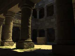
A good suggestion, Thomas. I have implemented a first attempt at what you
describe, attached here. I think it does look better, although that's partly
because I now have more crevices in which to grow the grass! :-)
> would make a subtle difference, especially at a larger scale. You can get
> away now with a featureless floor because the image is small, but with a
> larger render, that is going to be a problem.
I haven't tried many very large renders, but I think the grass, stones and
pigments should hold up quite well. I intended them to be extreme foreground
features, as with the columns and bricks. We'll soon see; I'll try a
full-quality full-size render this week.
Bill
Post a reply to this message
Attachments:
Download 'ruins07.jpg' (104 KB)
Preview of image 'ruins07.jpg'

|
 |


![]()