 |
 |
|
 |
|
 |
|  |
|  |
|
 |
|
 |
|  |
|  |
|
 |
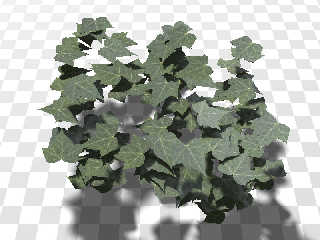
I took a quick play with some leaves the other day - they _are_ tricky, aren't
they?
I came to the conclusion that there is very little light passing through the
leaf onto the area (leaves) below, and that radiosity/light domes/ambient
occlusion gives you almost all the lighting you see. I think the other two
factors that give the crown of tree a lighter appearance is that the underside
of leaves is often light that the top, and that newer leaves are often lighter
too. Someone needs to write a paper with actual light measurements though I
suppose.
I might do some more playing with the leaves - these aren't translucent, but I
think I know how I could do that.
The texture is scanned from a leaf in my yard, and there's also a bump map, but
the lighting setup doesn't really show it up.
I made the leaf object by tracing the outline of the scanned image, then
outputting a (very thin) prism, then applying the leaf surfaces (top and bottom
image maps, bump map etc).
Cheers,
Edouard.
Post a reply to this message
Attachments:
Download 'leaves.jpg' (157 KB)
Preview of image 'leaves.jpg'
|
 |
|  |
|  |
|
 |
|
 |
|  |
|  |
|
 |
"Edouard Poor" <pov### [at] edouard info> wrote:
> I took a quick play with some leaves the other day - they _are_ tricky, aren't
> they?
Yes, very tricky when trying to make them look real. I was playing with leaves
again the other day myself.
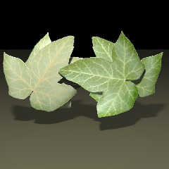
Here's a leaf I made from two differenced cylinders (for a bit of curvature). It
has both front and rear textures and a simple scattering media interior.
I stacked two of them into a union, then rotated another instance of the union
180 degrees to show the back side. This test render uses front lighting.
-Rob info> wrote:
> I took a quick play with some leaves the other day - they _are_ tricky, aren't
> they?
Yes, very tricky when trying to make them look real. I was playing with leaves
again the other day myself.
Here's a leaf I made from two differenced cylinders (for a bit of curvature). It
has both front and rear textures and a simple scattering media interior.
I stacked two of them into a union, then rotated another instance of the union
180 degrees to show the back side. This test render uses front lighting.
-Rob
Post a reply to this message
Attachments:
Download 'leaftestfrontlit.jpg' (244 KB)
Preview of image 'leaftestfrontlit.jpg'
|
 |
|  |
|  |
|
 |
|
 |
|  |
|  |
|
 |
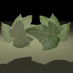
Same scene setup but this test render uses rear lighting.
Post a reply to this message
Attachments:
Download 'leaftestbacklit.jpg' (200 KB)
Preview of image 'leaftestbacklit.jpg'
|
 |
|  |
|  |
|
 |
|
 |
|  |
|  |
|
 |
"Robert McGregor" <rob### [at] mcgregorfineart com> schreef in bericht
news:web.49121bc3b807850bbd1b3ad10@news.povray.org...
> Same scene setup but this test render uses rear lighting.
>
Very good. Very convincing. I wonder however, if you render time is not
going to be prohibitive when using a fully leaved tree... or forest? Because
of the media, I mean.
Thomas com> schreef in bericht
news:web.49121bc3b807850bbd1b3ad10@news.povray.org...
> Same scene setup but this test render uses rear lighting.
>
Very good. Very convincing. I wonder however, if you render time is not
going to be prohibitive when using a fully leaved tree... or forest? Because
of the media, I mean.
Thomas
Post a reply to this message
|
 |
|  |
|  |
|
 |
|
 |
|  |
|  |
|
 |
"Robert McGregor" <rob### [at] mcgregorfineart com> wrote:
> "Edouard Poor" <pov### [at] edouard com> wrote:
> "Edouard Poor" <pov### [at] edouard info> wrote:
> > I took a quick play with some leaves the other day - they _are_ tricky, aren't
> > they?
>
> Yes, very tricky when trying to make them look real. I was playing with leaves
> again the other day myself.
>
> Here's a leaf I made from two differenced cylinders (for a bit of curvature). It
> has both front and rear textures and a simple scattering media interior.
>
> I stacked two of them into a union, then rotated another instance of the union
> 180 degrees to show the back side. This test render uses front lighting.
Oh those look fantastic!
I've been trying to simulate translucency using transmit, fade_color and
micro-normals, but so far with little success. I'm sure it's possible, so I'll
keep trying...
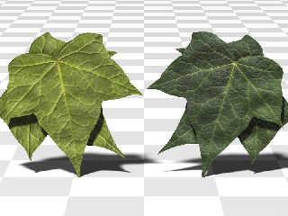
The front lighting (which is the easy part, to be honest) is looking OK.
Attached is a render based on your leaf "test pattern".
Cheers,
Edouard. info> wrote:
> > I took a quick play with some leaves the other day - they _are_ tricky, aren't
> > they?
>
> Yes, very tricky when trying to make them look real. I was playing with leaves
> again the other day myself.
>
> Here's a leaf I made from two differenced cylinders (for a bit of curvature). It
> has both front and rear textures and a simple scattering media interior.
>
> I stacked two of them into a union, then rotated another instance of the union
> 180 degrees to show the back side. This test render uses front lighting.
Oh those look fantastic!
I've been trying to simulate translucency using transmit, fade_color and
micro-normals, but so far with little success. I'm sure it's possible, so I'll
keep trying...
The front lighting (which is the easy part, to be honest) is looking OK.
Attached is a render based on your leaf "test pattern".
Cheers,
Edouard.
Post a reply to this message
Attachments:
Download 'leaves-front-light.jpg' (138 KB)
Preview of image 'leaves-front-light.jpg'
|
 |
|  |
|  |
|
 |
|
 |
|  |
|  |
|
 |
"Edouard Poor" <pov### [at] edouard info> schreef in bericht
news:web.4913515bb807850b35f945a30@news.povray.org...
>
> The front lighting (which is the easy part, to be honest) is looking OK.
> Attached is a render based on your leaf "test pattern".
>
This is looking very good indeed. I am curious to see your progress in
translucency.
Thomas info> schreef in bericht
news:web.4913515bb807850b35f945a30@news.povray.org...
>
> The front lighting (which is the easy part, to be honest) is looking OK.
> Attached is a render based on your leaf "test pattern".
>
This is looking very good indeed. I am curious to see your progress in
translucency.
Thomas
Post a reply to this message
|
 |
|  |
|  |
|
 |
|
 |
|  |
|  |
|
 |
"Thomas de Groot" <t.d### [at] inter nlDOTnet> wrote:
>
> > The front lighting (which is the easy part, to be honest) is looking OK.
> > Attached is a render based on your leaf "test pattern".
>
> This is looking very good indeed. I am curious to see your progress in
> translucency.
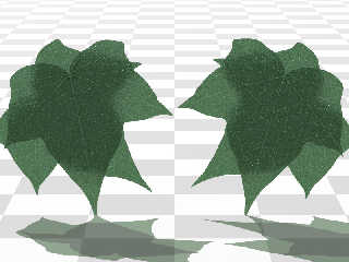
This is what I've got so far for the interior, but it's still not good enough
yet to paste between the top and bottom layers of the leaf.
It looks like the media route is much simpler, but I'll have a bit more of a
play and see if I can improve the micro-normal method.
> Thomas
Cheers,
Edouard. nlDOTnet> wrote:
>
> > The front lighting (which is the easy part, to be honest) is looking OK.
> > Attached is a render based on your leaf "test pattern".
>
> This is looking very good indeed. I am curious to see your progress in
> translucency.
This is what I've got so far for the interior, but it's still not good enough
yet to paste between the top and bottom layers of the leaf.
It looks like the media route is much simpler, but I'll have a bit more of a
play and see if I can improve the micro-normal method.
> Thomas
Cheers,
Edouard.
Post a reply to this message
Attachments:
Download 'translucent_leaves.jpg' (139 KB)
Preview of image 'translucent_leaves.jpg'
|
 |
|  |
|  |
|
 |
|
 |
|  |
|  |
|
 |
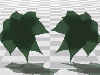
> This is what I've got so far for the interior, but it's still not good enough
> yet to paste between the top and bottom layers of the leaf.
Opps - I'd messed up the micro-normals (I'd forgotten to move them randomly).
This one is a lot less noisy.
Cheers,
Edouard.
Post a reply to this message
Attachments:
Download 'translucent_leaves2.jpg' (56 KB)
Preview of image 'translucent_leaves2.jpg'
|
 |
|  |
|  |
|
 |
|
 |
|  |
|  |
|
 |
By the way, I think you're doing excellent work with these :)
...Ben Chambers
www.pacificwebguy.com
Post a reply to this message
|
 |
|  |
|  |
|
 |
|
 |
|  |
|  |
|
 |
> I've been trying to simulate translucency using transmit, fade_color and
> micro-normals, but so far with little success. I'm sure it's possible, so I'll
> keep trying...
>
> The front lighting (which is the easy part, to be honest) is looking OK.
> Attached is a render based on your leaf "test pattern".
Wow, those look great! Is that just bump mapping on the veins? Very convincing
(much more so than mine). I'll have another go at it...
-Rob
Post a reply to this message
|
 |
|  |
|  |
|
 |
|
 |
|  |


![]()