|
|
|
|
|
|
| |
| |
|
|
|
|
| |
| |
|
|
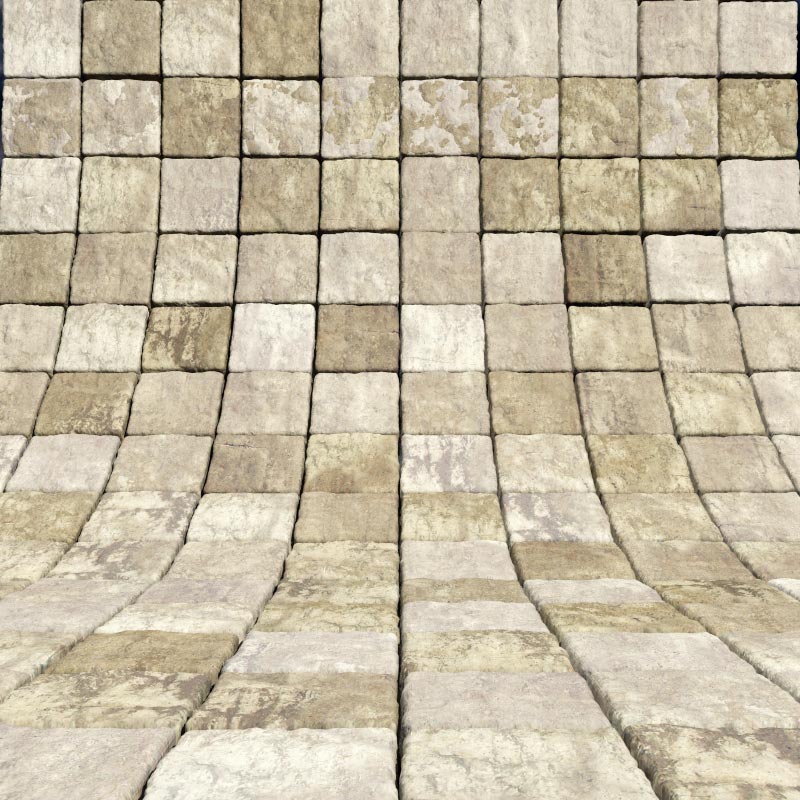
Bill Pragnell wrote:
> Another version, coloured. I'm not sure I like this colour; I may go back to a
> blue/grey slate-type colour, but more granite-like. Or maybe a sandstone-like
> texture. Hmm. The grass isn't quite right either but this was only a first
> stab!
>
> Bill
>
>
> ------------------------------------------------------------------------
>
Nice. I guess you are matching the color map to the deforming pattern?
I was playing with that a bit too. Of course once the mesh is
deformed it not longer quite matches the original pattern. But soft
effects are possible and carry the illusion to a degree.
Post a reply to this message
|
|
| |
| |
|
|
|
|
| |
| |
|
|
"Bill Pragnell" <bil### [at] hotmail com> wrote:
> Another version, coloured. I'm not sure I like this colour; I may go back to a
> blue/grey slate-type colour, but more granite-like. Or maybe a sandstone-like
> texture. Hmm. The grass isn't quite right either but this was only a first
> stab!
>
> Bill
Bill, your entry is looking great. I like the warmer tones.
I assume you set up your grid with a loop of some sort? Care to share?
Thanks,
Rob com> wrote:
> Another version, coloured. I'm not sure I like this colour; I may go back to a
> blue/grey slate-type colour, but more granite-like. Or maybe a sandstone-like
> texture. Hmm. The grass isn't quite right either but this was only a first
> stab!
>
> Bill
Bill, your entry is looking great. I like the warmer tones.
I assume you set up your grid with a loop of some sort? Care to share?
Thanks,
Rob
Post a reply to this message
|
|
| |
| |
|
|
|
|
| |
| |
|
|
I think I like the monochrome blue/gray image a bit better. Not sure why it is,
but it might be that the lack of different pigments draws attention to the
physical surface, rather than color ...
Post a reply to this message
|
|
| |
| |
|
|
|
|
| |
| |
|
|
"Bill Pragnell" <bil### [at] hotmailcom> wrote:
> Another version, coloured. I'm not sure I like this colour; I may go back to a
> blue/grey slate-type colour, but more granite-like. Or maybe a sandstone-like
> texture. Hmm. The grass isn't quite right either but this was only a first
> stab!
>
> Bill
Okay Bill, I just couldn't resist trying a few takes on your great idea. Here's
one from this lazy Saturday afternoon. Thanks for bringing that site to my
attention, I have a few ideas - I love spheres.
-Rob :)
"There is no spoon."
Post a reply to this message
Attachments:
Download 'rwmcgsphereramp1.jpg' (142 KB)
Preview of image 'rwmcgsphereramp1.jpg'
|
|
| |
| |
|
|
|
|
| |
| |
|
|
"Robert McGregor" <rob### [at] mcgregorfineartcom> schreef in bericht
news:web.4866c2289c465badbd1b3ad10@news.povray.org...
> Okay Bill, I just couldn't resist trying a few takes on your great idea.
> Here's
> one from this lazy Saturday afternoon. Thanks for bringing that site to my
> attention, I have a few ideas - I love spheres.
>
That's a good one too!!
Thomas
Post a reply to this message
|
|
| |
| |
|
|
|
|
| |
| |
|
|
Jim Charter <jrc### [at] msncom> wrote:
> Bill Pragnell wrote:
> > Another version, coloured. I'm not sure I like this colour; I may go back to a
> > blue/grey slate-type colour, but more granite-like. Or maybe a sandstone-like
> > texture. Hmm. The grass isn't quite right either but this was only a first
> > stab!
> >
> > Bill
> >
> Nice. I guess you are matching the color map to the deforming pattern?
> I was playing with that a bit too. Of course once the mesh is
> deformed it not longer quite matches the original pattern. But soft
> effects are possible and carry the illusion to a degree.
As long as the pattern hasn't been drastically non-uniformly scaled, I find the
mismatch unnoticeable. I should add that I had this technique in mind when I
first started coding the macro - very handy!
Post a reply to this message
|
|
| |
| |
|
|
|
|
| |
| |
|
|
"Robert McGregor" <rob### [at] mcgregorfineartcom> wrote:
> Okay Bill, I just couldn't resist trying a few takes on your great idea. Here's
> one from this lazy Saturday afternoon. Thanks for bringing that site to my
> attention, I have a few ideas - I love spheres.
Nice! That's a great rock texture. I guess you didn't need to see my code after
all then.. :)
Post a reply to this message
|
|
| |
| |
|
|
|
|
| |
| |
|
|
"Aaron Gillies" <nomail@nomail> wrote:
> I think I like the monochrome blue/gray image a bit better. Not sure why it is,
> but it might be that the lack of different pigments draws attention to the
> physical surface, rather than color ...
I agree, that first reddish one was a little busy. I've honed it a bit more and
I think it looks much better, although I may yet change the colour again. See
other image post...
Post a reply to this message
|
|
| |
| |
|
|
|
|
| |
| |
|
|
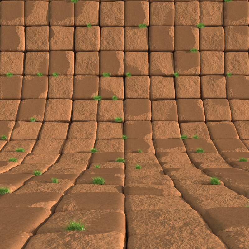
New version, more grass. I'm quite happy with the eroded/flat colour transition
now, although I might try some other colours at some point. The grass is
definitely not finished yet, needs to be less vivid, with more dead blades and
in a greater variety of sizes. Some of the tussocks appear to be floating over
the cracks, too.
Getting there, though.
Post a reply to this message
Attachments:
Download 'cgsphere7.jpg' (440 KB)
Preview of image 'cgsphere7.jpg'
|
|
| |
| |
|
|
|
|
| |
| |
|
|
The grass add some more touch of realism to the background.
Just a question: it seems to grow normal to the bricks, such as the
gravity center would be at the cgsphere position. Is an intended effect?
;-)
Paolo
>Bill Pragnell wrote:
> New version, more grass. I'm quite happy with the eroded/flat colour transition
> now, although I might try some other colours at some point. The grass is
> definitely not finished yet, needs to be less vivid, with more dead blades and
> in a greater variety of sizes. Some of the tussocks appear to be floating over
> the cracks, too.
>
> Getting there, though.
>
>
> ------------------------------------------------------------------------
>
Post a reply to this message
|
|
| |
| |
|
|
|
|
| |