|
|
|
|
|
|
| |
| |
|
|
|
|
| |
| |
|
|
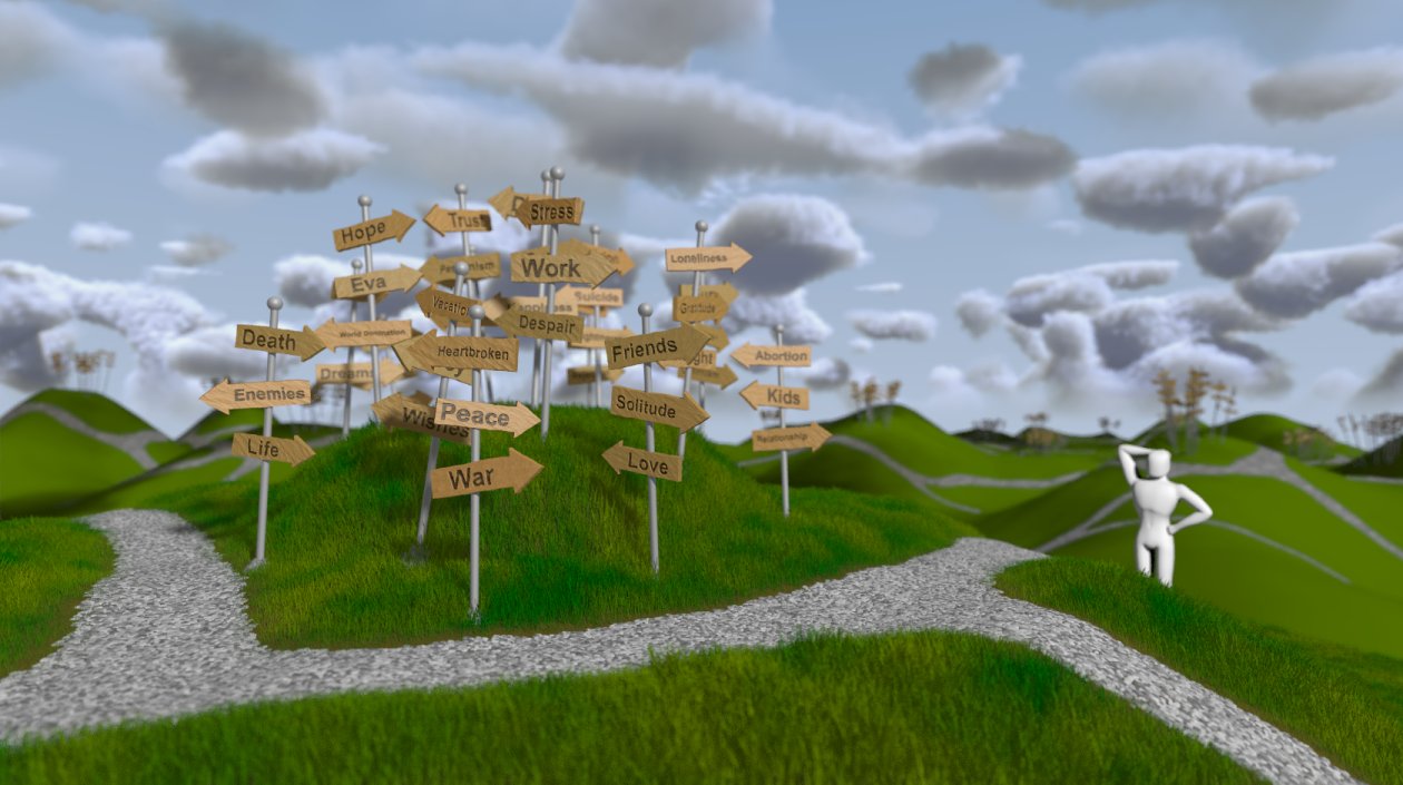
Hello all!
Latest installment on the WIP. A little more subtle work on the
paths/signs in the background maybe, a lot work left on the figure
(still has those dislocated shoulderjoints), but after that, I guess I'm
going to call it a final... :-)
Nontheless, comments and suggestions still welcome!
Regards,
Tim
--
aka "Tim Nikias"
Homepage: <http://www.nolights.de>
Post a reply to this message
Attachments:
Download 'lostguy_20.jpg' (130 KB)
Preview of image 'lostguy_20.jpg'
|
|
| |
| |
|
|
|
|
| |
| |
|
|
Tim Nikias wrote:
> Latest installment on the WIP. A little more subtle work on the
> paths/signs in the background maybe,
The paths look much more realistic!
--
Darren New / San Diego, CA, USA (PST)
Remember the good old days, when we
used to complain about cryptography
being export-restricted?
Post a reply to this message
|
|
| |
| |
|
|
|
|
| |
| |
|
|
Tim Nikias wrote:
> Hello all!
>
> Latest installment on the WIP. A little more subtle work on the
> paths/signs in the background maybe, a lot work left on the figure
> (still has those dislocated shoulderjoints), but after that, I guess
> I'm going to call it a final... :-)
>
> Nontheless, comments and suggestions still welcome!
I hate to say this, but overall I preferred WIP #6 to this one.
I liked how the background hills seemed to be far away and give the
impression of a whole world made up of these hills with paths and signs. In
the new version, it seems that you have increased the size of the background
signs/poles and the paths, making them look like they're oddly close to the
foreground. This not only makes the world seem smaller, it also distracts
from the main motif in the foreground, because the new wide paths are thick
gray lines penetrating though the image. I also preferred the distribution
of sign clusters in WIP #6 where they were all over the place. In this new
image, they are almost only on hill tops (it seems), which looks odd and
unbalanced to me.
The positive improvement here is that the paths look natural. If only they
were thinner and there were more of them, as if the whole system of paths
were seen from a longer distance like in WIP #6, it would look great IMHO.
Rune
--
http://runevision.com
Post a reply to this message
|
|
| |
| |
|
|
|
|
| |
| |
|
|
> I hate to say this, but overall I preferred WIP #6 to this one.
I'll second that for the same reasons that Rune pointed out.
The clouds look strange to me, too. They seem to dense to me and my eyes
miss some noise on the big scale, i.e. aside from the small scale noise
the clouds look to smooth. Combinations of several clouds look strange
too, especially these over the guys head.
But aside from that it's a very impressive image! I like it a lot.
Regards,
Florian
Post a reply to this message
|
|
| |
| |
|
|
|
|
| |
| |
|
|
Rune wrote:
> I hate to say this, but overall I preferred WIP #6 to this one.
No need to hate it! Refining an image, for me, often needs a step into
the wrong direction (maybe exagherate something too much) to make flaws
visible. The important thing is to find what was better before and get
back to it.
> I liked how the background hills seemed to be far away and give the
> impression of a whole world made up of these hills with paths and signs. In
> the new version, it seems that you have increased the size of the background
> signs/poles and the paths, making them look like they're oddly close to the
> foreground. This not only makes the world seem smaller, it also distracts
> from the main motif in the foreground, because the new wide paths are thick
> gray lines penetrating though the image. I also preferred the distribution
> of sign clusters in WIP #6 where they were all over the place. In this new
> image, they are almost only on hill tops (it seems), which looks odd and
> unbalanced to me.
Agreed. I wasn't too sure and happy about the signs on only the hills
myself, but wanted to try how it looked if I mimicked the foreground. As
for the paths being to thick: I don't like it that much either, the
image resolution I used didn't offer anything better, so I'll have to
switch to something bigger. But I needed to check how it looked all
together.
> The positive improvement here is that the paths look natural. If only they
> were thinner and there were more of them, as if the whole system of paths
> were seen from a longer distance like in WIP #6, it would look great IMHO.
I'll see what I can do. Maybe I'll model the paths in POV-Ray and render
a topview, so that I can change the resolution and thickness on the fly
if I need it...
Thanks for the comments, much appreciated!
Regards,
Tim
--
aka "Tim Nikias"
Homepage: <http://www.nolights.de>
Post a reply to this message
|
|
| |
| |
|
|
|
|
| |
| |
|
|
Florian Brucker wrote:
>> I hate to say this, but overall I preferred WIP #6 to this one.
> I'll second that for the same reasons that Rune pointed out.
Okay. :-)
> The clouds look strange to me, too. They seem to dense to me and my eyes
> miss some noise on the big scale, i.e. aside from the small scale noise
> the clouds look to smooth. Combinations of several clouds look strange
> too, especially these over the guys head.
Hm... I liked them so far, but I'll try some other positions in the
procedural texture, maybe something nice pops up. ;-)
> But aside from that it's a very impressive image! I like it a lot.
Thanks!
Regards,
Tim
--
aka "Tim Nikias"
Homepage: <http://www.nolights.de>
Post a reply to this message
|
|
| |
| |
|
|
|
|
| |
| |
|
|
Darren New wrote:
> Tim Nikias wrote:
>> Latest installment on the WIP. A little more subtle work on the
>> paths/signs in the background maybe,
>
> The paths look much more realistic!
Thanks! The handpainting effort *is* an improvement, although I've got
to spend some more time on it for a proper background-feel (too large).
Regards,
Tim
--
aka "Tim Nikias"
Homepage: <http://www.nolights.de>
Post a reply to this message
|
|
| |
| |
|
|
|
|
| |
| |
|
|
Wow, the pic came out really nice, congratulations!
Some nitpicking, if you don't mind:
the paths are too flat, they're as if nobody ever trod on them. I haven't
got a clue on how to do that, though.
I also agree that the clouds are somewhat strange. The small ones may be too
small to have such a grey colour. It also looks like they don't interact,
even though they are fairly close to one another.
Post a reply to this message
|
|
| |
| |
|
|
|
|
| |
| |
|
|
Tim Nikias wrote:
> Nonetheless, comments and suggestions still welcome!
Great image! and is the direction I'd like go in my 3D.
Clouds and grass definitely hit a blank wall and would like to see the
source for same.
I find the image intriguing and calling, creative and masterful.
Q
Post a reply to this message
|
|
| |
| |
|
|
|
|
| |
| |
|
|
"Rune" wrote:
> I hate to say this, but overall I preferred WIP #6 to this one.
Q disagrees and finds #7 far superior to #6
Hmmm does it have to do with which image the opinion saw first?
Q
Post a reply to this message
|
|
| |
| |
|
|
|
|
| |