|
|
|
|
|
|
| |
| |
|
|
|
|
| |
| |
|
|
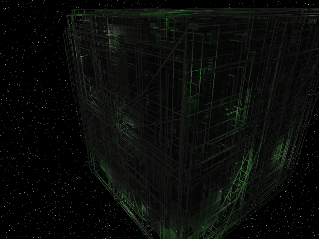
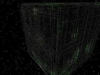
I was working on some greeble code and ended up here just for fun. Thanks to
Chris Colefax for the star background. As always, comments and suggestions
are appreciated.
Mike S.
Post a reply to this message
Attachments:
Download 'borgcube.png' (689 KB)
Preview of image 'borgcube.png'
|
|
| |
| |
|
|
|
|
| |
| |
|
|
Great image, I like a lot the cube-like construction. Sorry Chris Colefax
because I dont like the background. Perhaps lowering the contrast so it
doesnt look like white spots but a little bit grey. I dont know, it is only
an opinion. Congratulations anyway.
Post a reply to this message
|
|
| |
| |
|
|
|
|
| |
| |
|
|
I can't see anything. Ok, I can: A dozen or so dark-green random
lines here and there on a black background, and some dark-grey dots.
Nothing coherent, though.
How about bumping up lighting a bit? Or preferably a lot.
Post a reply to this message
|
|
| |
| |
|
|
|
|
| |
| |
|
|
Warp <war### [at] tag povrayorg> wrote:
> I can't see anything. Ok, I can: A dozen or so dark-green random
> lines here and there on a black background, and some dark-grey dots.
> Nothing coherent, though.
>
> How about bumping up lighting a bit? Or preferably a lot.
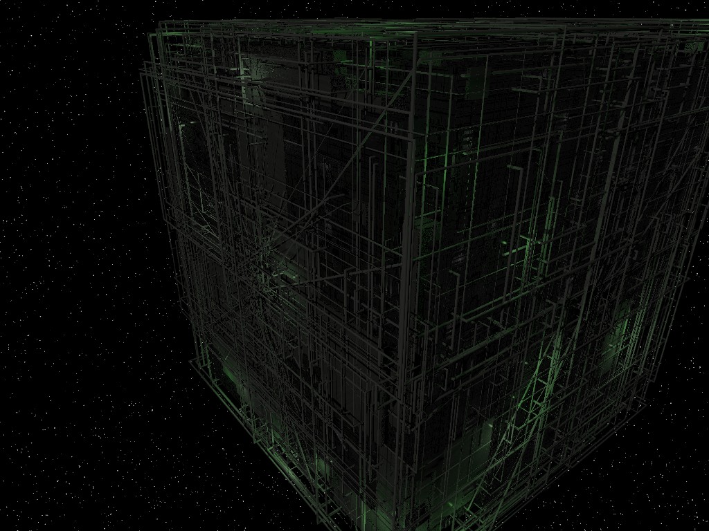
The original looks fine on my monitor (LCD), but here's one with lighting
turned up 3x. In addition to the lights within the structure, it's
illuminated with:
light_source {
<40,20,10>
color rgb .75*<0.5,0.5,0.45>
area_light
<2, 0, 0> <0, 0, 2>
8, 8
adaptive 0
jitter
circular
orient
fade_power 2
fade_distance 20
}
Looks like I forgot to increase fade_distance after moving the light back a
bit, but since it looked good on my screen I didn't notice before. I used
assume_gamma 1.0.
Mike S.
PS - sorry about the file size on the first one - I meant to post the .jpg
version. povrayorg> wrote:
> I can't see anything. Ok, I can: A dozen or so dark-green random
> lines here and there on a black background, and some dark-grey dots.
> Nothing coherent, though.
>
> How about bumping up lighting a bit? Or preferably a lot.
The original looks fine on my monitor (LCD), but here's one with lighting
turned up 3x. In addition to the lights within the structure, it's
illuminated with:
light_source {
<40,20,10>
color rgb .75*<0.5,0.5,0.45>
area_light
<2, 0, 0> <0, 0, 2>
8, 8
adaptive 0
jitter
circular
orient
fade_power 2
fade_distance 20
}
Looks like I forgot to increase fade_distance after moving the light back a
bit, but since it looked good on my screen I didn't notice before. I used
assume_gamma 1.0.
Mike S.
PS - sorry about the file size on the first one - I meant to post the .jpg
version.
Post a reply to this message
Attachments:
Download 'borgcube2.jpg' (213 KB)
Preview of image 'borgcube2.jpg'
|
|
| |
| |
|
|
|
|
| |
| |
|
|
"kike" <dry### [at] hotmailcom> wrote:
> Great image, I like a lot the cube-like construction. Sorry Chris Colefax
> because I dont like the background. Perhaps lowering the contrast so it
> doesnt look like white spots but a little bit grey. I dont know, it is only
> an opinion. Congratulations anyway.
Thanks for the opinion - I agree the background needs some work. Chris
wrote some great macros (galaxy.inc) but the usage in the scene requires a
little more attention on my part. I was having trouble balancing the star
size with the AA settings - the smaller ones tended to get washed out
completely. I may instead try some sort of a pattern on a sky sphere. If
I have any luck I'll repost.
Mike S.
Post a reply to this message
|
|
| |
| |
|
|
|
|
| |
| |
|
|
Wasn't it Warp who wrote:
> I can't see anything. Ok, I can: A dozen or so dark-green random
>lines here and there on a black background, and some dark-grey dots.
>Nothing coherent, though.
>
> How about bumping up lighting a bit? Or preferably a lot.
Some newsreaders do that with PNG files. Turnpike (which is what I use)
always makes PNG files look very dark. I'm not familiar with Enigmail,
perhaps that does the same. If you view the image in a graphics
application you may well find that it appears somewhat brighter.
When I first saw it in Turnpike, I thought it was a blank image. It was
only when I couldn't work out what the joke was that I looked closer and
saw the faint green lines.
--
Mike Williams
Gentleman of Leisure
Post a reply to this message
|
|
| |
| |
|
|
|
|
| |
| |
|
|
Mike Sobers wrote:
> The original looks fine on my monitor (LCD), but here's one with lighting
> turned up 3x.
Sorry, I see no difference.
Post a reply to this message
|
|
| |
| |
|
|
|
|
| |
| |
|
|
"Warp" <war### [at] tagpovrayorg> schreef in bericht
news:465fe6cb$1@news.povray.org...
> Mike Sobers wrote:
>> The original looks fine on my monitor (LCD), but here's one with lighting
>> turned up 3x.
>
> Sorry, I see no difference.
No problem here, though, with an LCD screen. This version is a bit lighter
and showing some more details.
So, what could make the difference in viewing?
Thomas
Post a reply to this message
|
|
| |
| |
|
|
|
|
| |
| |
|
|
Warp <war### [at] tagpovrayorg> wrote:
> Mike Sobers wrote:
> > The original looks fine on my monitor (LCD), but here's one with lighting
> > turned up 3x.
>
> Sorry, I see no difference.
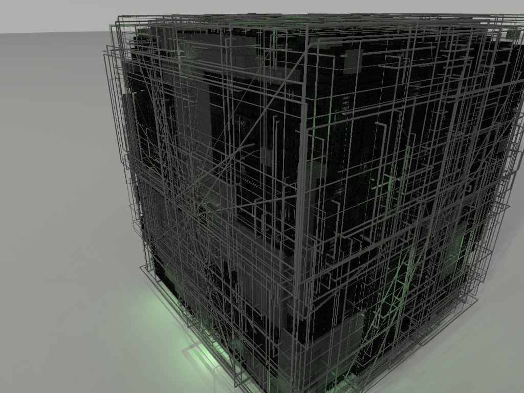
How about this one?
Post a reply to this message
Attachments:
Download 'borg2.jpg' (217 KB)
Preview of image 'borg2.jpg'
|
|
| |
| |
|
|
|
|
| |
| |
|
|
For the stars, could you try changing a bit the colors, to various soft
levels of yellow, red and blue? I think it would increase immersion.
Post a reply to this message
|
|
| |
| |
|
|
|
|
| |