|
|
|
|
|
|
| |
| |
|
|
|
|
| |
| |
|
|
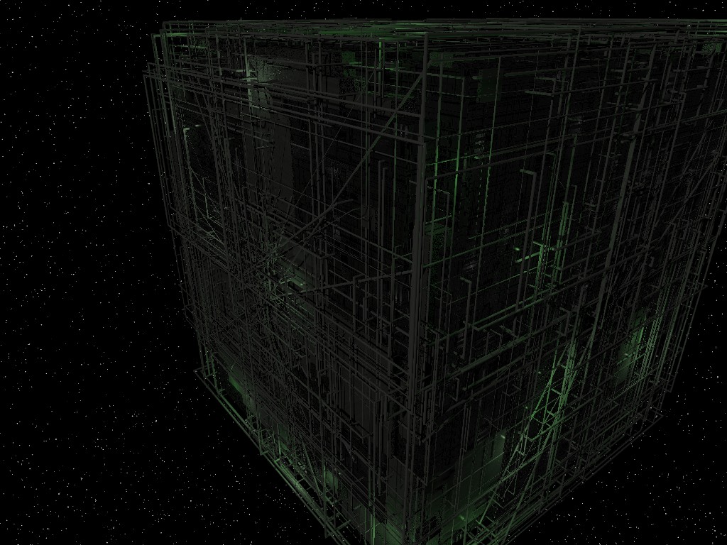
I can't see anything. Ok, I can: A dozen or so dark-green random
lines here and there on a black background, and some dark-grey dots.
Nothing coherent, though.
How about bumping up lighting a bit? Or preferably a lot.
Post a reply to this message
|
|
| |
| |
|
|
|
|
| |
| |
|
|
Warp <war### [at] tag povrayorg> wrote:
> I can't see anything. Ok, I can: A dozen or so dark-green random
> lines here and there on a black background, and some dark-grey dots.
> Nothing coherent, though.
>
> How about bumping up lighting a bit? Or preferably a lot.
The original looks fine on my monitor (LCD), but here's one with lighting
turned up 3x. In addition to the lights within the structure, it's
illuminated with:
light_source {
<40,20,10>
color rgb .75*<0.5,0.5,0.45>
area_light
<2, 0, 0> <0, 0, 2>
8, 8
adaptive 0
jitter
circular
orient
fade_power 2
fade_distance 20
}
Looks like I forgot to increase fade_distance after moving the light back a
bit, but since it looked good on my screen I didn't notice before. I used
assume_gamma 1.0.
Mike S.
PS - sorry about the file size on the first one - I meant to post the .jpg
version. povrayorg> wrote:
> I can't see anything. Ok, I can: A dozen or so dark-green random
> lines here and there on a black background, and some dark-grey dots.
> Nothing coherent, though.
>
> How about bumping up lighting a bit? Or preferably a lot.
The original looks fine on my monitor (LCD), but here's one with lighting
turned up 3x. In addition to the lights within the structure, it's
illuminated with:
light_source {
<40,20,10>
color rgb .75*<0.5,0.5,0.45>
area_light
<2, 0, 0> <0, 0, 2>
8, 8
adaptive 0
jitter
circular
orient
fade_power 2
fade_distance 20
}
Looks like I forgot to increase fade_distance after moving the light back a
bit, but since it looked good on my screen I didn't notice before. I used
assume_gamma 1.0.
Mike S.
PS - sorry about the file size on the first one - I meant to post the .jpg
version.
Post a reply to this message
Attachments:
Download 'borgcube2.jpg' (213 KB)
Preview of image 'borgcube2.jpg'
|
|
| |
| |
|
|
|
|
| |
| |
|
|
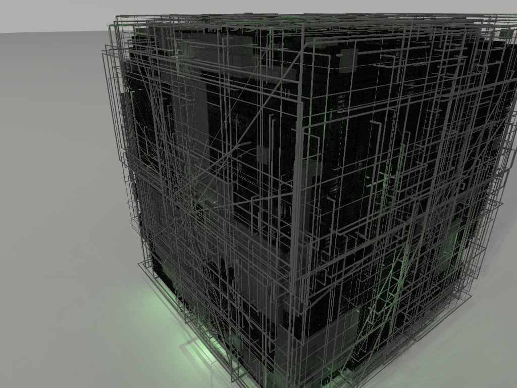
"kike" <dry### [at] hotmailcom> wrote:
> Great image, I like a lot the cube-like construction. Sorry Chris Colefax
> because I dont like the background. Perhaps lowering the contrast so it
> doesnt look like white spots but a little bit grey. I dont know, it is only
> an opinion. Congratulations anyway.
Thanks for the opinion - I agree the background needs some work. Chris
wrote some great macros (galaxy.inc) but the usage in the scene requires a
little more attention on my part. I was having trouble balancing the star
size with the AA settings - the smaller ones tended to get washed out
completely. I may instead try some sort of a pattern on a sky sphere. If
I have any luck I'll repost.
Mike S.
Post a reply to this message
|
|
| |
| |
|
|
|
|
| |
| |
|
|
Wasn't it Warp who wrote:
> I can't see anything. Ok, I can: A dozen or so dark-green random
>lines here and there on a black background, and some dark-grey dots.
>Nothing coherent, though.
>
> How about bumping up lighting a bit? Or preferably a lot.
Some newsreaders do that with PNG files. Turnpike (which is what I use)
always makes PNG files look very dark. I'm not familiar with Enigmail,
perhaps that does the same. If you view the image in a graphics
application you may well find that it appears somewhat brighter.
When I first saw it in Turnpike, I thought it was a blank image. It was
only when I couldn't work out what the joke was that I looked closer and
saw the faint green lines.
--
Mike Williams
Gentleman of Leisure
Post a reply to this message
|
|
| |
| |
|
|
|
|
| |
| |
|
|
Mike Sobers wrote:
> The original looks fine on my monitor (LCD), but here's one with lighting
> turned up 3x.
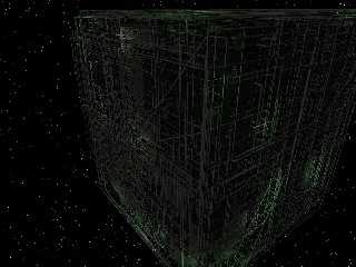
Sorry, I see no difference.
Post a reply to this message
|
|
| |
| |
|
|
|
|
| |
| |
|
|
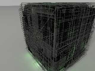
"Warp" <war### [at] tagpovrayorg> schreef in bericht
news:465fe6cb$1@news.povray.org...
> Mike Sobers wrote:
>> The original looks fine on my monitor (LCD), but here's one with lighting
>> turned up 3x.
>
> Sorry, I see no difference.
No problem here, though, with an LCD screen. This version is a bit lighter
and showing some more details.
So, what could make the difference in viewing?
Thomas
Post a reply to this message
|
|
| |
| |
|
|
|
|
| |
| |
|
|
Warp <war### [at] tagpovrayorg> wrote:
> Mike Sobers wrote:
> > The original looks fine on my monitor (LCD), but here's one with lighting
> > turned up 3x.
>
> Sorry, I see no difference.
How about this one?
Post a reply to this message
Attachments:
Download 'borg2.jpg' (217 KB)
Preview of image 'borg2.jpg'
|
|
| |
| |
|
|
|
|
| |
| |
|
|
For the stars, could you try changing a bit the colors, to various soft
levels of yellow, red and blue? I think it would increase immersion.
Post a reply to this message
|
|
| |
| |
|
|
|
|
| |
| |
|
|
"Mike Sobers" <sob### [at] mindspringcom> schreef in bericht
news:web.46602e682667b8e757033b2e0@news.povray.org...
> Warp <war### [at] tagpovrayorg> wrote:
>> Mike Sobers wrote:
>> > The original looks fine on my monitor (LCD), but here's one with
>> > lighting
>> > turned up 3x.
>>
>> Sorry, I see no difference.
>
>
> How about this one?
>
...an oil refinery... :-)
Thomas
Post a reply to this message
|
|
| |
| |
|
|
|
|
| |
| |
|
|
Mike Sobers wrote:
> How about this one?
Much more visible (although most of the tubes are still quite dark
grey...)
Post a reply to this message
|
|
| |
| |
|
|
|
|
| |