|
|
|
|
|
|
| |
| |
|
|
|
|
| |
| |
|
|
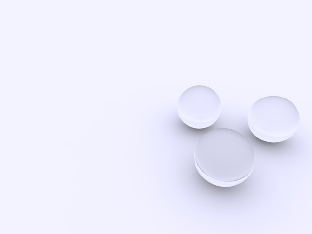
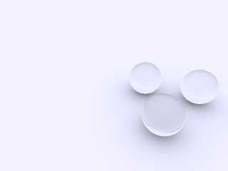
I tried to do one of those minimalist images, but I'm not sure if I ended up
with less or more.
Post a reply to this message
Attachments:
Download 'glassballs2.png' (41 KB)
Preview of image 'glassballs2.png'
|
|
| |
| |
|
|
|
|
| |
| |
|
|
scam wrote:
> I tried to do one of those minimalist images, but I'm not sure if I ended up
> with less or more.
Ooh, cool. Did you try any photons?
Alternatively, some phong on the spheres could brighten up the scene a
touch. Since the scene is all shades of gray, it feels like it could use
just a touch more range (either some darker shadows or brighter
highlights--I vote for the brighter highlights).
Even as it is, this would be fantastic desktop wallpaper. :-)
--
William Tracy
+-+-+-+-+-+-+-+-+-+-+-+-+-+-+-+-+-+-+-+-+-+
|a|f|i|s|h|i|o|n|a|d|o|@|g|m|a|i|l|.|c|o|m|
+-+-+-+-+-+-+-+-+-+-+-+-+-+-+-+-+-+-+-+-+-+
+-+-+-+-+-+-+-+-+-+-+-+-+-+-+-+-+-+-+
|w|t|r|a|c|y|@|c|a|l|p|o|l|y|.|e|d|u|
+-+-+-+-+-+-+-+-+-+-+-+-+-+-+-+-+-+-+
You know you've been raytracing too long when you even think about using
Povray for writing letters.
Sven Rudolph (Germany)
Post a reply to this message
|
|
| |
| |
|
|
|
|
| |
| |
|
|
web.46472aa069eefd8b8728aa0b0@news.povray.org...
>I tried to do one of those minimalist images, but I'm not sure if I ended
>up
> with less or more.
>
Equal?
Hum prepare yourself to the visit of Disney lawiers :-)
Marc
Post a reply to this message
|
|
| |
| |
|
|
|
|
| |
| |
|
|
> Hum prepare yourself to the visit of Disney lawiers :-)
I'm glad it wasn't just me...
Post a reply to this message
|
|
| |
| |
|
|
|
|
| |
| |
|
|
"scam" <sca### [at] mail usydeduau> wrote:
> I tried to do one of those minimalist images, but I'm not sure if I ended up
> with less or more.
"scam" <sca### [at] mailusydeduau> wrote:
> I tried to do one of those minimalist images, but I'm not sure if I ended up
> with less or more.
Images are interpreted subjectively and in a specific context on top of
that. Personally, I like the image. It has a calm, peaceful ambiance
about it. Like a previous commenter, I think it could make an interesting
desktop image. Increasing the contrast range with phong highlights or
deeper shadows would make the image more suitable to some uses and tastes
and less appropriate for others. One possible path for development that
comes to mind is to transform it into a single cycle animated gif where the
dismiss this image as being unworthy of use or further work if you happen
to like it yourself.
Regards,
Mike C. usydeduau> wrote:
> I tried to do one of those minimalist images, but I'm not sure if I ended up
> with less or more.
"scam" <sca### [at] mailusydeduau> wrote:
> I tried to do one of those minimalist images, but I'm not sure if I ended up
> with less or more.
Images are interpreted subjectively and in a specific context on top of
that. Personally, I like the image. It has a calm, peaceful ambiance
about it. Like a previous commenter, I think it could make an interesting
desktop image. Increasing the contrast range with phong highlights or
deeper shadows would make the image more suitable to some uses and tastes
and less appropriate for others. One possible path for development that
comes to mind is to transform it into a single cycle animated gif where the
dismiss this image as being unworthy of use or further work if you happen
to like it yourself.
Regards,
Mike C.
Post a reply to this message
|
|
| |
| |
|
|
|
|
| |
| |
|
|
Cool image...I like it...
Personally, I've always said that less is more or less like more - but
that's always been in reference to the utilities 'less' and 'more'. ;-)
Jim
Post a reply to this message
|
|
| |
| |
|
|
|
|
| |
| |
|
|
On Sun, 13 May 2007 08:58:28 +0000, William Tracy <wtr### [at] calpolyedu>
wrote:
>scam wrote:
>> I tried to do one of those minimalist images, but I'm not sure if I ended up
>> with less or more.
>
>Ooh, cool. Did you try any photons?
>
>Alternatively, some phong on the spheres could brighten up the scene a
>touch. Since the scene is all shades of gray, it feels like it could use
>just a touch more range (either some darker shadows or brighter
>highlights--I vote for the brighter highlights).
>
>Even as it is, this would be fantastic desktop wallpaper. :-)
Spheres !!!-
Now that is interesting I first saw these as dishes with a strange
shadow in the lower one.
John
Post a reply to this message
|
|
| |
| |
|
|
|
|
| |
| |
|
|
Jim Henderson wrote:
> Cool image...I like it...
>
> Personally, I've always said that less is more or less like more - but
> that's always been in reference to the utilities 'less' and 'more'. ;-)
>
> Jim
I remember a programming class where the instructor challenged people to
write quines (programs that recreate their own code). Someone created a
program and named it "caffiene". All it did was run the shell command
"more caffiene". :-P
--
William Tracy
+-+-+-+-+-+-+-+-+-+-+-+-+-+-+-+-+-+-+-+-+-+
|a|f|i|s|h|i|o|n|a|d|o|@|g|m|a|i|l|.|c|o|m|
+-+-+-+-+-+-+-+-+-+-+-+-+-+-+-+-+-+-+-+-+-+
+-+-+-+-+-+-+-+-+-+-+-+-+-+-+-+-+-+-+
|w|t|r|a|c|y|@|c|a|l|p|o|l|y|.|e|d|u|
+-+-+-+-+-+-+-+-+-+-+-+-+-+-+-+-+-+-+
You know you've been raytracing too long when you read about an
algorithm or datastructure and your first thought is: "How can I use
this to speed up raytracing?"
Christoph Rieder
Post a reply to this message
|
|
| |
| |
|
|
|
|
| |
| |
|
|
William Tracy <wtr### [at] calpolyedu> wrote:
>
> Ooh, cool. Did you try any photons?
>
> Alternatively, some phong on the spheres could brighten up the scene a
> touch. Since the scene is all shades of gray, it feels like it could use
> just a touch more range (either some darker shadows or brighter
> highlights--I vote for the brighter highlights).
>
> Even as it is, this would be fantastic desktop wallpaper. :-)
>
I did try some photons, but at the time the caustics seemed too harsh and
dominating. That could just be my lack of experience shinning through
though.
For now I have it set as a desktop wallpaper, however the urge to tweak it
is very distracting and not conducive to getting real work done ;)
http://www.guidetomp3players.com/glassballs_1680x1050.png
http://www.guidetomp3players.com/glassballs_3360x2100.png
"Marc" <jac### [at] wanadoofr> wrote:
> Equal?
> Hum prepare yourself to the visit of Disney lawiers :-)
That certainly is cryptic to someone who hasn't seen many Disney movies!
Have I infringed the copyright of some small, singing & dancing cartoon
character?
"Mike the Elder" <zer### [at] wyanorg> wrote:
> Images are interpreted subjectively and in a specific context on top of
> that. Personally, I like the image. It has a calm, peaceful ambiance
> about it. Like a previous commenter, I think it could make an interesting
> desktop image. Increasing the contrast range with phong highlights or
> deeper shadows would make the image more suitable to some uses and tastes
> and less appropriate for others. One possible path for development that
> comes to mind is to transform it into a single cycle animated gif where the
> dismiss this image as being unworthy of use or further work if you happen
> to like it yourself.
>
> Regards,
> Mike C.
As always an insightful post Mike. The image came about as a reaction to the
overcooked images I'd been working on recently. HDR light probes, focal
blur, complex geometry, normal maps etc at each step seem to add something
to an image, but at some point they also start to detract from it if you
are not careful. So in that context and with my own prejudices I think I
did end up with more. Thanks for the suggestions, if it stays on my desktop
for much longer I have no doubt I'll end up trying them all.
Jim Henderson <nos### [at] nospamcom> wrote:
> Cool image...I like it...
>
Cheers.
> Personally, I've always said that less is more or less like more - but
> that's always been in reference to the utilities 'less' and 'more'. ;-)
>
Love it!
Post a reply to this message
|
|
| |
| |
|
|
|
|
| |
| |
|
|
I think it looks cool!
--
Dan
GoofyGraffix.com
Post a reply to this message
|
|
| |
| |
|
|
|
|
| |