|
|
|
|
|
|
| |
| |
|
|
|
|
| |
| |
|
|
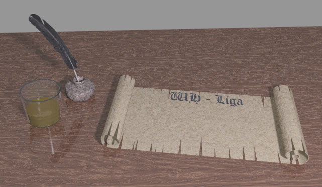
....to say the least. :(
Please, can someone advice me in finding the proper setting for this image.
The content of the glass should be whisky.... But I just cant get the color
right, or the proper "shine-thru". :/
And, besides, my pictures always have like a dull filter. *boo-hoo*
Any hints on what one should remember to avoid this?
This is the setting for the glass. Yep, it's the one from the documentation
atm:
-------------------
// A simple water glass made with a difference:
#declare MyGlass=
difference
{ cone { <0,0,0>,1,<0,5,0>,1.2 }
cone { <0,.1,0>,.9,<0,5.1,0>,1.1 }
material { M_Glass3 }
}
#declare MyGlassWithWater=
union
{ object { MyGlass }
intersection
{ cone { <0,.1,0>,.9,<0,5.1,0>,1.1 }
plane { y,2 }
scale .999
pigment { color rgbft <0.3647,0.2862,0.0156,0.5,0.5> }
normal {ripples 0.5 scale <0.25,0.5,0.25> }
// finish {Phong_Glossy}
}
}
object {MyGlassWithWater scale <5,2,5> translate <-25,-5.4,9> }
-----------
Post a reply to this message
Attachments:
Download 'whligarullraal.jpg' (74 KB)
Preview of image 'whligarullraal.jpg'
|
|
| |
| |
|
|
|
|
| |
| |
|
|
> Please, can someone advice me in finding the proper setting for
> this image. The content of the glass should be whisky.... But I
> just cant get the color right, or the proper "shine-thru". :/
>
> And, besides, my pictures always have like a dull filter. *boo-hoo*
> Any hints on what one should remember to avoid this?
Looks to me like the boring grey wall is just reflecting in the table making
it look washed out. Try making the wall a bit more interesting (maybe some
pattern and some other objects like a doorway, window, picture, light
switch, shelf etc etc). Have you got assumed_gamma set to 1.0 in your file?
As for the liquid, I am no expert (at whisky or POVing liquids) but it seems
you need to make it much more transparent, and adding photons will make it
look more realistic. Check you have max trace level set high enough for
light to get all the way through the liquid and glass.
After you get that sorted, I would make the lights a bit brighter, at the
moment there isn't really anything getting near maximum brightness, so not
only does it looked washed out (due to lack of blacks) it also looks
underexposed due to lack of whites.
If you merge a torus onto the rim of your glass it will look much better.
Post a reply to this message
|
|
| |
| |
|
|
|
|
| |
| |
|
|
For an example of clear liquid in a glass with scene file take a look at
http://csi.chemie.tu-darmstadt.de/ak/immel/graphics/povray35/grenadine.html
It may not be whisky, but its got photonic kick!
DLM
"RusHHouR" <gee### [at] mail nu> wrote in message
news:web.44dcaa91571d936647d3ae5e0@news.povray.org...
> ....to say the least. :(
>
> Please, can someone advice me in finding the proper setting for this
> image.
> The content of the glass should be whisky.... But I just cant get the
> color
> right, or the proper "shine-thru". :/
>
> And, besides, my pictures always have like a dull filter. *boo-hoo*
> Any hints on what one should remember to avoid this?
>
> This is the setting for the glass. Yep, it's the one from the
> documentation
> atm:
> nu> wrote in message
news:web.44dcaa91571d936647d3ae5e0@news.povray.org...
> ....to say the least. :(
>
> Please, can someone advice me in finding the proper setting for this
> image.
> The content of the glass should be whisky.... But I just cant get the
> color
> right, or the proper "shine-thru". :/
>
> And, besides, my pictures always have like a dull filter. *boo-hoo*
> Any hints on what one should remember to avoid this?
>
> This is the setting for the glass. Yep, it's the one from the
> documentation
> atm:
>
Post a reply to this message
|
|
| |
| |
|
|
|
|
| |
| |
|
|
"scott" <spa### [at] spamcom> wrote:
>
> Looks to me like the boring grey wall is just reflecting in the table making
> it look washed out. Try making the wall a bit more interesting (maybe some
> pattern and some other objects like a doorway, window, picture, light
> switch, shelf etc etc). Have you got assumed_gamma set to 1.0 in your file?
>
> As for the liquid, I am no expert (at whisky or POVing liquids) but it seems
> you need to make it much more transparent, and adding photons will make it
> look more realistic. Check you have max trace level set high enough for
> light to get all the way through the liquid and glass.
>
> After you get that sorted, I would make the lights a bit brighter, at the
> moment there isn't really anything getting near maximum brightness, so not
> only does it looked washed out (due to lack of blacks) it also looks
> underexposed due to lack of whites.
>
> If you merge a torus onto the rim of your glass it will look much better.
These were a bunch of very good ideas for me to try!
Thanks a lot scott! :D
Post a reply to this message
|
|
| |
| |
|
|
|
|
| |
| |
|
|
"dlm" <me### [at] addressinvalid> wrote:
> For an example of clear liquid in a glass with scene file take a look at
> http://csi.chemie.tu-darmstadt.de/ak/immel/graphics/povray35/grenadine.html
> It may not be whisky, but its got photonic kick!
> DLM
Well, using photons and increasing maxtracelevel turned out to be very
improving. Thanx both of you!!
Post a reply to this message
|
|
| |
| |
|
|
|
|
| |
| |
|
|
RusHHouR nous apporta ses lumieres en ce 11/08/2006 12:04:
> ....to say the least. :(
>
> Please, can someone advice me in finding the proper setting for this image.
> The content of the glass should be whisky.... But I just cant get the color
> right, or the proper "shine-thru". :/
>
> And, besides, my pictures always have like a dull filter. *boo-hoo*
> Any hints on what one should remember to avoid this?
>
> This is the setting for the glass. Yep, it's the one from the documentation
> atm:
>
> -------------------
>
> // A simple water glass made with a difference:
> #declare MyGlass=
> difference
> { cone { <0,0,0>,1,<0,5,0>,1.2 }
> cone { <0,.1,0>,.9,<0,5.1,0>,1.1 }
> material { M_Glass3 }
> }
>
>
>
> #declare MyGlassWithWater=
> union
> { object { MyGlass }
> intersection
> { cone { <0,.1,0>,.9,<0,5.1,0>,1.1 }
> plane { y,2 }
> scale .999
>
> pigment { color rgbft <0.3647,0.2862,0.0156,0.5,0.5> }
> normal {ripples 0.5 scale <0.25,0.5,0.25> }
> // finish {Phong_Glossy}
>
> }
> }
>
>
> object {MyGlassWithWater scale <5,2,5> translate <-25,-5.4,9> }
>
> -----------
>
>
> ------------------------------------------------------------------------
>
Your "wisky" is only coloured on it's surface while real wisky is coloured all
the way trough, but not "on" it's surface.
First, make an empty glass.
Now, model it content, make a very little smaller to prevent coincident surfaces.
Give it texture{pigment{rgbt 0.95}finish{reflection{0.1,0.9 fresnel}ambient 0
diffuse 0.1}}
Give it an interior: interior{ior 0.32 dispersion 0.02
fade_color<0.3647,0.2862,0.0156> fade_distance 0.4}// I used your colour
It will give you a content that is almost completely transparent, experiment
with the pigment to fine tune it. A pigment on the surface of a transparent
object give a bubble like effect with no feeling of substance.
Wiskey ior is a little lower than that of water.
The key is fade_color and fade_distance. This give you a better feel of
substance, the final colour is dependent on how long you travel into the
substance. Adjust fade_distance as needed if it's to dark or light.
--
Alain
-------------------------------------------------
At the feast of ego everyone leaves hungry.
Bentley's House of Coffee and Tea, Tucson, AZ
Post a reply to this message
|
|
| |
| |
|
|
|
|
| |
| |
|
|
"RusHHouR" <gee### [at] mailnu> wrote:
> And, besides, my pictures always have like a dull filter. *boo-hoo*
> Any hints on what one should remember to avoid this?
Put "ambient 0" in your finish.
Post a reply to this message
|
|
| |
| |
|
|
|
|
| |
| |
|
|
gonzo nous apporta ses lumieres en ce 12/08/2006 17:11:
> "RusHHouR" <gee### [at] mailnu> wrote:
>
>> And, besides, my pictures always have like a dull filter. *boo-hoo*
>> Any hints on what one should remember to avoid this?
>
> Put "ambient 0" in your finish.
>
...or add: default{finish{ambient 0 diffuse 1}} early in the scene.
--
Alain
-------------------------------------------------
Congregationalist: Shit that happens to one person is just as good as shit that
happens to another.
Post a reply to this message
|
|
| |
| |
|
|
|
|
| |
| |
|
|
Thanks a lot guys! No matter how much documentation you (I) read, there's
always something that's slippes by unnoticed...
I've reached a satisfactory result, and I went as bold as to post it as a
new topic(!) Thanks again all of ya!
//Rushen
Post a reply to this message
|
|
| |
| |
|
|
|
|
| |
|
|