|
|
|
|
|
|
| |
| |
|
|
|
|
| |
| |
|
|
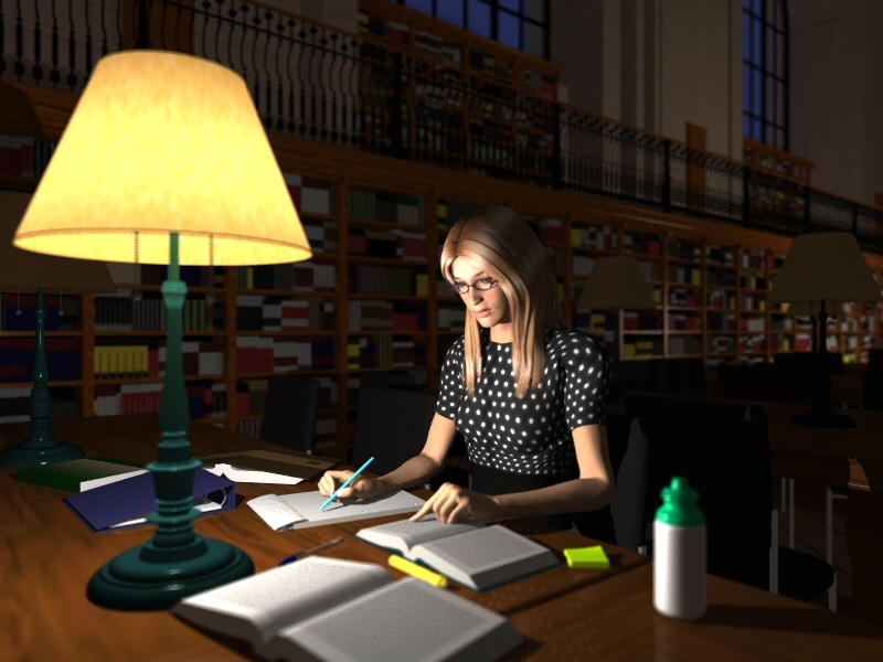
Hi,
I'm looking for constructive criticism to improve this image.
I'd like to improve the radiosity (currently using Radiosity_IndoorLQ), but
not clear on which settings to tweak.
Thanks in advance,
Rob.
---
http://www.fitzel.ca/dart/index.html
Post a reply to this message
Attachments:
Download 'library.0605.jpg' (183 KB)
Preview of image 'library.0605.jpg'
|
|
| |
| |
|
|
|
|
| |
| |
|
|
Very nice. Your way beyond what I could do, so heres my 2 cents.
Put some text on the note pad, something she's written or perhaps a doodle.
At the moment it looks like shes just started. I'd also like to see some
"branding" on the bottle in the foreground. The Text in the books is a
little too regular, some paragraphs would be nice. Also if you have a
"theme" for the image perhaps make the spine of a book visible so that we
can read the title.
--
#####-----#####-----#####
POV Tips and Hints at ...
http://povman.blogspot.com/
Post a reply to this message
|
|
| |
| |
|
|
|
|
| |
| |
|
|
Don't see anything wrong with this.
Post a reply to this message
|
|
| |
| |
|
|
|
|
| |
| |
|
|
Nice scene so far.
One item from me: the lighting should have a more yellow hue based on the
lamp shade, at least the ambient lighting that doesn't come directly from
the bulb (i.e. on the woman, etc.)
-tgq
Post a reply to this message
|
|
| |
| |
|
|
|
|
| |
| |
|
|
RobF wrote:
> Hi,
>
> I'm looking for constructive criticism to improve this image.
> I'd like to improve the radiosity (currently using Radiosity_IndoorLQ), but
> not clear on which settings to tweak.
>
> Thanks in advance,
>
> Rob.
> ---
> http://www.fitzel.ca/dart/index.html
>
>
> ------------------------------------------------------------------------
>
Lovely scene. Very complete. Great detail. The expression and
sentience of the figure very believable. The composition and lighting
looks solid.
So any crits assume a high level of accomplisnment and seem more about
fine tuning what the ultimate "expression" of the image.
If photorealism is the intention, it doesn't look photographic to me and
so I find the focal blur a bit distracting. It looks more
painterly-real, if you will, in the style of Edward Hopper. I think
this is because of the figure. It has a very believable physical
presence but not a photoreal presence and probably it will stay that
way. It is as if you had to sacrifice the one to get the other.
You might be able to boost the (photo)realism by:
- gaining more foreground tactility ... perhaps you could get more out
of the wood grain of the desk
- make her sweater completely black so to eliminate some of the
modelling awkwardness around the shoulder
That's as far as my thoughts go at the moment. It really has a
Hopper-like feel.
Post a reply to this message
|
|
| |
| |
|
|
|
|
| |
| |
|
|
"RobF" <nomail@nomail> wrote:
> Hi,
>
> I'm looking for constructive criticism to improve this image.
Well, my critiques are on the Poserish problems... the woman looks very good
(excellent hair!) except her arms and hands... From personal experience:
get a rough approximation of the pose you want, then TURN INVERSE
KINEMATICS OFF! Fine tune all the joints using the movement dials. Its
more time consuming, but its the only way to get away from the "Poser
look".
1. Fix her index finger on the page, the current pose is painful to look at.
Poser doesn't do straight fingers very well, I'd use the dials to raise the
knuckles and give the finger more of a natural bend. You may also need to
change the angle of the bend at the wrist to get this right.
2. The inside of the arm at the elbow has a very flattened "bent" look. This
is another area Poser is weak, because the skin does not flex with
positional changes like real skin does. Poser isn't natural, so ignore
what *seems* natural in favor of what looks good. Rotating the forearm
with the dials will move the flattened part to where it is less noticable.
In this case, moving the elbow further away from the body would probably
help also as it will put the flattened part on the inside facing the figure
and away from the camera.
RG
Post a reply to this message
|
|
| |
| |
|
|
|
|
| |
| |
|
|
Great image.. Difficult to say what needs improving, I assume as it is WIP
you may be working on some of the textures (although none of them jump out
as being bad, I just think they need a bit more detail/dirt etc..) Also it
would look better with radiosity.
Gotta get me one of those cordless lamps, are they cheap to run?
Sean
Post a reply to this message
|
|
| |
| |
|
|
|
|
| |
| |
|
|
I agree with the other critiques and would add just a few of my own. Close
the aperture of the focal blur a bit and move it where most of the
foreground is in focus. I also have a problem with the books having too many
color variances. They look just a little too fake with the yellows not too
many books have those colors(afaik) but who I'm I to say? The lighting is
not bad but( I guess you knew this was coming) I would like to see it darker
in the background scene. I would add ambient 0 to global settings also (I
find it helpful in getting lighting right). I also think that the other
lampshades look a little odd. I think you could try tweaking the ambient on
them that might bring them around. Rad settings are always tough to get. You
can always try recursion_limit 2 or higher and tweak the grey_level abit . I
do like your scene though . Please change the scale of the texture of the
wood on the desk .
I hope this is helpful.
Later,
Brent
"RobF" <nomail@nomail> wrote in message
news:web.4484e379e003e28629c50a910@news.povray.org...
> Hi,
>
> I'm looking for constructive criticism to improve this image.
> I'd like to improve the radiosity (currently using Radiosity_IndoorLQ),
> but
> not clear on which settings to tweak.
>
> Thanks in advance,
>
> Rob.
> ---
> http://www.fitzel.ca/dart/index.html
>
Post a reply to this message
|
|
| |
| |
|
|
|
|
| |
| |
|
|
"RobF" <nomail@nomail> wrote in message
news:web.4484e379e003e28629c50a910@news.povray.org...
> Hi,
>
> I'm looking for constructive criticism to improve this image.
Rob,
Pretty good!
One more thing to consider is the hair. Lovely texture. But no visible means
of support - unless its thick with laquer. Gravity would have it hanging
over her face unless clipped back.
DLM
Post a reply to this message
|
|
| |
| |
|
|
|
|
| |
| |
|
|
This image is screaming for an area light instead of a point light.
Use a 'circular orient' area light (probably a 10x10 points adaptive 1
should do) which is about the size of the light bulb (well, of the
imaginary light bulb since you probably didn't use a real one but
just put a light source inside the shade).
Also the shade should have an effect on the lighting. Try removing
no_shadow from it and letting light go through it filtered.
Post a reply to this message
|
|
| |
| |
|
|
|
|
| |