|
|
|
|
|
|
| |
| |
|
|
|
|
| |
| |
|
|
Il 24/02/2022 00:31, Cousin Ricky ha scritto:
> If you all like these, I will post the revised include files to p.b.s-f
> (and also figure out how to do branches and pull requests).
Yes, please, the examples are really nice.
Thank you,
Paolo
Post a reply to this message
|
|
| |
| |
|
|
From: Cousin Ricky
Subject: Re: Colors from golds.inc and metals.inc
Date: 27 Feb 2022 12:09:58
Message: <621bb066@news.povray.org>
|
|
|
| |
| |
|
|
On 2022-02-22 09:36 (-4), Cousin Ricky wrote:
>
> One question that must be answered is should we assume that the colors
> are gamma pre-encoded? Image stock_metal_gamma-srgb.jpg assumes that
> they are, and uses the srgbft keyword to decode them. Image
> stock_metal_gamma-linear.jpg assumes they are not, and just uses the
> colors as-is. Comparing them, it seems to me that the colors were not
> pre-encoded, unlike those in colors.inc.
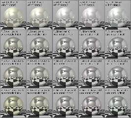
I discovered that the demo scenes from POV-Ray 3.0 explicitly set
assumed_gamma to 2.2, suggesting that the pigment colors were gamma
pre-encoded. However, as the first OP image shows, this results in
metals that are too dark when used with a realistic finish. It appears
that the old finishes exaggerated the luminances of the colors while
reducing their saturations, so it seems best to leave the colors as-is,
as if they were not pre-encoded.
Not gamma-decoding the colors does result in hue drift, but I think the
drift is in a better direction.
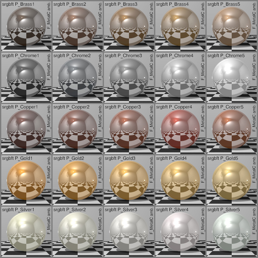
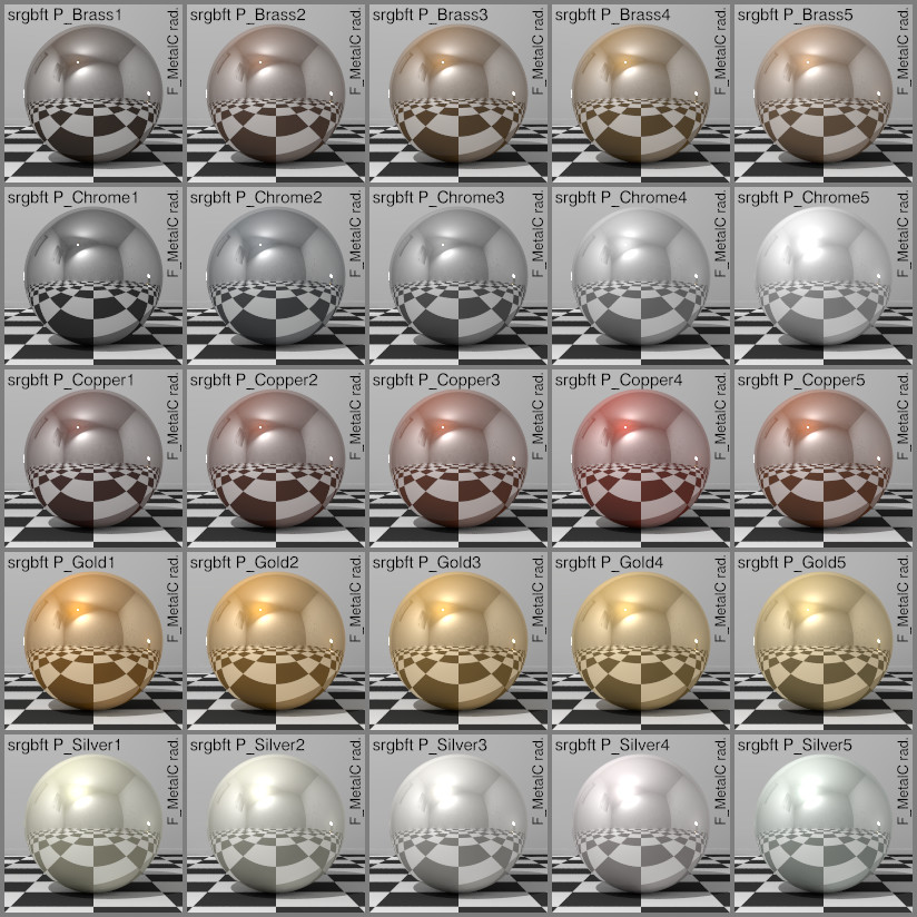
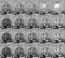
The attached images show the old finishes without and with radiosity.
Since they were rendered with POV-Ray 3.7, the ambients were
automatically suppressed for the radiosity renders. The radiosity image
shows that the ambients were not the only problem with the old finishes;
the reflection { metallic } introduced in POV-Ray 3.5 really makes a
difference.
Post a reply to this message
Attachments:
Download 'stock_metalc_gamma-srgb-a.jpg' (211 KB)
Download 'stock_metalc_gamma-srgb-r.jpg' (211 KB)
Preview of image 'stock_metalc_gamma-srgb-a.jpg'
Preview of image 'stock_metalc_gamma-srgb-r.jpg'
|
|
| |
| |
|
|
From: Cousin Ricky
Subject: Re: Colors from golds.inc and metals.inc
Date: 28 Feb 2022 14:06:36
Message: <621d1d3c@news.povray.org>
|
|
|
| |
| |
|
|
On 2022-02-27 13:09 (-4), Cousin Ricky wrote:
> On 2022-02-22 09:36 (-4), Cousin Ricky wrote:
>>
>> One question that must be answered is should we assume that the colors
>> are gamma pre-encoded? Image stock_metal_gamma-srgb.jpg assumes that
>> they are, and uses the srgbft keyword to decode them. Image
>> stock_metal_gamma-linear.jpg assumes they are not, and just uses the
>> colors as-is. Comparing them, it seems to me that the colors were not
>> pre-encoded, unlike those in colors.inc.
>
> I discovered that the demo scenes from POV-Ray 3.0 explicitly set
> assumed_gamma to 2.2, suggesting that the pigment colors were gamma
> pre-encoded. However, as the first OP image shows, this results in
> metals that are too dark when used with a realistic finish. It appears
> that the old finishes exaggerated the luminances of the colors while
> reducing their saturations, so it seems best to leave the colors as-is,
> as if they were not pre-encoded.
In POV-Ray 3.7, the assumed_gamma in the demo scenes was changed to 1,
and the results look horrible, further confirming that the colors are
gamma encoded. As assumed_gamma 1 is the recommended setting going
forward, one would think these colors should be decoded for the new
include file; but decoding the colors is more problematic than not.
> Not gamma-decoding the colors does result in hue drift, but I think the
> drift is in a better direction.
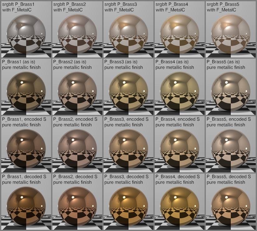
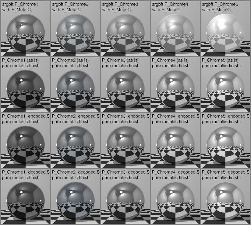
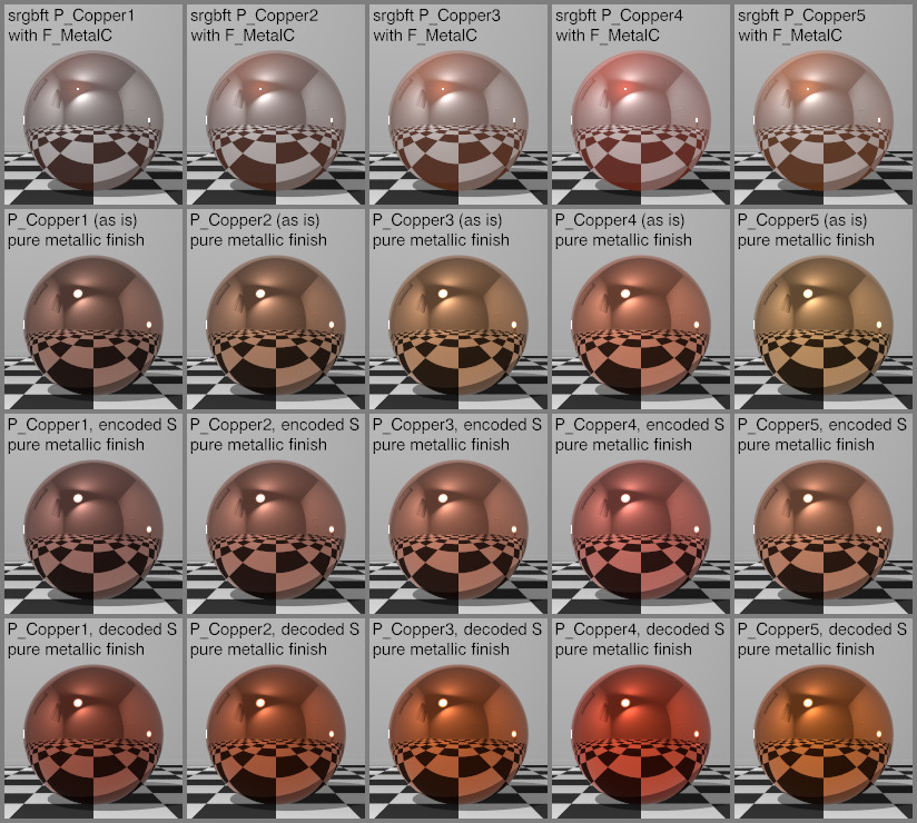
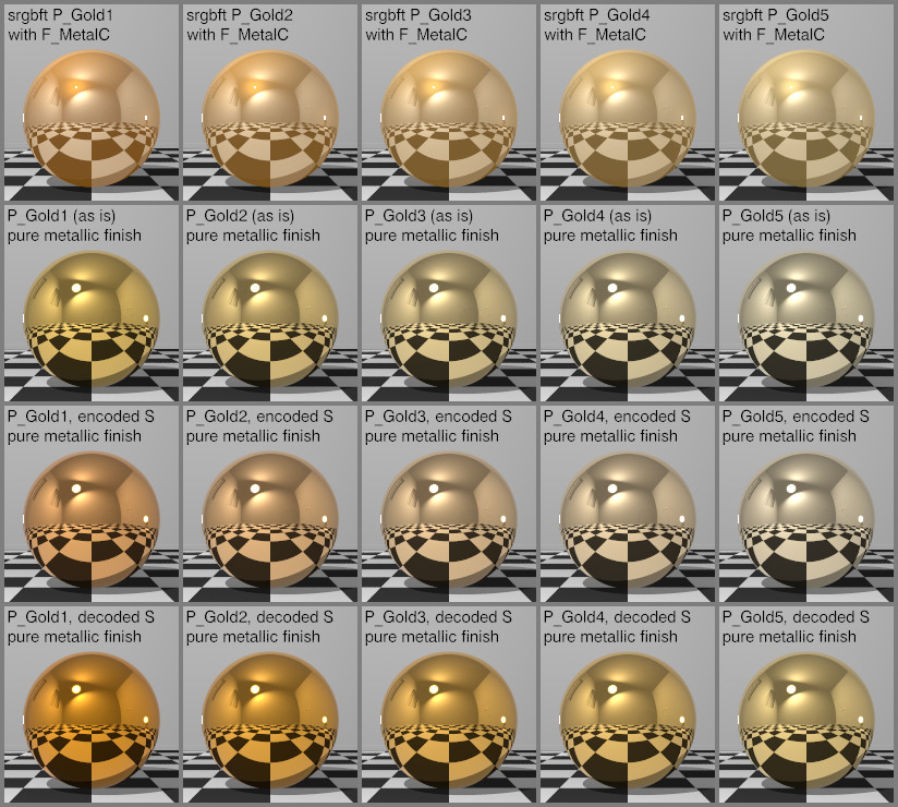
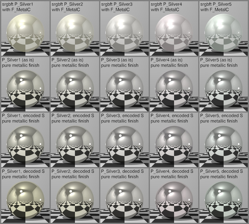
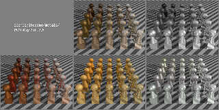
On second thought...
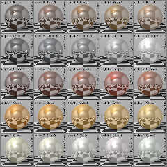
I massaged the colors in an attempt to eliminate the hue drift while
keeping them suitable for linear gamma and metallic reflection.
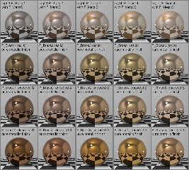
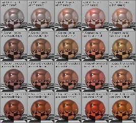
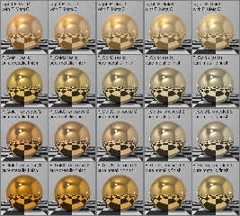
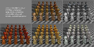
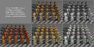
The top row of each image uses the original F_MetalC, but with the
colors decoded to retain the gamma 2.2 look when using assumed_gamma 1.
The second row uses the 2.2 encoded colors to maintain somewhat high
luminance with an updated metallic finish. A drift in hue away from the
top row is evident.
The third row maintains the original hues, while using the 2.2 encoded
saturations and values.
The bottom row maintains the original hues, while using the decoded
saturations and 2.2 encoded values.
I believe the third row best matches the original colors as presumably
intended by the POV-Team, although, for the brasses and golds, the
second row seems closer to colors I see in real life. What do you think?
Post a reply to this message
Attachments:
Download 'stock_metal-massaged-bs.jpg' (197 KB)
Download 'stock_metal-massaged-cr.jpg' (172 KB)
Download 'stock_metal-massaged-cu.jpg' (205 KB)
Download 'stock_metal-massaged-au.jpg' (207 KB)
Download 'stock_metal-massaged-ag.jpg' (176 KB)
Preview of image 'stock_metal-massaged-bs.jpg'
Preview of image 'stock_metal-massaged-cr.jpg'
Preview of image 'stock_metal-massaged-cu.jpg'
Preview of image 'stock_metal-massaged-au.jpg'
Preview of image 'stock_metal-massaged-ag.jpg'
|
|
| |
| |
|
|
|
|
| |
| |
|
|
Cousin Ricky <ric### [at] yahoo com> wrote:
> I believe the third row best matches the original colors as presumably
> intended by the POV-Team, although, for the brasses and golds, the
> second row seems closer to colors I see in real life. What do you think?
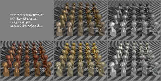
Regarding the brass, I have a chunk of brass sitting next to me and, 4th row,
P_Brass4 decoded S pure metallic finish looks best.
P_Brass3 in that row is too dark/orange, and the second row is too
pale/unsaturated.
Most of the other colors look like crap, unless we're talking about oxidized or
heat-discolored metal.
The finish in that first row is an atrocity. It's like there's a fog or haze.
The first brass looks like steel, and the second in the 4th row looks like
copper.
For the chromes, I'm comparing it to a pair of nail clippers - presumably chrome
plated like everything else - and P_Chrome3 in row 2 or 3 look the closest in
color tone.
For the copper, I have a 3-foot section copper rain gutter, and a 6-foot copper
downspout. Keep in mind that pure copper rapidly acquires a thin oxide layer
that darkens the color, so I'm comparing as-is, not buffed / polished /
chemically cleaned. The lighting also heavily factors in.
But I'd have to say that I favor P_Copper3 in the 4th row above all others, with
2 and 5 in that same row as possible alternates.
For the gold, I have a Canadian 1/4 oz 0.9999 coin.
Also, some 1 g fine gold rectangles.
This one is the hardest to determine by far. It's extremely sensitive to angle
and lighting....
It seems to my eye to fall between the 1st and 2nd in the 4th row - but neither
one really captures the peculiar shade of orange that the metal has.
Shining a white LED onto it to get "better" light makes it a LOT more yellow.
So --- we might need a real-life Cornell Box with standardized illumination to
eliminate the many influential variables.
For the silver, I'm comparing to a 1 oz silver round.
And wow - this is devilishly hard as well.
Numbering from left to right, top to bottom, I'd say it falls somewhere in the
range of 6, 7, 8, 9, 11, 12, 13, 14, 18
16 and 17 are too yellow, and 19 is too - purple?
It's also hard to compare to the renders, since it's hard to say if I'm looking
at the color of the metal or the color of the reflection.
Maybe a different set of spheres with some normal / micronormal finishes to give
a more matte appearance might help in future assessments.
Not sure what else we have, but I'd say that at some point in the future we
ought to strive to have have iron, steel, nickel, aluminum, tin, and zinc.
And maybe titanium nitride.
I'm sure they're all wildly similar, but maybe trying to look at the real world
objects and figure out rendering textures for them might teach us to see what
we're overlooking, discover better lighting and environment for objective
observation, and maybe lump a few of those metals/platings into a catch-all
texture that works for all of that group.
No idea what, if any, effect alloying with chromium, molybdenum, vanadium, etc
would have. I'm sure there's a difference between different steels, high
carbon, stainless, etc. My neighbor endeavors to be a bladesmith, so maybe
he's got some bar stock samples I can look at.
Great work so far, as usual - that's a lot of meticulous work and a lot of
renders. It's a pretty nuanced topic, for sure. com> wrote:
> I believe the third row best matches the original colors as presumably
> intended by the POV-Team, although, for the brasses and golds, the
> second row seems closer to colors I see in real life. What do you think?
Regarding the brass, I have a chunk of brass sitting next to me and, 4th row,
P_Brass4 decoded S pure metallic finish looks best.
P_Brass3 in that row is too dark/orange, and the second row is too
pale/unsaturated.
Most of the other colors look like crap, unless we're talking about oxidized or
heat-discolored metal.
The finish in that first row is an atrocity. It's like there's a fog or haze.
The first brass looks like steel, and the second in the 4th row looks like
copper.
For the chromes, I'm comparing it to a pair of nail clippers - presumably chrome
plated like everything else - and P_Chrome3 in row 2 or 3 look the closest in
color tone.
For the copper, I have a 3-foot section copper rain gutter, and a 6-foot copper
downspout. Keep in mind that pure copper rapidly acquires a thin oxide layer
that darkens the color, so I'm comparing as-is, not buffed / polished /
chemically cleaned. The lighting also heavily factors in.
But I'd have to say that I favor P_Copper3 in the 4th row above all others, with
2 and 5 in that same row as possible alternates.
For the gold, I have a Canadian 1/4 oz 0.9999 coin.
Also, some 1 g fine gold rectangles.
This one is the hardest to determine by far. It's extremely sensitive to angle
and lighting....
It seems to my eye to fall between the 1st and 2nd in the 4th row - but neither
one really captures the peculiar shade of orange that the metal has.
Shining a white LED onto it to get "better" light makes it a LOT more yellow.
So --- we might need a real-life Cornell Box with standardized illumination to
eliminate the many influential variables.
For the silver, I'm comparing to a 1 oz silver round.
And wow - this is devilishly hard as well.
Numbering from left to right, top to bottom, I'd say it falls somewhere in the
range of 6, 7, 8, 9, 11, 12, 13, 14, 18
16 and 17 are too yellow, and 19 is too - purple?
It's also hard to compare to the renders, since it's hard to say if I'm looking
at the color of the metal or the color of the reflection.
Maybe a different set of spheres with some normal / micronormal finishes to give
a more matte appearance might help in future assessments.
Not sure what else we have, but I'd say that at some point in the future we
ought to strive to have have iron, steel, nickel, aluminum, tin, and zinc.
And maybe titanium nitride.
I'm sure they're all wildly similar, but maybe trying to look at the real world
objects and figure out rendering textures for them might teach us to see what
we're overlooking, discover better lighting and environment for objective
observation, and maybe lump a few of those metals/platings into a catch-all
texture that works for all of that group.
No idea what, if any, effect alloying with chromium, molybdenum, vanadium, etc
would have. I'm sure there's a difference between different steels, high
carbon, stainless, etc. My neighbor endeavors to be a bladesmith, so maybe
he's got some bar stock samples I can look at.
Great work so far, as usual - that's a lot of meticulous work and a lot of
renders. It's a pretty nuanced topic, for sure.
Post a reply to this message
|
|
| |
| |
|
|
|
|
| |
| |
|
|
On 2022-02-28 17:56 (-4), Bald Eagle wrote:
>
> The finish in that first row is an atrocity. It's like there's a fog or haze.
Of course it is! That is one of the finishes we're trying to replace.
Post a reply to this message
|
|
| |
| |
|
|
|
|
| |
| |
|
|
Op 28/02/2022 om 22:56 schreef Bald Eagle:
> Cousin Ricky <ric### [at] yahoocom> wrote:
>
>> I believe the third row best matches the original colors as presumably
>> intended by the POV-Team, although, for the brasses and golds, the
>> second row seems closer to colors I see in real life. What do you think?
>
> Regarding the brass, I have a chunk of brass sitting next to me and, 4th row,
> P_Brass4 decoded S pure metallic finish looks best.
> P_Brass3 in that row is too dark/orange, and the second row is too
> pale/unsaturated.
>
[snip]>
> Great work so far, as usual - that's a lot of meticulous work and a lot of
> renders. It's a pretty nuanced topic, for sure.
>
I do not have real-world examples at hand, but /instinctively/ I would
choose the third row. The fourth appears too saturated to me. However,
taking into account any outside lighting which might influence the hue
of an object, I would also plead for real-world examples as texture basis.
Anyway, excellent work indeed.
--
Thomas
Post a reply to this message
|
|
| |
| |
|
|
|
|
| |
| |
|
|
Le 2022-02-28 à 16:56, Bald Eagle a écrit :
>
> The finish in that first row is an atrocity. It's like there's a fog or haze.
That haze comes from the insane ambient that those finishes have.
It's the main reason that prompted this whole thread.
Post a reply to this message
|
|
| |
| |
|
|
|
|
| |
| |
|
|
On 2022-02-28 17:56 (-4), Bald Eagle wrote:
>
> [snip]
> So --- we might need a real-life Cornell Box with standardized illumination to
> eliminate the many influential variables.
I believe I have figured out a setup for photographing metals while
minimizing environmental biases. Alas, lack of availability of some
metals has been a disincentive to me for proceeding with measurements of
those that I have on hand.
> [snip]
>
> Not sure what else we have, but I'd say that at some point in the future we
> ought to strive to have have iron, steel, nickel, aluminum, tin, and zinc.
> And maybe titanium nitride.
How far should we extend the scope of the standard include files?
Should we even discard the current colors altogether and start with a
new set? Or should we limit ourselves to the original goal of improving
the finishes? The only reason I brought up the colors was because they
are significantly changed by the improved textures and the scene gamma
change.
> I'm sure they're all wildly similar, but maybe trying to look at the real world
> objects and figure out rendering textures for them might teach us to see what
> we're overlooking, discover better lighting and environment for objective
> observation, and maybe lump a few of those metals/platings into a catch-all
> texture that works for all of that group.
I would be very suspicious of a catchall finish. The variability of
metallic textures is probably why metals.inc contains 5 finishes, why
even those 5 were culled from 9, why golds.inc's 5 finishes are
different from those of metals.inc, and why textures.inc has even more
metallic textures, most of which ignore the catchall finish that's
defined in that very same include file! But the finishes F_MetalA
through F_MetalE should be sufficient for most purposes.
I wrote RC3Metal for the Object Collection precisely to overcome the
shortcomings of a fixed set of metallic textures, in addition to
resolving the obsolescence of the standard textures. These are the
metallic colors defined in RC3Metal; however, the colors were not
derived from measurements:
Deduced naively from online spectral data:
aluminum
warm gold
yellowish gold
nickel plating
silver
Eyeballed:
yellow brass
pale yellow-orange brass
soft yellow-orange brass
deep orange brass
chrome plating
brand new copper
a darker copper
old copper, on the orange side
copper-nickel
dark stainless steel
light stainless steel
regular steel
new zinc plating
weathered zinc plating
Pure guesswork:
new bronze of the kind used for Olympic medals or ancient mirrors
3 dark bronzes
Not long after publishing RC3Metal 1.0, I learned two things from Ive
and Christoph: that conversion of spectral data to a color, especially
of metals, is not straightforward; and that human vision is even more
horribly unreliable than I thought, so eyeballing colors, especially of
metals, is insufficient. RC3Metal's existing colors definitely need
revision. The following is what I have so far.
Metals already measured, though not published:
freshly minted USA pennies, plating 95% Cu, 5% Zn
Metals already photographed for measurement (sampling quality unverified):
yellow brass doorknob
deep orange brass shelf mount
chrome plated bathroom fixture
shiny nickel bathroom fixture
light stainless steel knife
Metals available, but not yet photographed:
aluminum foil
pale yellow-orange brass binder clip (probably in storage)
soft yellow-orange brass clock
old USA pennies, on the orange side, plating 95% Cu, 5% Zn
dark stainless steel spoon or fork
steel scissors
copper-nickel plated coins
weathered zinc plated fence posts
Metals that may be lying around:
regular steel, if it's not rusted out
indoor zinc plating
Metals photographed behind glass or from afar:
gold of unknown purity
Metals not in hand, but easily purchased:
moderately new copper piping
lead (I'd be nervous keeping it around, though)
titanium nitride
new zinc plating
Metals of dubious availability:
mirror or medal quality new bronze
dark bronzes that aren't spray-on
14K gold
18K gold
24K gold
silver
mercury
niobium
pewter
platinum
rhodium plating
ruthenium plating
speculum
tin
Post a reply to this message
|
|
| |
| |
|
|
|
|
| |
| |
|
|
On 2022-02-28 15:06 (-4), Cousin Ricky wrote:
>
> In POV-Ray 3.7, the assumed_gamma in the demo scenes was changed to 1,
> and the results look horrible, further confirming that the colors are
> gamma encoded.
Wouldn't you know it, I happened to look at the one (1) scene that had
been changed. All except copper are still at 2.2.
========== 3.0 ==========
brasses.pov:global_settings { assumed_gamma 2.2 }
chromes.pov:global_settings { assumed_gamma 2.2 }
coppers.pov:global_settings { assumed_gamma 2.2 }
golds.pov:global_settings { assumed_gamma 2.2 }
silvers.pov:global_settings { assumed_gamma 2.2 }
========== 3.6.1 ==========
brasses.pov: assumed_gamma 2.2
chromes.pov: assumed_gamma 2.2
coppers.pov: assumed_gamma 2.2
golds.pov: assumed_gamma 2.2
silvers.pov: assumed_gamma 2.2
========== 3.7.0.0 ==========
brasses.pov: assumed_gamma 2.2
chromes.pov: assumed_gamma 2.2
coppers.pov: assumed_gamma 1.0
golds.pov: assumed_gamma 2.2
silvers.pov: assumed_gamma 2.2
Post a reply to this message
|
|
| |
| |
|
|
From: Cousin Ricky
Subject: Re: Colors from golds.inc and metals.inc
Date: 9 Mar 2022 15:37:50
Message: <6229101e@news.povray.org>
|
|
|
| |
| |
|
|
On 2022-02=28 15:06 (-4), Cousin Ricky wrote:
>
> I massaged the colors in an attempt to eliminate the hue drift while
> keeping them suitable for linear gamma and metallic reflection.
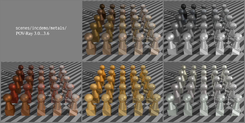
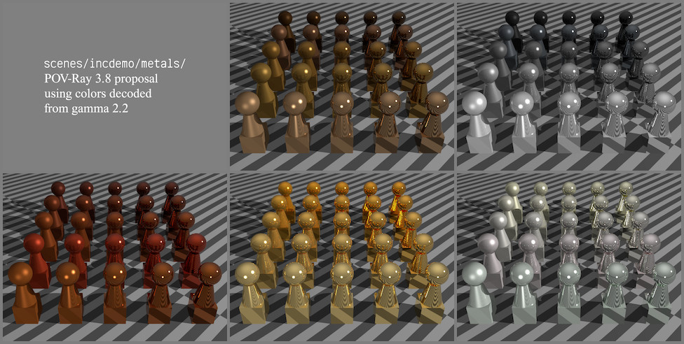
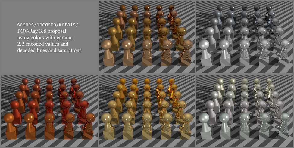
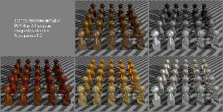
I have rendered several variations of the demo scenes from the
scenes/incdemo/metals directory in the POV-Ray distribution.
Image incdemo-metals-old.jpg is a montage of the original metal demos.
Note that assumed_gamma was explicitly set to 2.2 for these scenes. The
ambient on the ground plane was set to an outrageous 0.45, but it
doesn't seem that bad due to the non-linear tracing. The baked-in
ambients don't look that bad at this unrealistic scene gamma, but the
"harder" finishes are much lighter than the softer ones, which doesn't
seem realistic to me.
The remaining scenes all use my new finishes, and have assumed_gamma 1,
and ambient 0.1 set on the ground plane.
Image incdemo-metals-encoded.jpg uses the original metal colors as
declared. The colors are considerably less saturated, and the hues are
noticeably different.
For image incdemo-metals-decoded.jpg, the colors are decoded from gamma
2.2. The colors are all very dark, and do not lighten up for the
"harder" finishes. This darkness is why I proposed not decoding the HSV
values.
For image incdemo-metals-encv.jpg, only the hue and saturation are
decoded. However, the colors now look too strong.
For image incdemo-metals-half.jpg, the saturation is half-decoded.
Because reducing the saturation affects our *perception* of hue (even
though the hue is mathematically unchanged), I also half-decoded the
hue. As for why changes in saturation affect our hue perception, I have
no ides; you'll have to ask a color scientist.
Post a reply to this message
Attachments:
Download 'incdemo-metals-old.jpg' (162 KB)
Download 'incdemo-metals-encoded.jpg' (170 KB)
Download 'incdemo-metals-decoded.jpg' (171 KB)
Download 'incdemo-metals-encv.jpg' (179 KB)
Download 'incdemo-metals-half.jpg' (175 KB)
Preview of image 'incdemo-metals-old.jpg'
Preview of image 'incdemo-metals-encoded.jpg'
Preview of image 'incdemo-metals-decoded.jpg'
Preview of image 'incdemo-metals-encv.jpg'
Preview of image 'incdemo-metals-half.jpg'
|
|
| |
| |
|
|
|
|
| |
|
|