 |
 |
|
 |
|
 |
|  |
|  |
|
 |
|
 |
|  |
|  |
|
 |
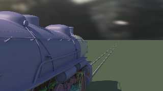
Added some more "steam greebles":
- Corrugated catwalks, handrails & treads
- Sand pipework
- Feedwater pipe
- Pressured air tanks
- Rivets, rivets and more rivets
Not perfectly authentic yet (e.g. the air tanks should actually go on
the left-hand side), but authenticity has to wait until after the
TINA-CHeP deadline (stay tuned on www.tc-rtc.co.uk).
Post a reply to this message
Attachments:
Download 'steam 2009-10-17 1702.png' (462 KB)
Preview of image 'steam 2009-10-17 1702.png'

|
 |
|  |
|  |
|
 |
|
 |
|  |
|  |
|
 |
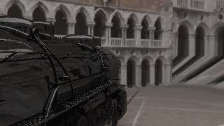
... and on display at venice after a fresh paint job.
Post a reply to this message
Attachments:
Download 'steam 2009-10-17 1757.jpg' (126 KB)
Preview of image 'steam 2009-10-17 1757.jpg'

|
 |
|  |
|  |
|
 |
|
 |
|  |
|  |
|
 |
> ... and on display at venice after a fresh paint job.
>
> ------------------------------------------------------------------------
>
You must rotate that HDR background. The seam is horrible.
Other than that, good job.
Alain
Post a reply to this message
|
 |
|  |
|  |
|
 |
|
 |
|  |
|  |
|
 |
Alain schrieb:
> You must rotate that HDR background. The seam is horrible.
I just use it as a lighting stage, which is why I didn't bother.
Post a reply to this message
|
 |
|  |
|  |
|
 |
|
 |
|  |
|  |
|
 |
clipka <ano### [at] anonymous org> wrote:
> ... and on display at venice after a fresh paint job.
I like the paint and imperfections of the surface. Did you use a warp or other
finish to do that? org> wrote:
> ... and on display at venice after a fresh paint job.
I like the paint and imperfections of the surface. Did you use a warp or other
finish to do that?
Post a reply to this message
|
 |
|  |
|  |
|
 |
|
 |
|  |
|  |
|
 |
clipka wrote:
> ... and on display at venice after a fresh paint job.
that's so friggin' nice!
Post a reply to this message
|
 |
|  |
|  |
|
 |
|
 |
|  |
|  |
|
 |
SafePit schrieb:
> I like the paint and imperfections of the surface. Did you use a warp or other
> finish to do that?
Thanks. The irregularities in the reflection are simply two overlayed
"bumps":
normal {
average
normal_map {
[1 bumps 0.01 scale 2.0*in ]
[1 bumps 0.05 scale 20.0*in ]
}
}
where "in" is a distance equivalent to 1 inch in the model.
The rivets are just spheres.
The corrugated catwalk uses an isosurface based on a "bump map" image;
an actual bump map turned out to be problematic regarding the direction
of light (an old ailment of POV-Ray's bump mapping), and the isosurface
didn't bog down rendering time too much.
Post a reply to this message
|
 |
|  |
|  |
|
 |
|
 |
|  |
|  |
|
 |
clipka wrote:
> Added some more "steam greebles":
>
> - Corrugated catwalks, handrails & treads
> - Sand pipework
> - Feedwater pipe
> - Pressured air tanks
> - Rivets, rivets and more rivets
>
> Not perfectly authentic yet (e.g. the air tanks should actually go on
> the left-hand side), but authenticity has to wait until after the
> TINA-CHeP deadline (stay tuned on www.tc-rtc.co.uk).
>
>
> ------------------------------------------------------------------------
>
Very nice, but as predicted loses something when "properly" textured. By
modeling in different colors, you revealed things that wouldn't be
present in a photograph or photo-realistic render.
This is important, I think, because so few things render or photograph
well. What looks good in flattened 3D? Relatively convex objects like
faces, buildings, and landscapes. That's it. Sure, you can find some
impressive 3D examples of other things, but compare those to 2D work of
the same subject and I'll bet you find the 3D lacking. A few years ago,
I ran across the CGTalk "Grand Space Opera" challenge which blew my mind
when I compared the 2D to 3D entries.
What's the problem with 3D? I believe there's a human tendency to
separate any image into positive and negative or light and dark space
(look at the difference in perspective one can gain from cropping a
render). A 2D artist can overcome this and create more spaces with his
complete control of localized contrast and "texture" of the flattened
image. A 3D artist could exercise more control than most do, but the
time required for extra light sources and experimentation is great.
Something I will continue to think on.
-Shay
Post a reply to this message
|
 |
|  |
|  |
|
 |
|
 |
|  |
|  |
|
 |
> Very nice, but as predicted loses something when "properly" textured. By
> modeling in different colors, you revealed things that wouldn't be
> present in a photograph or photo-realistic render.
>
> This is important, I think, because so few things render or photograph
> well. What looks good in flattened 3D? Relatively convex objects like
> faces, buildings, and landscapes. That's it. Sure, you can find some
> impressive 3D examples of other things, but compare those to 2D work of
> the same subject and I'll bet you find the 3D lacking. A few years ago,
> I ran across the CGTalk "Grand Space Opera" challenge which blew my mind
> when I compared the 2D to 3D entries.
>
> What's the problem with 3D? I believe there's a human tendency to
> separate any image into positive and negative or light and dark space
> (look at the difference in perspective one can gain from cropping a
> render). A 2D artist can overcome this and create more spaces with his
> complete control of localized contrast and "texture" of the flattened
> image. A 3D artist could exercise more control than most do, but the
> time required for extra light sources and experimentation is great.
>
> Something I will continue to think on.
>
> -Shay
I think you're on to something. In this way, 3D art is similar to photography.
A good photographer can turn an ordinary scene into a piece of art by careful
consideration of composition and lighting. In reality, the potential for the
same is even stronger in 3D artwork, but like you say, we give up too soon.
Post a reply to this message
|
 |
|  |
|  |
|
 |
|
 |
|  |
|  |
|
 |
"Shay" <n@n.n> schreef in bericht news:4aeb2faf@news.povray.org...
> Very nice, but as predicted loses something when "properly" textured. By
> modeling in different colors, you revealed things that wouldn't be present
> in a photograph or photo-realistic render.
>
> This is important, I think, because so few things render or photograph
> well. What looks good in flattened 3D? Relatively convex objects like
> faces, buildings, and landscapes. That's it. Sure, you can find some
> impressive 3D examples of other things, but compare those to 2D work of
> the same subject and I'll bet you find the 3D lacking. A few years ago, I
> ran across the CGTalk "Grand Space Opera" challenge which blew my mind
> when I compared the 2D to 3D entries.
>
> What's the problem with 3D? I believe there's a human tendency to separate
> any image into positive and negative or light and dark space (look at the
> difference in perspective one can gain from cropping a render). A 2D
> artist can overcome this and create more spaces with his complete control
> of localized contrast and "texture" of the flattened image. A 3D artist
> could exercise more control than most do, but the time required for extra
> light sources and experimentation is great.
>
> Something I will continue to think on.
Please do. You have started here an interesting string of thoughts which
might be fundamental to the way we usually look at the work we are creating.
Kirk mentioned photography as an analog to 3D art as we understand it. I
agree to some extent, although I believe we have more power over the subject
than the photographer.
Thomas
Post a reply to this message
|
 |
|  |
|  |
|
 |
|
 |
|  |


![]()