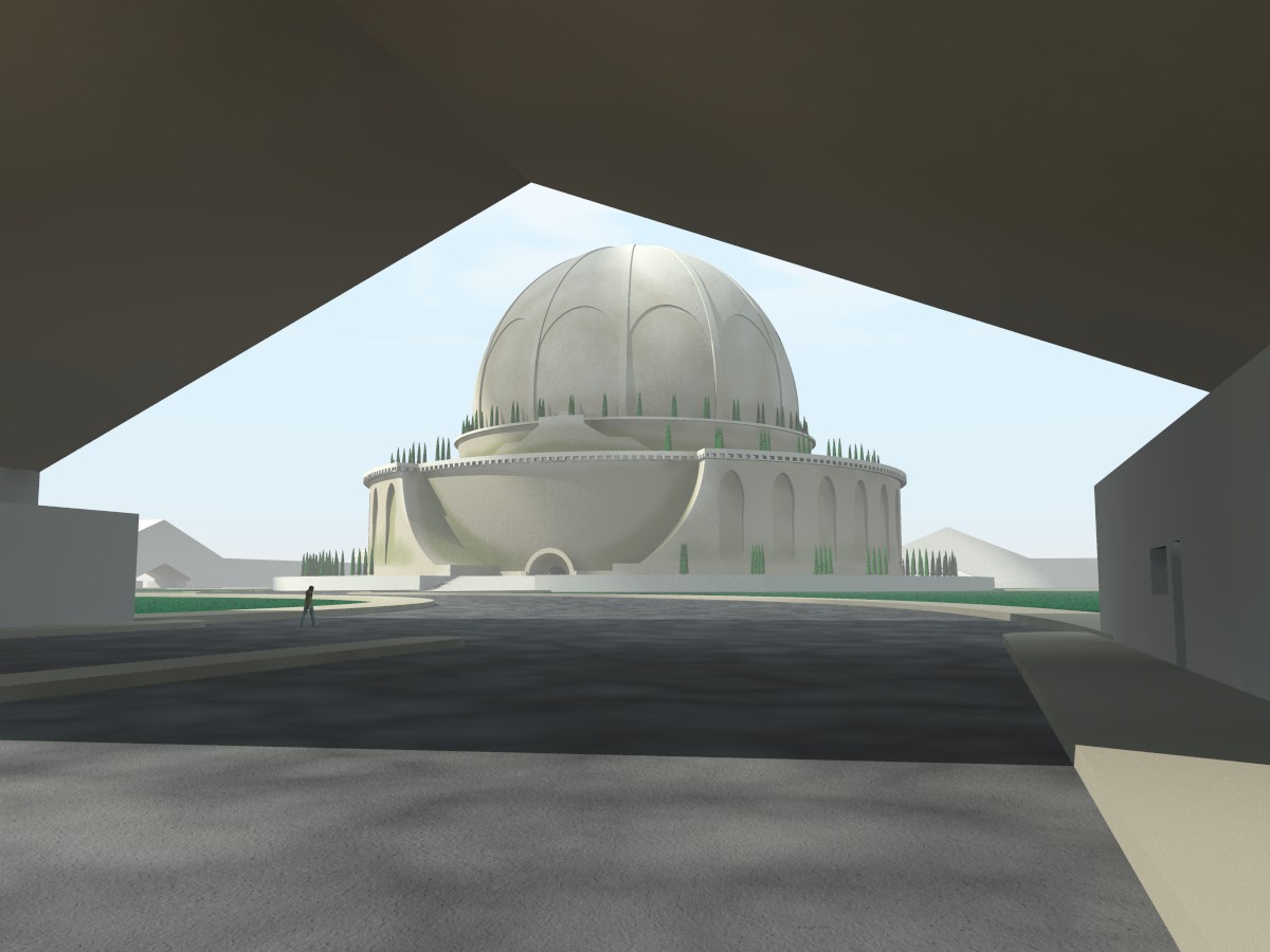
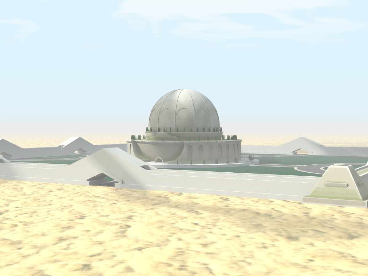
Right. This is what I have been doing up till now.
- I cropped invisible features underground from the central building.
Dimensions now: <33.5, 33.5, 16.5> with z being up
- Assuming that the *magic* number 7.5 is valid for an object sized 120 pov
units, I calculated the reducing factor for my building and used that in the
params.
- I did the same for the basic element constituting the surrounding wall.
Question: This object being strongly elongated, shouldn't the *scaling* of
the bozo noise be scaled accordingly? I am not sure about that.
- From Edouard's example I deduced that the calculation of the df3 does not
necessarily take place on an object centered at the origin, so the wall was
calculated at its world's location. Question: Is this assumption correct?
Results for the time being vesible on the image.
--
All the best,
Thomas
Post a reply to this message
Attachments:
Download 'boullee_cenotaphe_proxpat.jpg' (104 KB)
Preview of image 'boullee_cenotaphe_proxpat.jpg'
|