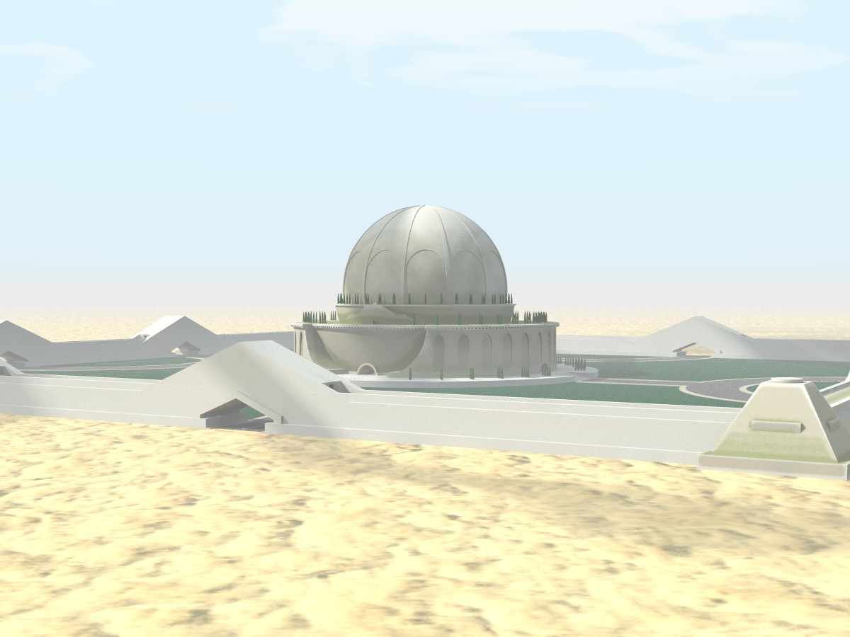
A birdseye view to show the different df3's. The tower looks right (a bit
boring maybe) but the wall is not correct at all. At the extreme right one
can see that the top has some greenish hue, but that is all that suggests
the proximity pattern. The cenotaph needs some more fine tuning of course.
Thomas
Post a reply to this message
Attachments:
Download 'boullee_cenotaphe_proxpat.jpg' (111 KB)
Preview of image 'boullee_cenotaphe_proxpat.jpg'
|