 |
 |
|
 |
|
 |
|  |
|  |
|
 |
|
 |
|  |
|  |
|
 |
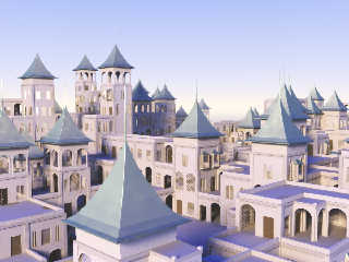
Just something that was rolling around in the back of my head for some time.
There's still a lot of improvements I'd like to add, but here it is for now.
All randomly generated from a macro.
Post a reply to this message
Attachments:
Download 'palace01.jpg' (216 KB)
Preview of image 'palace01.jpg'

|
 |
|  |
|  |
|
 |
|
 |
|  |
|  |
|
 |
"Kirk Andrews" <kir### [at] tektonart com> wrote:
> Just something that was rolling around in the back of my head for some time.
> There's still a lot of improvements I'd like to add, but here it is for now.
> All randomly generated from a macro.
Nice one!
The square wooden door looks a bit out of place. com> wrote:
> Just something that was rolling around in the back of my head for some time.
> There's still a lot of improvements I'd like to add, but here it is for now.
> All randomly generated from a macro.
Nice one!
The square wooden door looks a bit out of place.
Post a reply to this message
|
 |
|  |
|  |
|
 |
|
 |
|  |
|  |
|
 |
Kirk Andrews wrote:
> Just something that was rolling around in the back of my head for some time.
> There's still a lot of improvements I'd like to add, but here it is for now.
> All randomly generated from a macro.
>
Intriguing... Reminds me of Escher's work.
-=- Larry -=-
Post a reply to this message
|
 |
|  |
|  |
|
 |
|
 |
|  |
|  |
|
 |
"Larry Hudson" <org### [at] yahoo com> schreef in bericht
news:4987a7a3@news.povray.org...
>>
> Intriguing... Reminds me of Escher's work.
Now... Why did I think that too?
Thomas com> schreef in bericht
news:4987a7a3@news.povray.org...
>>
> Intriguing... Reminds me of Escher's work.
Now... Why did I think that too?
Thomas
Post a reply to this message
|
 |
|  |
|  |
|
 |
|
 |
|  |
|  |
|
 |
"Kirk Andrews" <kir### [at] tektonart com> schreef in bericht
news:web.498779911daf8688da29fa390@news.povray.org...
> Just something that was rolling around in the back of my head for some
> time.
> There's still a lot of improvements I'd like to add, but here it is for
> now.
> All randomly generated from a macro.
>
>
Oh yes. A kind of building blocks lego. This could become something very
interesting. I note that the dome is not appearing very often. The square
door should have some semi-circular decoration above it.
Thomas com> schreef in bericht
news:web.498779911daf8688da29fa390@news.povray.org...
> Just something that was rolling around in the back of my head for some
> time.
> There's still a lot of improvements I'd like to add, but here it is for
> now.
> All randomly generated from a macro.
>
>
Oh yes. A kind of building blocks lego. This could become something very
interesting. I note that the dome is not appearing very often. The square
door should have some semi-circular decoration above it.
Thomas
Post a reply to this message
|
 |
|  |
|  |
|
 |
|
 |
|  |
|  |
|
 |
Nice!
I've made years ago a endless house, but your palace is superb!
;-)
Paolo
>Kirk Andrews on date 02/02/2009 23:54 wrote:
> Just something that was rolling around in the back of my head for some time.
> There's still a lot of improvements I'd like to add, but here it is for now.
> All randomly generated from a macro.
>
>
>
> ------------------------------------------------------------------------
>
Post a reply to this message
|
 |
|  |
|  |
|
 |
|
 |
|  |
|  |
|
 |
"Thomas de Groot" <tDOTdegroot@interDOTnlANOTHERDOTnet> wrote:
> "Larry Hudson" <org### [at] yahoo com> schreef in bericht
> news:4987a7a3@news.povray.org...
> >>
> > Intriguing... Reminds me of Escher's work.
>
>
> Now... Why did I think that too?
It's what might arise if Escher tried to illustrate Gormenghast. Minus the
illusions. :)
Very nice, too. com> schreef in bericht
> news:4987a7a3@news.povray.org...
> >>
> > Intriguing... Reminds me of Escher's work.
>
>
> Now... Why did I think that too?
It's what might arise if Escher tried to illustrate Gormenghast. Minus the
illusions. :)
Very nice, too.
Post a reply to this message
|
 |
|  |
|  |
|
 |
|
 |
|  |
|  |
|
 |
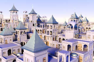
Thanks, everyone.
I started thinking about Escher, too, after I started working on it. I thought
about going for some minor illusions, but that seemed complicated.
I think I've improved the doors, but now there are perhaps too many doors and
not enough windows. Unfortunately, the project will have to halt here for now
until I'm more caught up on other things.
Post a reply to this message
Attachments:
Download 'palace02.jpg' (320 KB)
Preview of image 'palace02.jpg'

|
 |
|  |
|  |
|
 |
|
 |
|  |
|  |
|
 |
"Kirk Andrews" <kir### [at] tektonart com> wrote:
> I think I've improved the doors, but now there are perhaps too many doors and
> not enough windows. Unfortunately, the project will have to halt here for now
> until I'm more caught up on other things.
Big doors = too massive. Windows without gratings = too bare. Space = too
cluttered. Radiosity = too splotchy (used 3.6, right? Try increasing
max_trace_level).
I liked the previous shot better actually. com> wrote:
> I think I've improved the doors, but now there are perhaps too many doors and
> not enough windows. Unfortunately, the project will have to halt here for now
> until I'm more caught up on other things.
Big doors = too massive. Windows without gratings = too bare. Space = too
cluttered. Radiosity = too splotchy (used 3.6, right? Try increasing
max_trace_level).
I liked the previous shot better actually.
Post a reply to this message
|
 |
|  |
|  |
|
 |
|
 |
|  |
|  |
|
 |
"clipka" <nomail@nomail> wrote:
> Big doors = too massive.
Not to *massive* I think, just too common.
> Windows without gratings = too bare.
Admitted.
> Space = too cluttered.
Admitted.
> Radiosity = too splotchy (used 3.6, right? Try increasing
> max_trace_level).
Admitted--these are not "final" render settings.
> I liked the previous shot better actually.
I agree, but mostly because I need to tweak the frequency of various elements to
reduce the cluttered feeling.
Post a reply to this message
|
 |
|  |
|  |
|
 |
|
 |
|  |


![]()