|
|
|
|
|
|
| |
| |
|
|
|
|
| |
| |
|
|
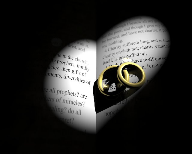
A photographer friend of mine is doing another friend's wedding. As a
result, they've been going through a bunch of typical wedding photos,
and one in particular struck me as an, "I can do that with POV!" picture :)
I'm not happy with the color of the rings, and something about the
lighting still doesn't seem right. It's a single point light - maybe I
should try an area light, or add one or two more point lights...
Anyway, here it is.
...Chambers
Post a reply to this message
Attachments:
Download 'book.jpg' (30 KB)
Preview of image 'book.jpg'
|
|
| |
| |
|
|
|
|
| |
| |
|
|
Chambers nous illumina en ce 2008-07-20 20:16 -->
> A photographer friend of mine is doing another friend's wedding. As a
> result, they've been going through a bunch of typical wedding photos,
> and one in particular struck me as an, "I can do that with POV!" picture :)
>
> I'm not happy with the color of the rings, and something about the
> lighting still doesn't seem right. It's a single point light - maybe I
> should try an area light, or add one or two more point lights... Anyway,
> here it is.
>
> ...Chambers
>
> ------------------------------------------------------------------------
>
Maybe just give the rings a little more reflection and sharper highlights.
--
Alain
-------------------------------------------------
One nice thing about egotists: they don't talk about other people.
Post a reply to this message
|
|
| |
| |
|
|
|
|
| |
| |
|
|
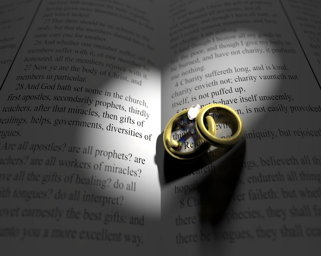
Added a fill light, switched to area lights, and turned dispersion on.
...Chambers
Post a reply to this message
Attachments:
Download 'book.jpg' (47 KB)
Preview of image 'book.jpg'
|
|
| |
| |
|
|
|
|
| |
| |
|
|
Chambers wrote:
> Added a fill light, switched to area lights, and turned dispersion on.
I like the composition and idea behind this image. You are doing well so
far.
Care to receive a few suggestions?
First off, since the primary light makes a heart shape on the pages, why
not give that light a pinkish/peachy color? A warm color for the fill
light would also be nice.
As Alain mentioned, the rings could look more reflective. Sometimes for
metal surfaces, I bump the brilliance all the way up to 4, and knock the
diffuse down to 0.25. I make the reflection{} and specular attributes
fully metallic (for non-pure colors). It looks like you already have a
good environment for reflective materials. You can pull more of it in by
making the gold surfaces a little rough. Since you are using focal blur,
you can probably get away with blurring the reflections with a surface
normal:
bumps 0.125 scale 0.0001
Most gold surfaces do not have perfectly specular reflection.
Well, that's all. I hope I haven't offended you with my suggestions...
Sam
Post a reply to this message
|
|
| |
| |
|
|
|
|
| |
| |
|
|
stbenge wrote:
> Well, that's all. I hope I haven't offended you with my suggestions...
Not at all - I'm already using metallic, and a bumped normal on the
gold. However, the bumps are very subtle - probably too much so - and I
like the idea of increasing the brilliance. I'll play around with it
more tomorrow.
...Chambers
Post a reply to this message
|
|
| |
| |
|
|
|
|
| |
| |
|
|
>> Well, that's all. I hope I haven't offended you with my suggestions...
>
> Not at all - I'm already using metallic, and a bumped normal on the gold.
> However, the bumps are very subtle - probably too much so - and I like the
> idea of increasing the brilliance. I'll play around with it more
> tomorrow.
Reflective stuff tends to look much better when there's stuff to reflect.
Maybe the inside of a church?
Post a reply to this message
|
|
| |
| |
|
|
|
|
| |
| |
|
|
Chambers <ben### [at] pacificwebguy com> wrote:
> I'm not happy with the color of the rings, and something about the
> lighting still doesn't seem right.
I'm with Sam: up the brilliance on the rings. Also, try a more reddish hue and
slightly less color saturation.
I have a compositional suggestion, if it's not to late. You have the rings
sitting on chapter 13 of 1 Corinthians. I think it would be better if the
rings were on the opposite side, so they wouldn't obscure the words of that
sublime chapter. com> wrote:
> I'm not happy with the color of the rings, and something about the
> lighting still doesn't seem right.
I'm with Sam: up the brilliance on the rings. Also, try a more reddish hue and
slightly less color saturation.
I have a compositional suggestion, if it's not to late. You have the rings
sitting on chapter 13 of 1 Corinthians. I think it would be better if the
rings were on the opposite side, so they wouldn't obscure the words of that
sublime chapter.
Post a reply to this message
|
|
| |
| |
|
|
|
|
| |