|
|
|
|
|
|
| |
| |
|
|
|
|
| |
| |
|
|
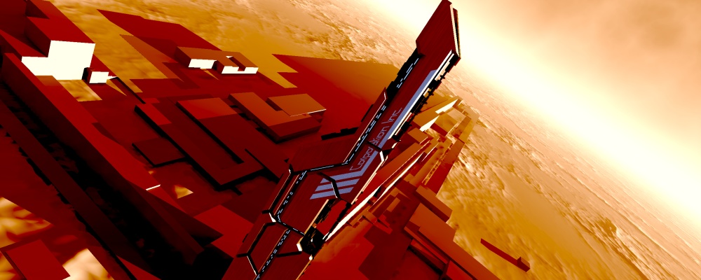
A little thing I've been working on. The background's just something I
bashed together quickly, the tower's the only bit I've been seriously
working on. It's built mostly out of polygons placed with macros to bevel &
greeble things.
It's very directly inspired by the awesome art for the game mass effect,
like this: http://www.1up.com/do/media?cId=3144257&sec=IMAGES
I'm going to work on it some more and make a more serious picture (such as
one with more colours, the mad oranges are a post processing filter in
megapov).
Comments? Criticisms?
--
Tek
http://evilsuperbrain.com
Post a reply to this message
Attachments:
Download 'scifi bevels -take1.jpg' (128 KB)
Preview of image 'scifi bevels -take1.jpg'
|
|
| |
| |
|
|
|
|
| |
| |
|
|
"Tek" <tek### [at] evilsuperbrain com> wrote in message
news:465875df@news.povray.org...
>A little thing I've been working on. The background's just something I
>bashed together quickly, the tower's the only bit I've been seriously
>working on. It's built mostly out of polygons placed with macros to bevel &
>greeble things.
Well, the background and the whole image is looking pretty damn good to
me. I like it!
>
> It's very directly inspired by the awesome art for the game mass effect,
> like this: http://www.1up.com/do/media?cId=3144257&sec=IMAGES
Wow! Is that game only on the 360? Man, those images are great. When I
was looking at them, it reminded me that it's the game itself that creates
those kind of images via screenshots. No-one would sit there for that long
and create that many with some handy media, surely?
>
> I'm going to work on it some more and make a more serious picture (such as
> one with more colours, the mad oranges are a post processing filter in
> megapov).
>
> Comments? Criticisms?
Not really at this moment in time, it's too young so far. Can't wait to
see the progress though Tek.
~Steve~
> --
> Tek
> http://evilsuperbrain.com
>
>
> com> wrote in message
news:465875df@news.povray.org...
>A little thing I've been working on. The background's just something I
>bashed together quickly, the tower's the only bit I've been seriously
>working on. It's built mostly out of polygons placed with macros to bevel &
>greeble things.
Well, the background and the whole image is looking pretty damn good to
me. I like it!
>
> It's very directly inspired by the awesome art for the game mass effect,
> like this: http://www.1up.com/do/media?cId=3144257&sec=IMAGES
Wow! Is that game only on the 360? Man, those images are great. When I
was looking at them, it reminded me that it's the game itself that creates
those kind of images via screenshots. No-one would sit there for that long
and create that many with some handy media, surely?
>
> I'm going to work on it some more and make a more serious picture (such as
> one with more colours, the mad oranges are a post processing filter in
> megapov).
>
> Comments? Criticisms?
Not really at this moment in time, it's too young so far. Can't wait to
see the progress though Tek.
~Steve~
> --
> Tek
> http://evilsuperbrain.com
>
>
>
Post a reply to this message
|
|
| |
| |
|
|
|
|
| |
| |
|
|
ah! Futuristic alienesque cityscapes never fail to amaze me.
Post a reply to this message
|
|
| |
| |
|
|
|
|
| |
| |
|
|
> Comments? Criticisms?
Ooh, cool. :-)
Random thoughts:
The seam running right through the corporate name seems awkward--I can't
image a company letting their name get chopped up like that. The one
farther down, running across the lines from the logo, does work
surprisingly well, though.
Also, I found the red shadows hard to wrap my head around at first. I'm
used to shadows being blue. :-) Softening it up with some area lights
would probably help.
Finally, the "bashed together quickly" background actually looks pretty
good to me.
--
William Tracy
+-+-+-+-+-+-+-+-+-+-+-+-+-+-+-+-+-+-+-+-+-+
|a|f|i|s|h|i|o|n|a|d|o|@|g|m|a|i|l|.|c|o|m|
+-+-+-+-+-+-+-+-+-+-+-+-+-+-+-+-+-+-+-+-+-+
+-+-+-+-+-+-+-+-+-+-+-+-+-+-+-+-+-+-+
|w|t|r|a|c|y|@|c|a|l|p|o|l|y|.|e|d|u|
+-+-+-+-+-+-+-+-+-+-+-+-+-+-+-+-+-+-+
You know you've been raytracing too long when you've converted POV-Ray
into an operating system; now you've got all the system resources to do
your renderings.
Vimal N. Lad / Gautam N. Lad
Post a reply to this message
|
|
| |
| |
|
|
|
|
| |
| |
|
|
"William Tracy" <wtr### [at] calpolyedu> wrote in message
news:4658cb92@news.povray.org...
>
> The seam running right through the corporate name seems awkward--I can't
> image a company letting their name get chopped up like that. The one
> farther down, running across the lines from the logo, does work
> surprisingly well, though.
Yeah I'm going to redesign the corporate emblem to allow for that line. At
present it's written upside down on the other side, and the company is
currently entitled "Corporation Inc.". So I'm gonna change all that. I might
have to adjust the panel gaps to fit between the words, or name my company
so the space is in the right place!
> Also, I found the red shadows hard to wrap my head around at first. I'm
> used to shadows being blue. :-) Softening it up with some area lights
> would probably help.
The shadows aren't red, they're grey, in fact everything apart from the blue
bits is completely grey scale, then I use a post-processing filter to tint
the whole image orange! i.e. it's a monochrome image in red-orange with a
couple of blue highlights! That's what you get when you bash stuff together,
it's not even vaguely realistic lighting!
> Finally, the "bashed together quickly" background actually looks pretty
> good to me.
The high-contrast look definitely looks good on this kind of scene.
--
Tek
http://evilsuperbrain.com
Post a reply to this message
|
|
| |
| |
|
|
|
|
| |
| |
|
|
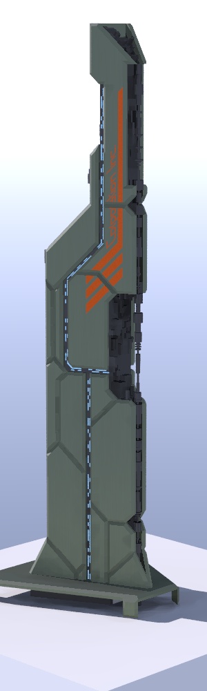
Here's one of my newer test renders. Much less interesting colours but it's
easier to see the modelling details here. I've just modelled the bottom
(which is why it was out of frame in the earlier image).
Next I'm going to play with materials to get something that looks more
interesting under normal lighting, then see how that improved version works
with my crazy red effects... And then hopefully find some good compromise
that's not so OTT as my first image, and not so dull as this one...
--
Tek
http://evilsuperbrain.com
Post a reply to this message
Attachments:
Download 'scifi bevels.jpg' (49 KB)
Preview of image 'scifi bevels.jpg'
|
|
| |
| |
|
|
|
|
| |
| |
|
|
Tek wrote:
> A little thing I've been working on. The background's just something I
> bashed together quickly, the tower's the only bit I've been seriously
> working on. It's built mostly out of polygons placed with macros to bevel &
> greeble things.
> Comments? Criticisms?
Nice one :)
Post a reply to this message
|
|
| |
| |
|
|
|
|
| |
| |
|
|
"Tek" <tek### [at] evilsuperbraincom> wrote:
> A little thing I've been working on. The background's just something I
> bashed together quickly, the tower's the only bit I've been seriously
> working on. It's built mostly out of polygons placed with macros to bevel &
> greeble things.
BEAUTIFUL colors. And I really like the tilted camera view. No other
critiques; I like it as-is! Looking forward to seeing what you add, though.
I would have said that you were inspired by futurist Syd Mead's industrial
design work (in his books SENTINEL and OBLAGON.) This is like something he
would come up with.
Ken W.
Post a reply to this message
|
|
| |
| |
|
|
|
|
| |
| |
|
|
"Kenneth" <kdw### [at] earthlinknet> wrote in message
news:web.465b9eacf0e22615bd27f590@news.povray.org...
> I would have said that you were inspired by futurist Syd Mead's industrial
> design work (in his books SENTINEL and OBLAGON.) This is like something
> he
> would come up with.
I hadn't seen his work, but from the look of it (having googled him) it
looks like a lot of people I was inspired by were inspired by him!
--
Tek
http://evilsuperbrain.com
Post a reply to this message
|
|
| |
| |
|
|
|
|
| |
| |
|
|
On Sat, 26 May 2007 19:00:56 +0100, Tek wrote:
> A little thing I've been working on. The background's just something I
> bashed together quickly, the tower's the only bit I've been seriously
> working on. It's built mostly out of polygons placed with macros to bevel &
> greeble things.
>
> It's very directly inspired by the awesome art for the game mass effect,
> like this: http://www.1up.com/do/media?cId=3144257&sec=IMAGES
>
> I'm going to work on it some more and make a more serious picture (such as
> one with more colours, the mad oranges are a post processing filter in
> megapov).
>
> Comments? Criticisms?
kickass! Remind me of a book cover (for an SF book) I saw once. Very
nice!!
Post a reply to this message
|
|
| |
| |
|
|
|
|
| |