|
|
|
|
|
|
| |
| |
|
|
|
|
| |
| |
|
|
Hi
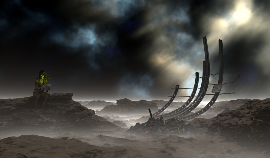
Latest concept, still needs lots of work, your comments welcom.
Mick
Post a reply to this message
Attachments:
Download 'desertV6.jpg' (295 KB)
Preview of image 'desertV6.jpg'

|
|
| |
| |
|
|
|
|
| |
| |
|
|
Mick Hazelgrove wrote:
> Hi
>
> Latest concept, still needs lots of work, your comments welcom.
>
> Mick
>
>
>
Beautiful. The figure and the wreckage compete for attention, IMO. I
would either drastically increase the size of the wreckage (making it a
landscape feature) or cover the entire landscape with wreckage
(preventing any single piece from becoming a focal point). That's just me.
-Shay
Post a reply to this message
|
|
| |
| |
|
|
|
|
| |
| |
|
|
Mick Hazelgrove wrote:
> Hi
>
> Latest concept, still needs lots of work, your comments welcom.
>
> Mick
Is that a reference to Iain M. Banks' "The Algebraist"?
--
Bill Hails
http://thyme.homelinux.net/
Post a reply to this message
|
|
| |
| |
|
|
|
|
| |
| |
|
|
Already a beautiful image, that sky is just incredible.
FWIW...
Technically, the only problem I see is the metal parts
seem a little like plastic, maybe need more metal/shiny
appearance. The ground also appears somewhat smooth,
the rocks are all rounded (especially in the foreground
and to the right) and the same color as the dirt, but it's
an alien planet so that could be explained; also, using a
simple pallet for the surface could be an artistic choice.
The screen lighting her face is an excellent idea/effect.
In fact, I'd eliminate all the colorful items in the wreckage
so it stands out even more, or maybe lean those parts
toward red (or some other single color) since you already
have the blue sky and green screen.
Looking at the image it seems she has crashed and is
consulting some mechanism that has survived the crash. The
first thing I thought is any future spacefaring technology
would have flat screens, not a tube as appears in her hands.
The other thing I thought is she appears unscathed, so likely
there is an escape pod or a statis capsule in which she
survived the impact. The size and curve of the metal beams
leads me to believe the ship was large and mostly demolished.
Of course, likely her escape pod is far away, but for some
reason I'd like to see it.
Her wind-blow hair looks very good, very realistic. The band
around her waist looks out of place compared to the otherwise
very good and realistic uniform top.
Hope this helps,
Mark
Post a reply to this message
|
|
| |
| |
|
|
|
|
| |
| |
|
|
Renderdog wrote:
>
> Looking at the image it seems she has crashed and is
> consulting some mechanism that has survived the crash. The
> first thing I thought is any future spacefaring technology
> would have flat screens, not a tube as appears in her hands.
>
Perhaps due to the title, I interpreted this as her searching for clues
about some ancient wreckage of unknown origin.
-Shay
Post a reply to this message
|
|
| |
| |
|
|
|
|
| |
| |
|
|
Overall it's shaping up to be a very good image, but there's still
something which doesn't feel quite right about it. I suppose it's that
the elements don't quite fit together. It feels more like the various
parts of the scene (sky, ground, wreck, person) each was created
independently of the others.
For example, there's something about the transition from the haze above
the ground to the sky that feels artificial. I know that you'd want to
avoid too much of an atmospheric effect obscuring the sky, but I think
that something more than the uniform ground fog would be beneficial.
Maybe adding more of a texture to the fog would be enough to do it though.
Along these lines, I noticed that the hair of the girl is blowing in the
wind, but that the mist on the ground seems totally uniform and
perfectly still. I envision a ground mist in a scene like this having a
much more intimate and dynamic interplay with the forms of the landscape
and the wreckage.
The wreckage also seems to have merely been placed upon the ground,
which presumable in the case of a real wreckage would not be the case.
Either there would be clear marking of the crash, or if the wreck had
occurred in the more distant past effects of weathering as buildup of
sand and such around the base.
As far as the landscape itself goes, I feel that it's too smooth and too
homogeneous. There's a rather clear scale where the features on the
ground stop, and this is rather distracting on the nearer of the
landscape features. I would imagine that in `reality' rocks as jagged
as these would have a good deal of texture on very fine scales as well.
I've found in cases like these that adding detail to a level which in
the actual render ends up being smaller than a pixel manages to help
with this. Though since this is a preliminary version of the picture I
can understand avoiding the render times associated with this.
The coloring of the rocks is also pretty much completely uniform.
There's a bit of texture on there, but I can't discern any interplay
between this texture and the form of the landscape. Since the forms on
such a landscape arise in part from the nature of the rocks in which
they are built, adding a bit of variation in the coloring different
features of the landscape (or in this case having the coloring depend on
the values of some of the functions which you use to generate the
isosurface) can help a good deal, even if it's too subtly to be
consciously noticed without careful inspection.
Anyway, i don't mean to nitpick, it's a good image and I just wanted to
point out things that i noticed about it!
Post a reply to this message
|
|
| |
| |
|
|
|
|
| |
| |
|
|
The right honourable Mick Hazelgrove spake:
> Hi
>
> Latest concept, still needs lots of work, your comments welcom.
>
> Mick
Very dark and brooding - I like it! Looks like a scene from the movie
Soldier. Do continue!
--
---
Stefan Viljoen
Software Support Technician
Polar Design Solutions
Post a reply to this message
|
|
| |
| |
|
|
|
|
| |