 |
 |
|
 |
|
 |
|  |
|  |
|
 |
|
 |
|  |
|  |
|
 |
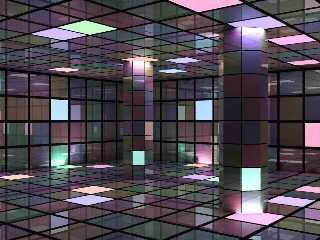
Well, I was trying to copy this effect:
http://www.pouet.net/prod.php?which=9450
Only problem is, it took POV 200000 times longer to render this scene that
it takes in that demo (which is realtime and totally amazing, you should
download it). Is the image 200000 times better? Certainly not! But it was
fun :-)
Post a reply to this message
Attachments:
Download 'dance.jpg' (94 KB)
Preview of image 'dance.jpg'

|
 |
|  |
|  |
|
 |
|
 |
|  |
|  |
|
 |
> Well, I was trying to copy this effect:
>
> http://www.pouet.net/prod.php?which=9450
That's an awesome demo.
> Only problem is, it took POV 200000 times longer to render this scene that
> it takes in that demo (which is realtime and totally amazing, you should
> download it). Is the image 200000 times better? Certainly not! But it
was
> fun :-)
Well, the demo only had one level of reflection. Otherwise, it oversaturated
the bright areas and left the dark areas darker so it had much more contrast
than your image.
Are you actually making each bright tile a light source? There's probably a
better (faster) way than that.
- Slime
[ http://www.slimeland.com/ ]
Post a reply to this message
|
 |
|  |
|  |
|
 |
|
 |
|  |
|  |
|
 |
"Slime" <fak### [at] email address> wrote in message
news:41bb4ff7$1@news.povray.org
>> Well, I was trying to copy this effect:
>>
>> http://www.pouet.net/prod.php?which=9450
>
>
> That's an awesome demo.
It's pretty good isn't it. There are many other on that site, from 256-byte
ray-traced tubes to huge 3D demos like that one.
>> Only problem is, it took POV 200000 times longer to render this
>> scene that it takes in that demo (which is realtime and totally
>> amazing, you should download it). Is the image 200000 times
>> better? Certainly not! But it was fun :-)
>
> Well, the demo only had one level of reflection. Otherwise, it
> oversaturated the bright areas and left the dark areas darker so it
> had much more contrast than your image.
>
> Are you actually making each bright tile a light source? There's
> probably a better (faster) way than that.
Hehe you missed the radiosity artifacts. I just made some tiles "ambient"
and used radiosity. Maybe it would be quicker with a light for each
"bright" tile... address> wrote in message
news:41bb4ff7$1@news.povray.org
>> Well, I was trying to copy this effect:
>>
>> http://www.pouet.net/prod.php?which=9450
>
>
> That's an awesome demo.
It's pretty good isn't it. There are many other on that site, from 256-byte
ray-traced tubes to huge 3D demos like that one.
>> Only problem is, it took POV 200000 times longer to render this
>> scene that it takes in that demo (which is realtime and totally
>> amazing, you should download it). Is the image 200000 times
>> better? Certainly not! But it was fun :-)
>
> Well, the demo only had one level of reflection. Otherwise, it
> oversaturated the bright areas and left the dark areas darker so it
> had much more contrast than your image.
>
> Are you actually making each bright tile a light source? There's
> probably a better (faster) way than that.
Hehe you missed the radiosity artifacts. I just made some tiles "ambient"
and used radiosity. Maybe it would be quicker with a light for each
"bright" tile...
Post a reply to this message
|
 |
|  |
|  |
|
 |
|
 |
|  |
|  |
|
 |
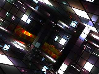
I made it a bit more contrasty and added a funky chair.
Post a reply to this message
Attachments:
Download 'dance2.jpg' (87 KB)
Preview of image 'dance2.jpg'

|
 |
|  |
|  |
|
 |
|
 |
|  |
|  |
|
 |
"scott" <spa### [at] spam com> wrote in message news:41bb8130@news.povray.org...
> I made it a bit more contrasty and added a funky chair.
I really like this version, nice work!
The new angle is good.
Lance.
thezone - thezone.firewave.com.au
thehandle - www.thehandle.com com> wrote in message news:41bb8130@news.povray.org...
> I made it a bit more contrasty and added a funky chair.
I really like this version, nice work!
The new angle is good.
Lance.
thezone - thezone.firewave.com.au
thehandle - www.thehandle.com
Post a reply to this message
|
 |
|  |
|  |
|
 |
|
 |
|  |
|  |
|
 |
scott wrote:
> I made it a bit more contrasty and added a funky chair.
>
>
>
>
Hey, this is good!
a sugestion; fog/mist and laser lights?
G.
Post a reply to this message
|
 |
|  |
|  |
|
 |
|
 |
|  |
|  |
|
 |
"Gary "Tigre" Blessing" <ble### [at] icefog net> wrote in message
news:41bc5220$1@news.povray.org
> scott wrote:
>> I made it a bit more contrasty and added a funky chair.
>>
>>
>>
>>
>
> Hey, this is good!
>
> a sugestion; fog/mist and laser lights?
Yes yes! At the moment I am working on the rest of the room, with a bar,
tables etc, then I'm going to work on animating the lights as in that demo I
posted the link to. Watch out in p.b.a in about a years time! net> wrote in message
news:41bc5220$1@news.povray.org
> scott wrote:
>> I made it a bit more contrasty and added a funky chair.
>>
>>
>>
>>
>
> Hey, this is good!
>
> a sugestion; fog/mist and laser lights?
Yes yes! At the moment I am working on the rest of the room, with a bar,
tables etc, then I'm going to work on animating the lights as in that demo I
posted the link to. Watch out in p.b.a in about a years time!
Post a reply to this message
|
 |
|  |
|  |
|
 |
|
 |
|  |
|  |
|
 |
news:41bc5220$1@news.povray.org...
> Hey, this is good!
Yes I agree
>
> a sugestion; fog/mist and laser lights?
And dancers?
Marc.
Post a reply to this message
|
 |
|  |
|  |
|
 |
|
 |
|  |
|  |
|
 |
A big improvement over the original. Did you make all of the lit panels
white, or are they just so bright that they look that way? I would
reintroduce some color to those.
I like the new camera angle but it's making me tilt my head; maybe you
should tone that down a bit.
- Slime
[ http://www.slimeland.com/ ]
Post a reply to this message
|
 |
|  |
|  |
|
 |
|
 |
|  |


![]()