 |
|
|
|
|
|
| |
| |
|
|
|
|
| |
| |
|
|
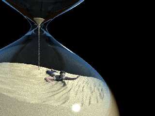
Well a lot of things have changed since the last version. Most noteably the
scene now uses radiosity, and I've added a huge amount of detail to the man.
I think it's nearly finished! (which is good 'cause I have a couple of other
ideas I want to do for this round) I just want to work on his hair a bit more so
it looks a bit bedraggled, and tweak a few of the colours in the scene (the
hourglass isn't as blue as in the first WIP, and I kinda liked that). Though
I've still not done anything with the empty black space and I'm starting to
think I just want to leave it empty.
Oh, a few technical details: The guy is my first serious attempt at modelling a
human in Wings, the hourglass was a lathe and is now a sor because the lathe had
some errors, the sand's just a height field and the falling sand's a texture on
a cylinder.
So what do you think?
--
Tek
www.evilsuperbrain.com
Post a reply to this message
Attachments:
Download 'desert_time1.jpg' (88 KB)
Preview of image 'desert_time1.jpg'
|
|
| |
| |
|
|
|
|
| |
| |
|
|
Tek wrote:
> So what do you think?
Very nice!
I think the falling sand would nevertheless get narrower as it fell,
since the grains are accellerating. (Well, probably not narrow, but
sparser. It would be narrower if there were surface tension.)
I like the plain black background, and the clarity of the glass, myself.
Post a reply to this message
|
|
| |
| |
|
|
|
|
| |
| |
|
|
Nice job.
Metaphoric joke... :-(
One comment : you may add a little cone (z-1)
on the soil (look inside an hourglass...;-)).
Kzerphii
France
Post a reply to this message
|
|
| |
| |
|
|
|
|
| |
| |
|
|
"Darren New" <dne### [at] san rrcom> wrote in message
news:40f98d70$1@news.povray.org...
> I think the falling sand would nevertheless get narrower as it fell,
> since the grains are accellerating. (Well, probably not narrow, but
> sparser. It would be narrower if there were surface tension.)
They do get sparser, but not much. If you compare the top to the bottom you can
see the difference in density. I tried doing it more but it looked wrong to me
:)
> I like the plain black background, and the clarity of the glass, myself.
Yes, it doesn't look wrong. I'll play with a few options but I'm happy enough
with this version.
--
Tek
www.evilsuperbrain.com rrcom> wrote in message
news:40f98d70$1@news.povray.org...
> I think the falling sand would nevertheless get narrower as it fell,
> since the grains are accellerating. (Well, probably not narrow, but
> sparser. It would be narrower if there were surface tension.)
They do get sparser, but not much. If you compare the top to the bottom you can
see the difference in density. I tried doing it more but it looked wrong to me
:)
> I like the plain black background, and the clarity of the glass, myself.
Yes, it doesn't look wrong. I'll play with a few options but I'm happy enough
with this version.
--
Tek
www.evilsuperbrain.com
Post a reply to this message
|
|
| |
| |
|
|
|
|
| |
| |
|
|
Yeah I keep forgetting to put that in! Thanks for reminding me.
--
Tek
www.evilsuperbrain.com
"Lawrence of Arabia" <MYN### [at] Wanadoofr> wrote in message
news:40f99b1c@news.povray.org...
> Nice job.
> Metaphoric joke... :-(
>
> One comment : you may add a little cone (z-1)
> on the soil (look inside an hourglass...;-)).
>
> Kzerphii
> France
>
>
Post a reply to this message
|
|
| |
| |
|
|
|
|
| |
| |
|
|
Tek wrote:
<snip>
> Oh, a few technical details: The guy is my first serious attempt at modelling a
> human in Wings, the hourglass was a lathe and is now a sor because the lathe had
> some errors, the sand's just a height field and the falling sand's a texture on
> a cylinder.
Good job on the falling sand texture. I tried that once in an image and
never did get it the way I wanted.
> So what do you think?
>
Looks really good. The guy's skin texture looks too shiney IMO, like
plastic. Maybe less specular.
RG
Post a reply to this message
|
|
| |
| |
|
|
|
|
| |
| |
|
|
"gonzo" <rgo### [at] lansetcom> wrote in message news:40f9d801@news.povray.org...
> Good job on the falling sand texture. I tried that once in an image and
> never did get it the way I wanted.
Thanks. Though it's completely by luck! I just tried "improving" it and after
about an hour I gave up and went back to this version!
> Looks really good. The guy's skin texture looks too shiney IMO, like
> plastic. Maybe less specular.
It's certainly not realistic. Though I've always kind of liked the shiny
stylised sort of skin, as a reasonable substitute for making it look real.
Though nothing else in the image is stylised so I guess I should see if I can
get something more realistic without needing to go all the way to sub-surface
scattering.
--
Tek
www.evilsuperbrain.com
Post a reply to this message
|
|
| |
| |
|
|
|
|
| |
| |
|
|
"Tek" <tek### [at] evilsuperbraincom> schreef in bericht
news:40f98154@news.povray.org...
> So what do you think?
> --
Keep the dark background! Most effective IMHO.
It's a poignant scene really. It grips you at the throat. Very well done, on
all levels of meaning, if you see what I mean.
Thomas
Post a reply to this message
|
|
| |
| |
|
|
|
|
| |
| |
|
|
Tek wrote:
> Well a lot of things have changed since the last version. Most noteably
> the scene now uses radiosity, and I've added a huge amount of detail to
> the man.
>
> I think it's nearly finished! (which is good 'cause I have a couple of
> other ideas I want to do for this round) I just want to work on his hair a
> bit more so it looks a bit bedraggled, and tweak a few of the colours in
> the scene (the hourglass isn't as blue as in the first WIP, and I kinda
> liked that). Though I've still not done anything with the empty black
> space and I'm starting to think I just want to leave it empty.
>
> Oh, a few technical details: The guy is my first serious attempt at
> modelling a human in Wings, the hourglass was a lathe and is now a sor
> because the lathe had some errors, the sand's just a height field and the
> falling sand's a texture on a cylinder.
>
> So what do you think?
Nice job.
Maybe you should add more sand in the upper glass ball to give an even more
claustrophobic touch. To give the feeling that if all the sand pass trough,
there will be no more space left for the guy.
I vote for the empty background
D-fence
AKA
Christophe Monniez
Post a reply to this message
|
|
| |
| |
|
|
|
|
| |
| |
|
|
"D-fence" wrote:
> Maybe you should add more sand in the upper glass ball to give an even
more
> claustrophobic touch. To give the feeling that if all the sand pass
trough,
> there will be no more space left for the guy.
That was my thought too...
Rune
--
http://runevision.com
Post a reply to this message
|
|
| |
| |
|
|
|
|
| |


