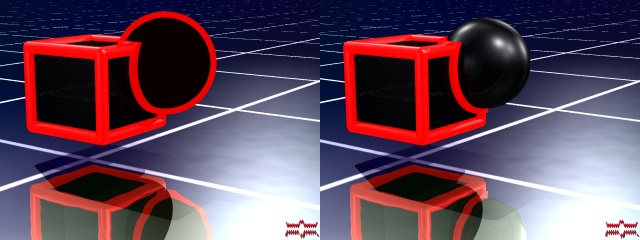
You mean more like this (brighter.png)?
I dunno, I think that looks too flat. I guess it depends on the brightness of
your monitor but on mine (both here and at work) all the colours are clearly
seperate from the black, apart from the blue which doesn't really look any
better in this version.
There is another option, which is to not use totally pure colours (colour.png).
This has as much contrast as the current one on my site, but more visible dark
areas because I've used slightly different colours. I'm not sure about it, what
do you think?
--
Tek
www.evilsuperbrain.com
"Rune" <run### [at] runevision com> wrote in message
news:404c5782@news.povray.org...
> I like the current one, but I think it should be brighter. As it is now,
> the darker shades of the colors almost can't be distinguished from the
> black outlines. Consider the attached version. (There however the
> reflections are too strong, which is an effect of the simple gamma
> correction I used.)
>
> Rune
> --
> 3D images and anims, include files, tutorials and more:
> rune|vision: http://runevision.com **updated Mar 7**
> POV-Ray Ring: http://webring.povray.co.uk
>
>
> com> wrote in message
news:404c5782@news.povray.org...
> I like the current one, but I think it should be brighter. As it is now,
> the darker shades of the colors almost can't be distinguished from the
> black outlines. Consider the attached version. (There however the
> reflections are too strong, which is an effect of the simple gamma
> correction I used.)
>
> Rune
> --
> 3D images and anims, include files, tutorials and more:
> rune|vision: http://runevision.com **updated Mar 7**
> POV-Ray Ring: http://webring.povray.co.uk
>
>
>
Post a reply to this message
Attachments:
Download 'brighter.png' (15 KB)
Download 'colour.png' (16 KB)
Preview of image 'brighter.png'

Preview of image 'colour.png'

|