|
|
|
|
|
|
| |
| |
|
|
|
|
| |
| |
|
|
Slime wrote:
> It's great as far as composition goes, but it's *way* too dark! Brighten
> that up! Bring up the light source or postprocess it! Even if you're going
> for a dark feel to it with lots of shadows and stuff, you need at least some
> contrast so that it's easy for people to view.
No you don't. High contrast is overrated, especially with
art teachers. If you're going for high contrast, fine, but
it isn't the end-all, be-all of design elements. Low contrast
is just fine, too, and is sometimes far more appropriate for
the subject matter.
Post a reply to this message
|
|
| |
| |
|
|
|
|
| |
| |
|
|
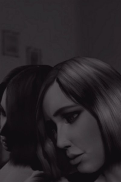
"James Taylor" <jim### [at] blueyonder couk> wrote in message
news:4019a4af@news.povray.org...
> Hi all,
>
> I saw this girl last week in a pub looking particularly unhappy with
her
> head resting against a mirror - so here's my rendition of the
scene.
She's beautiful. I think the darkness in this scene fits well with
the overall effect.
~Steve~
> jim
>
>
> couk> wrote in message
news:4019a4af@news.povray.org...
> Hi all,
>
> I saw this girl last week in a pub looking particularly unhappy with
her
> head resting against a mirror - so here's my rendition of the
scene.
She's beautiful. I think the darkness in this scene fits well with
the overall effect.
~Steve~
> jim
>
>
>
Post a reply to this message
|
|
| |
| |
|
|
|
|
| |
| |
|
|
> No you don't. High contrast is overrated, especially with
> art teachers. If you're going for high contrast, fine, but
> it isn't the end-all, be-all of design elements. Low contrast
> is just fine, too, and is sometimes far more appropriate for
> the subject matter.
I didn't say *high* contrast, just *some* contrast. The brightest color in
the image is about rgb(71,71,71). It borders on being difficult to see what
it is, and I think my monitor brightens things, too.
- Slime
[ http://www.slimeland.com/ ]
Post a reply to this message
|
|
| |
| |
|
|
|
|
| |
| |
|
|
"Tim Cook" <z99### [at] bellsouthnet> wrote
> Slime wrote:
> > It's great as far as composition goes, but it's *way* too dark! Brighten
> > that up! Bring up the light source or postprocess it! Even if you're
going
> > for a dark feel to it with lots of shadows and stuff, you need at least
some
> > contrast so that it's easy for people to view.
> No you don't. High contrast is overrated, especially with
> art teachers. If you're going for high contrast, fine, but
> it isn't the end-all, be-all of design elements. Low contrast
> is just fine, too, and is sometimes far more appropriate for
> the subject matter.
I hear you but in this case, contrast cannot be underrated.
You don't create a sense of darkness with dark colors. It's a mistake many
novices make. First and foremost, human sense of perception is adaptive as
far as absolutes go. The mind, however, feasts on relatives. That's why
contast is so important.
Post a reply to this message
|
|
| |
| |
|
|
|
|
| |
| |
|
|
> No you don't. High contrast is overrated, especially with
> art teachers. If you're going for high contrast, fine, but
> it isn't the end-all, be-all of design elements. Low contrast
> is just fine, too, and is sometimes far more appropriate for
> the subject matter.
When all I can see is some light blue on dark blue, a little contrast might
not be such a bad idea.
Although, I will admit that my monitor is kept at especially low brightness.
AW
Post a reply to this message
|
|
| |
| |
|
|
|
|
| |
| |
|
|
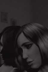
"Slime" <fak### [at] emailaddress> wrote in message
news:4019ac16$1@news.povray.org...
> > IrfanView was used for some post processing - ie conversion to black and
> > white
> >
> > comments and criticism welcome
>
> It's great as far as composition goes, but it's *way* too dark! Brighten
[clip]
I agree, it's too dark. Not by much, and the effect is really cool. I
altered the brightness by +25%, and adjusted the contrast by +10%. See if
you think this is an improvement to a marvelous work.
Post a reply to this message
Attachments:
Download 'Portrait_B&W.jpg' (15 KB)
Preview of image 'Portrait_B&W.jpg'
|
|
| |
| |
|
|
|
|
| |
| |
|
|
Yes, this is an excellent work. Technically and artistically the scene has
been captured. I agree that the lighting is perfect and does not need to be
made brighter. I believe those who question it may need a better viewing
environment. Monitor glare, screen brightness, and the white background of
a newsreader will wreak havoc on this picture. I viewed it full screen in
PSP and all the detail and mood came right out at me.
Skip
Post a reply to this message
|
|
| |
| |
|
|
|
|
| |
| |
|
|
"AngleWyrm" <no_### [at] hotmailcom> schrieb im Newsbeitrag
news:4019dca4@news.povray.org...
> See if you think this is an improvement to a marvelous work.
>
Not IMHO,
Marc-Hendrik
Post a reply to this message
|
|
| |
| |
|
|
|
|
| |
| |
|
|
> She's beautiful. I think the darkness in this scene fits well with
> the overall effect.
Thanks Steve :)
jim
Post a reply to this message
|
|
| |
| |
|
|
|
|
| |
| |
|
|
"Skip Talbot" <sta### [at] uiucedu> wrote in message
news:401a0647$1@news.povray.org...
> Yes, this is an excellent work. Technically and artistically the scene
has
> been captured. I agree that the lighting is perfect and does not need to
be
> made brighter. I believe those who question it may need a better viewing
> environment. Monitor glare, screen brightness, and the white background
of
> a newsreader will wreak havoc on this picture. I viewed it full screen in
> PSP and all the detail and mood came right out at me.
The darkness is obviously intentional, however it looks quite bright with
adequate contrast on my TFT screen. Also thanks for the comment Skip - I'm
quite proud of the image (although I still see areas for improvement) - it
just goes to show what can be done with a plane, a sphere and Poser 3.
ta ta
jim
Post a reply to this message
|
|
| |
| |
|
|
|
|
| |