|
|
|
|
|
|
| |
| |
|
|
|
|
| |
| |
|
|
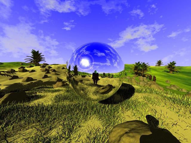
I've not had a lot of time to work on this since I last posted,
but I've added a sand texture in the fg, and played around
with texture maps for the grass and the sand. I've copied the
texture for the rocks from stones2.inc into my src and added
a small amount of rand pigment so they don't look so uniform,
I've used the nkflare macro and I've mutated the palm trees a
bit from the example PALM.inc that comes with tomtree (guesswork).
The blobman figures still look naff, (no offence, I couldn't do
better myself), but what do I have on Linux that can do better?
bigger rendition at http://thyme.homelinux.net/ancestors.jpg
still no radiosity or photons :-)
--
I would've gotten away with it too, if it wasn't for those pesky kids!
Post a reply to this message
Attachments:
Download 'ancestors_med.jpg' (69 KB)
Preview of image 'ancestors_med.jpg'
|
|
| |
| |
|
|
|
|
| |
| |
|
|
Hey Bill,
I love the idea you are presenting in this image. I remember a movie
from when I was a kid called "The Flight of the Navigator" where there was
a cool intelligent reflective metal ship.
I like the palm trees, the grass, and the sky, but the dirt and rocks
need some work. I'd recommend covering the dirt with more grass, or
changing its color so that it is different from that of the grass that is
growing out of it. Definitely try to work with resolutions to make a
sketchier grass to fill the places further out. That seems to be working
for you so far. The rocks look too much like they were placed on the
surface. They are very smooth, showing that they had been there for a
while. Did a glacier drop them? If that was the case, I think the
landscape would be much different. I think you should play more with
isosurfaces to make more interesting rougher rocks if you plan to leave them
on the surface, or you should bury 'em a bit, and maybe make them bigger and
fewer. It might be cool to arrange them into a fence like in the pastures
of Ireland. That guy kind of strikes me as being a shepherd. The land
seems good for that. By the way, where does that term, "naff" come from?
It sounds a bit British. Does it just mean bad? He doesn't look so bad.
At least in the way you have placed him. He does seem distorted, but I'm
sure that's due to the spherical nature of the mirror.
-Ben Scheele
"Bill Hails" <bil### [at] europe yahoo-inccom> wrote in message
news:3e7267a0@news.povray.org...
> I've not had a lot of time to work on this since I last posted,
> but I've added a sand texture in the fg, and played around
> with texture maps for the grass and the sand. I've copied the
> texture for the rocks from stones2.inc into my src and added
> a small amount of rand pigment so they don't look so uniform,
> I've used the nkflare macro and I've mutated the palm trees a
> bit from the example PALM.inc that comes with tomtree (guesswork).
> The blobman figures still look naff, (no offence, I couldn't do
> better myself), but what do I have on Linux that can do better?
>
> bigger rendition at http://thyme.homelinux.net/ancestors.jpg
>
> still no radiosity or photons :-)
> --
> I would've gotten away with it too, if it wasn't for those pesky kids! yahoo-inccom> wrote in message
news:3e7267a0@news.povray.org...
> I've not had a lot of time to work on this since I last posted,
> but I've added a sand texture in the fg, and played around
> with texture maps for the grass and the sand. I've copied the
> texture for the rocks from stones2.inc into my src and added
> a small amount of rand pigment so they don't look so uniform,
> I've used the nkflare macro and I've mutated the palm trees a
> bit from the example PALM.inc that comes with tomtree (guesswork).
> The blobman figures still look naff, (no offence, I couldn't do
> better myself), but what do I have on Linux that can do better?
>
> bigger rendition at http://thyme.homelinux.net/ancestors.jpg
>
> still no radiosity or photons :-)
> --
> I would've gotten away with it too, if it wasn't for those pesky kids!
Post a reply to this message
|
|
| |
| |
|
|
|
|
| |
| |
|
|
Mmm... an improvement I'd say.
Andrew.
Post a reply to this message
|
|
| |
| |
|
|
|
|
| |
| |
|
|
Ben T. Scheele wrote:
> Hey Bill,
> I love the idea you are presenting in this image. I remember a movie
> from when I was a kid called "The Flight of the Navigator" where there
> was a cool intelligent reflective metal ship.
A formative experience from my youth also :-)
> I like the palm trees, the grass, and the sky, but the dirt and rocks
> need some work. I'd recommend covering the dirt with more grass, or
> changing its color so that it is different from that of the grass that is
> growing out of it.
I dunno, it's supposed to be sand and grass (marram grass?), sparse
clumps are deliberate, I was thinking about later trying some sort
of media on the background dunes to simulate sand blowing low over
them, maybe.
btw is my monitor calibration out? Looks exactly the right
colour for sand to me.
> Definitely try to work with resolutions to make a
> sketchier grass to fill the places further out. That seems to be working
> for you so far.
Possibly, the render time increases horrendously as the grass
spreads though :-)
> The rocks look too much like they were placed on the
> surface. They are very smooth, showing that they had been there for a
> while. Did a glacier drop them? If that was the case, I think the
> landscape would be much different. I think you should play more with
> isosurfaces to make more interesting rougher rocks if you plan to leave
> them on the surface, or you should bury 'em a bit, and maybe make them
> bigger and
> fewer.
Agreed, they're still too uniform. I can play with the parameters
of the isosurfaces, I think I'm currently just adding noise at 2
different scales to spheres. I like the idea of burying them a bit
more too. I also want to see if I can get the sand to build up around
them (I saw that excellent example and tutorial recently, but in my
case I'd be adding to an existing height field, so only slightly more
tricky).
> It might be cool to arrange them into a fence like in the pastures
> of Ireland. That guy kind of strikes me as being a shepherd. The land
> seems good for that.
QED the figure is "naff" He's supposed to be a hominid. However I've
Finally got to grips with a wireframe modeller and made him a much
more appropriate head, modelled on Australopithecus afarensis (who's
body is almost human anyway), which means I can light the head a bit
more, which makes the whole point more clearly. Will re-post when I've
made significant progress elsewhere.
> By the way, where does that term, "naff" come from?
> It sounds a bit British. Does it just mean bad? He doesn't look so bad.
> At least in the way you have placed him. He does seem distorted, but I'm
> sure that's due to the spherical nature of the mirror.
Just a bit British :-)
http://dictionary.reference.com/search?q=naff
(first definition, but generally just "not very good").
he is also bending his knees, I think I can risk straightening him out
now I have a better head to make the point.
>
> -Ben Scheele
Thanks for the encouragement and helpful comments.
>
> "Bill Hails" <bil### [at] europeyahoo-inccom> wrote in message
> news:3e7267a0@news.povray.org...
>> [...]
--
I would've gotten away with it too, if it wasn't for those pesky kids!
Post a reply to this message
|
|
| |
| |
|
|
|
|
| |
|
|