|
|
|
|
|
|
| |
| |
|
|
|
|
| |
| |
|
|
After some weeks I wanted to do something with Pov-Ray again.
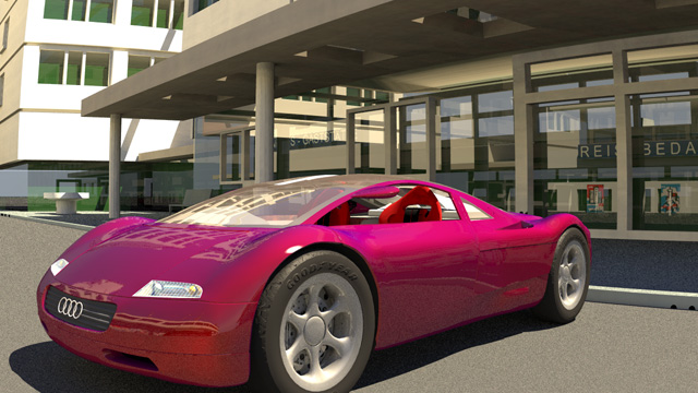
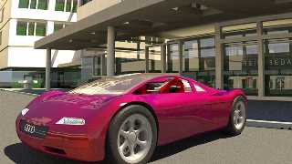
Tried to simulate a modern automotive varnish with interference pigments.
In fact, it is very easy with Pov-Ray.
But perhaps somebody does not know the trick.
Here is a quick test scene with some models found somtime ago in the net.


Norbert
Post a reply to this message
Attachments:
Download 'varnish.jpg' (104 KB)
Preview of image 'varnish.jpg'
|
|
| |
| |
|
|
|
|
| |
| |
|
|
Norbert Kern wrote:
>After some weeks I wanted to do something with Pov-Ray again.
>Tried to simulate a modern automotive varnish with interference pigments.
>In fact, it is very easy with Pov-Ray.
>But perhaps somebody does not know the trick.
>Here is a quick test scene with some models found somtime ago in the net.
>
>
>Norbert
>

Ohhhhh...me like it...

(briefly shakes head, to try to escape from source craving state, fails)

Source! Source!


Wondeful image!
Post a reply to this message
|
|
| |
| |
|
|
|
|
| |
| |
|
|
Mmm... yummy. (Well, nicer than the paint job on my car anyway ;-)

Andrew
Post a reply to this message
|
|
| |
| |
|
|
|
|
| |
| |
|
|
>(briefly shakes head, to try to escape from source craving state, fails)


rotfl - simple test source in p.b.s.f.

Norbert
Post a reply to this message
|
|
| |
| |
|
|
|
|
| |
| |
|
|
"Norbert Kern" <nor### [at] t-online de> wrote in
news:web.3d9d710bea2d989acf285b240@news.povray.org:
> rotfl - simple test source in p.b.s.f.
Sweet... de> wrote in
news:web.3d9d710bea2d989acf285b240@news.povray.org:
> rotfl - simple test source in p.b.s.f.
Sweet...
Post a reply to this message
|
|
| |
| |
|
|
|
|
| |
| |
|
|
Norbert,

I tried your varnish on this thing of mine, looks pretty good.

How did you come up with the sky_sphere gradient and the use of pow()?

I'm simply trying to understand how folks come up with exotic ways to
create textures/colors, in this case a world for reflections.

--
(MIKA) Marc Champagne
marcch.AT.videotron.DOT.ca
Montreal, CANADA
Post a reply to this message
|
|
| |
| |
|
|
|
|
| |
| |
|
|
Marc Champagne <nos### [at] pleasecom> wrote in
news:Xns### [at] 204213191226:

> Norbert,
>
> I tried your varnish on this thing of mine, looks pretty good.
>
> How did you come up with the sky_sphere gradient and the use of pow()?
>
> I'm simply trying to understand how folks come up with exotic ways to
> create textures/colors, in this case a world for reflections.
>

Ooops, here is the picture I'm refering to above

--
(MIKA) Marc Champagne
marcch.AT.videotron.DOT.ca
Montreal, CANADA
Post a reply to this message
Attachments:
Download 'mc_Torus_Twist2.jpg' (52 KB)
Preview of image 'mc_Torus_Twist2.jpg'

|
|
| |
| |
|
|
|
|
| |
| |
|
|
This should be Zazzled...

"Marc Champagne" <nos### [at] pleasecom> wrote in message
news:Xns### [at] 204213191226...
> Marc Champagne <nos### [at] pleasecom> wrote in
> news:Xns### [at] 204213191226:
>
> > Norbert,
> >
> > I tried your varnish on this thing of mine, looks pretty good.
> >
> > How did you come up with the sky_sphere gradient and the use of pow()?
> >
> > I'm simply trying to understand how folks come up with exotic ways to
> > create textures/colors, in this case a world for reflections.
> >
>
> Ooops, here is the picture I'm refering to above
>
> --
> (MIKA) Marc Champagne
> marcch.AT.videotron.DOT.ca
> Montreal, CANADA
>
>
Post a reply to this message
|
|
| |
| |
|
|
|
|
| |
| |
|
|
"Tom Galvin" <tom### [at] dataforgenospamcom> wrote in
news:3da0e062@news.povray.org:

> This should be Zazzled...


I'm way ahead of you....

http://www.zazzle.com/posters/gallery/contributor_list.asp?contributor=mika

--
(MIKA) Marc Champagne
marcch.AT.videotron.DOT.ca
Montreal, CANADA
Post a reply to this message
|
|
| |
| |
|
|
|
|
| |
| |
|
|
Marc Champagne <nos### [at] pleasecom> wrote in
news:Xns### [at] 204213191226:

> "Tom Galvin" <tom### [at] dataforgenospamcom> wrote in
> news:3da0e062@news.povray.org:
>
>> This should be Zazzled...
>
>
> I'm way ahead of you....
>
> http://www.zazzle.com/posters/gallery/contributor_list.asp?contributor=
> mika
>

The one on Zazzle is not varnished yet :) it's com'n

--
(MIKA) Marc Champagne
marcch.AT.videotron.DOT.ca
Montreal, CANADA
Post a reply to this message
|
|
| |
| |
|
|
|
|
| |
| |
|
|
I wish ....

;)

Alf
Post a reply to this message
|
|
| |
| |
|
|
|
|
| |
| |
|
|
I like the bright texture very much. Must have a look at Norbert's
posted scene.

OT. Its a pity that the sort of image I would like to hard copy always
looks better with a black background. With an inkjet - thats a lot of
ink. I wonder if there are printers or inks out there that rely on
_black_ paper.

--
Alf

http://www.peake42.freeserve.co.uk/
http://www.qsl.net/gw3srg/
gw3### [at] thersgbnet
Post a reply to this message
|
|
| |
| |
|
|
|
|
| |
| |
|
|
Marc Champagne wrote:

>I tried your varnish on this thing of mine, looks pretty good.

thanks!

>How did you come up with the sky_sphere gradient and the use of pow()?

I took the sky sphere colors from an old terragen sky render. The pow
commands are needed to adjust the colors to the gamma value of 1 (colors of
imagemaps are only correctly rendered with gamma = 2.2, if you arenīt
adjusting them).

>I'm simply trying to understand how folks come up with exotic ways to
>create textures/colors, in this case a world for reflections.

There are real texture masters like Gilles Tran, Mick Hazelgrove, Rune,
Margus Ramst and some others more.
Iīm only able to combine some ideas - by example:

http://news.povray.org/povray.binaries.images/18258/
http://news.povray.org/povray.binaries.images/22367/


Norbert
Post a reply to this message
|
|
| |
| |
|
|
|
|
| |
| |
|
|
WOW!

Very suggestive. After 5 minutes looking at the colors and following the
curves, I feel hypnotized.
Good work!


Norbert


Marc Champagne wrote:
>Marc Champagne <nos### [at] pleasecom> wrote in
>news:Xns### [at] 204213191226:
>
>> Norbert,
>>
>> I tried your varnish on this thing of mine, looks pretty good.
>>
>> How did you come up with the sky_sphere gradient and the use of pow()?
>>
>> I'm simply trying to understand how folks come up with exotic ways to
>> create textures/colors, in this case a world for reflections.
>>
>
>Ooops, here is the picture I'm refering to above
>
>(MIKA) Marc Champagne
>marcch.AT.videotron.DOT.ca
>Montreal, CANADA
>
Post a reply to this message
|
|
| |
| |
|
|
|
|
| |
| |
|
|
"Norbert Kern" <nor### [at] t-onlinede> a écrit dans le message de
news: web.3da30af4ea2d989a9c5824bd0@news.povray.org...
> There are real texture masters like Gilles Tran, Mick Hazelgrove, Rune,
> Margus Ramst and some others more.
> I´m only able to combine some ideas - by example:
>
> http://news.povray.org/povray.binaries.images/18258/
> http://news.povray.org/povray.binaries.images/22367/

I don't think qualify as a texture master as I mostly borrow stuff from
other people. Particularly, the SEM texture thread above was very productive
for me: skin textures can also be simulated this way, by changing the
diffuse value in the slope_map (this is what I used for the Poser tests).

G.


--

**********************
http://www.oyonale.com
**********************
- Graphic experiments
- POV-Ray and Poser computer images
- Posters
Post a reply to this message
|
|
| |
| |
|
|
|
|
| |
| |
|
|
Of course we all learn from each other. By example I love your pinnacle
texture from "chess".
The use of the slope dependent texture in the skin definition is really
clever and very fast, isn´t it?.
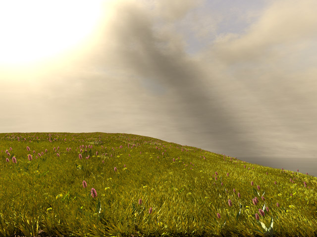
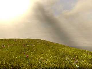
I by myself am testing the use in plant textures. I hope to solve the
double_illumination problem you mentioned some months ago, where you used
media instead of double_illuminate in a leaf material of your phantastic
pond image. Up to now I have a simple meadow as an test. Grass and flowers
have all slope dependent pigment definitions.


Norbert


> I don't think qualify as a texture master as I mostly borrow stuff from
> other people. Particularly, the SEM texture thread above was very
productive
> for me: skin textures can also be simulated this way, by changing the
> diffuse value in the slope_map (this is what I used for the Poser tests).
>
> G.
Post a reply to this message
Attachments:
Download 'slope_pigment_test.jpg' (100 KB)
Preview of image 'slope_pigment_test.jpg'
|
|
| |
| |
|
|
|
|
| |
| |
|
|
"Norbert Kern" <nor### [at] t-onlinede> a écrit dans le message de
news: 3da34957@news.povray.org...
> I by myself am testing the use in plant textures. I hope to solve the
> double_illumination problem you mentioned some months ago, where you used
> media instead of double_illuminate in a leaf material of your phantastic
> pond image. Up to now I have a simple meadow as an test. Grass and flowers
> have all slope dependent pigment definitions.

Wow. I'm going to put this to immediate use.
You're going to win the IRTC, right ? Too bad we can't place bets :-)

G.


--
**********************
http://www.oyonale.com
**********************
- Graphic experiments
- POV-Ray and Poser computer images
- Posters
Post a reply to this message
|
|
| |
| |
|
|
|
|
| |
| |
|
|
"Norbert Kern" <nor### [at] t-onlinede> wrote in
news:web.3da30c70e8b125269c5824bd0@news.povray.org:

> WOW!
>
> Very suggestive. After 5 minutes looking at the colors and following
> the curves, I feel hypnotized.
> Good work!

If the imbedded message got impregnated into your brain, I shall soon
rule the world

:)

--
(MIKA) Marc Champagne
marcch.AT.videotron.DOT.ca
Montreal, CANADA
Post a reply to this message
|
|
| |
| |
|
|
|
|
| |
| |
|
|
>Wow. I'm going to put this to immediate use.


Great compliment for me, thanks.


>You're going to win the IRTC, right ? Too bad we can't place bets :-)


No chance, donīt have time.
Iīm afraid, the little image is what I said, only a quick test scene.


Norbert
Post a reply to this message
|
|
| |
| |
|
|
|
|
| |
| |
|
|
Norbert Kern wrote:
>
> Of course we all learn from each other. By example I love your pinnacle
> texture from "chess".
> The use of the slope dependent texture in the skin definition is really
> clever and very fast, isnīt it?.
> I by myself am testing the use in plant textures. I hope to solve the
> double_illumination problem you mentioned some months ago, where you used
> media instead of double_illuminate in a leaf material of your phantastic
> pond image. Up to now I have a simple meadow as an test. Grass and flowers
> have all slope dependent pigment definitions.

I'm not sure if i understand this right, you use a slope pattern in
direction of the main light to texture the side facing the light with some
normal plant texture and the other side with an ambient finish to simulate
the light scattered?

Your scene, although being impressive by the sheer amount of plants, seems
to lack the contrast in the colors you usually would expect for a view
against the light.

A scene showing this quite well is:

http://marc.jacquier.free.fr/pen_ar_bed_herb.htm

Christoph

--
POV-Ray tutorials, IsoWood include,
TransSkin and more: http://www.tu-bs.de/~y0013390/
Last updated 13 Aug. 2002 _____./\/^>_*_<^\/\.______
Post a reply to this message
|
|
| |
| |
|
|
|
|
| |
| |
|
|
Christoph Hormann wrote:
>
>I'm not sure if i understand this right, you use a slope pattern in
>direction of the main light to texture the side facing the light with some
>normal plant texture and the other side with an ambient finish to simulate
>the light scattered?


the grass pigment has a slope pattern in the direction cam_pos to look_at.
Color is nearly orange with sides facing the camera and dark green with
perpendicular sides. So this is a total fake.
Flower blossoms have double_illuminate and a slope pattern regarding
transparency in the direction cam_pos to lightsource position. So every
blossom looks a little different. This is a better simulation of nature I
think.


>Your scene, although being impressive by the sheer amount of plants, seems
>to lack the contrast in the colors you usually would expect for a view
>against the light.
>A scene showing this quite well is:
>http://marc.jacquier.free.fr/pen_ar_bed_herb.htm


You are right, first it was a test scene for memory load reduction in grass
scenes.

But the light position is difficult and in the end the image didnīt evolve
to a scene because of the lacking contrast. This is because the sun is not
near the horizont, the heightfield is fairly flat and to reduce memory load
only a simple texture for the whole grass mesh is used. With
double_illuminate the situation was even worse. Contrast is higher in the
original 2560*1920 render.

Your link (thanks, havenīt known it yet) shows antialiasing problems. In
addition the contrast within the grass near the lighthouse seems to come
mainly from jpeg artifacts.
In my holidays I studied back light scenes in nature and your link seems not
very near to anything I have seen in sweden.


Norbert
Post a reply to this message
|
|
| |
| |
|
|
|
|
| |
| |
|
|
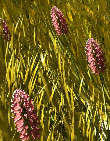
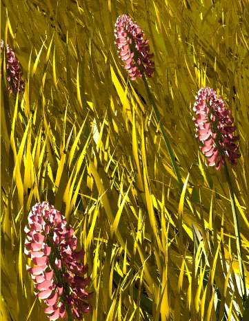
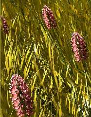
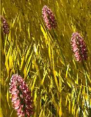
here are two small partial renders of my last grass scene.
The first one is with slope dependent pigments in the grass and the
blossoms,
the second has only averaged simple pigments.

In my opinion the first one has much more contrast as the second.


Norbert
Post a reply to this message
Attachments:
Download 'slope_pigments.jpg' (45 KB)
Download 'without_slope_pigments.jpg' (45 KB)
Preview of image 'slope_pigments.jpg'
Preview of image 'without_slope_pigments.jpg'
|
|
| |
| |
|
|
|
|
| |