|
|
|
|
|
|
| |
| |
|
|
|
|
| |
| |
|
|
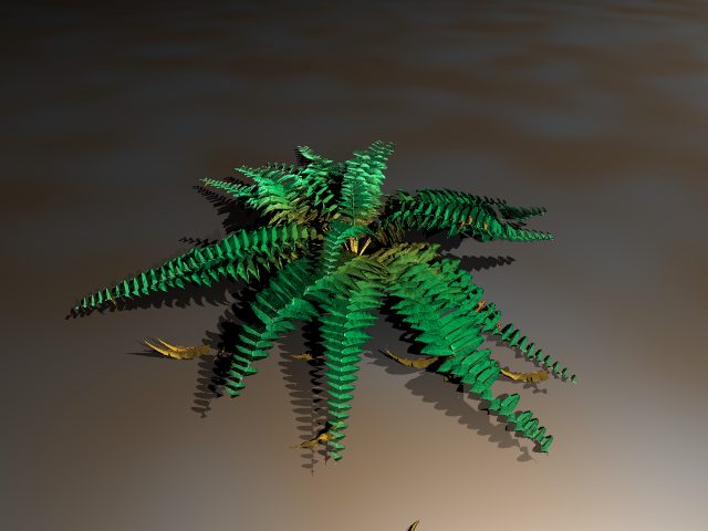
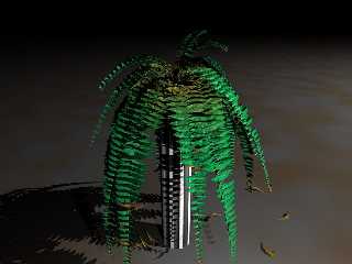
You are right, the camera was really close. I wanted to check the details,
especially the LOD settings.
Here's another picture showing the whole thing.
best regards
SY
Post a reply to this message
Attachments:
Download 'fern2.jpg' (33 KB)
Preview of image 'fern2.jpg'
|
|
| |
| |
|
|
|
|
| |
| |
|
|
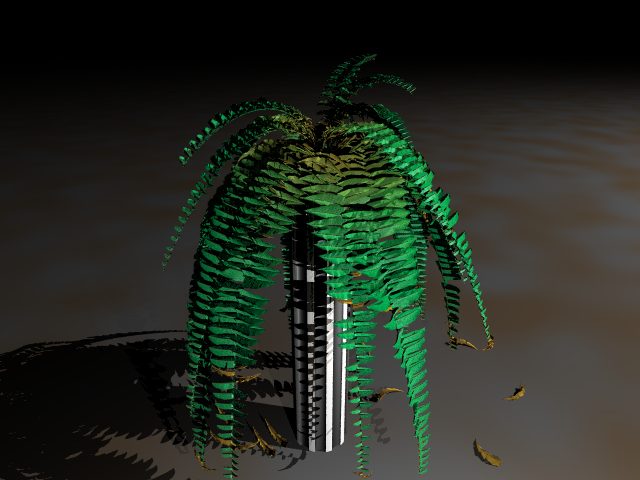
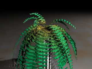
Here it is.
regards
SY
Post a reply to this message
Attachments:
Download 'fern3.jpg' (40 KB)
Preview of image 'fern3.jpg'
|
|
| |
| |
|
|
|
|
| |
| |
|
|
It looks VERY realistic. Congratulations, it is beautiful.
Very good work!
Fernando.
Post a reply to this message
|
|
| |
| |
|
|
|
|
| |
| |
|
|
This would be quite convincing in a scene!
--
David Fontaine <dav### [at] faricy net> ICQ 55354965
My raytracing gallery: http://davidf.faricy.net/ net> ICQ 55354965
My raytracing gallery: http://davidf.faricy.net/
Post a reply to this message
|
|
| |
| |
|
|
|
|
| |
| |
|
|
> This would be quite convincing in a scene!
Yes, I'm working on it. But for now the fern is the only thing already
finished. As you can see I am not satisfied easily with my own work so this
will take some time :-)
But if anyone would like to add a fern to his scene I can provide the latest
code for the macro together with a small description.
regards
SY
Post a reply to this message
|
|
| |
| |
|
|
|
|
| |
| |
|
|
> It looks VERY realistic. Congratulations, it is beautiful.
>
> Very good work!
Thank's a lot!
I spent much effort in it so I'm glad that it looks realistic.
Anyway, yesterday I found some bugs in it, improved the little scratches in
the leaves, improved the randomisation of too mathematiclly "clean"
behaviours of the wings and greatly decreased the number of triangles
depending on the LOD by the factor of sometimes up to 1:5(!) which speeds up
parsing and tracing.
Right now I think it is finished (beside the fact that there is still no
complete fern macro but this shouldn't be a problem since I already have the
code in a scene, as you see).
I will do a last test render and post it here since I think it looks now
even more realistic!
regards
SY
Post a reply to this message
|
|
| |
| |
|
|
|
|
| |
| |
|
|
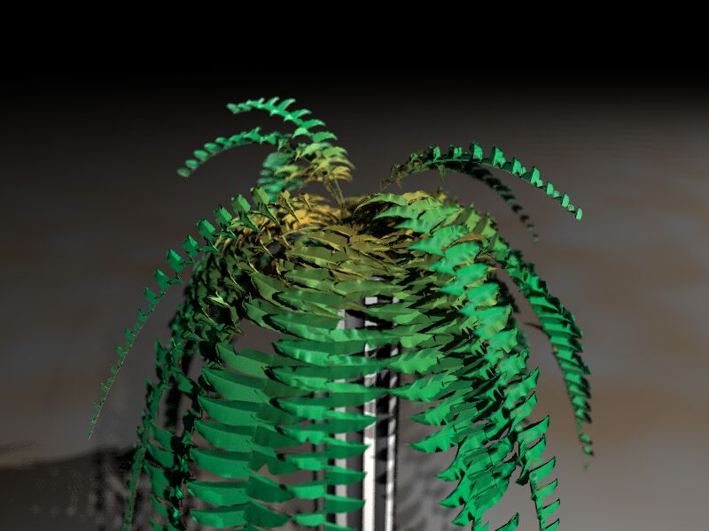
Hi again,
the last fern render (with some focal blur to add depth) after my latest
bugfixes.
From my point of view this fern is finished. Maybe I'll make a fern macro
but for now it's enough :)
BTW: the triangle reduction did good work. The last version created an 106MB
(!) include file for the complete hanging fern, the reduced version did the
same job with 16MB :-))
Have fun!
I'll concentrate now on a snail.
regards
SY
Post a reply to this message
Attachments:
Download 'fern2.jpg' (58 KB)
Preview of image 'fern2.jpg'
|
|
| |
| |
|
|
|
|
| |
| |
|
|
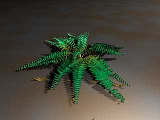
looks more like one of the fake plastic ferns - a very good one mind..
perhaps its just the setting
--
Rick
Kitty5 WebDesign - http://Kitty5.com
POV-Ray News & Resources - http://Povray.co.uk
TEL : +44 (01270) 501101 - FAX : +44 (01270) 251105 - ICQ : 15776037
PGP Public Key
http://pgpkeys.mit.edu:11371/pks/lookup?op=get&search=0x231E1CEA
Post a reply to this message
|
|
| |
| |
|
|
|
|
| |
| |
|
|
The fern model is fantastic, very close to the real one I have. But I
think the green color seems a bit artificial, and that's why someone
complained about plastic-looking. Mine has a more yellowish tone.
Nothing important for your great modelling effort, tough.
--
Jaime Vives Piqueres
La Persistencia de la Ignorancia
http://www.ignorancia.org
Post a reply to this message
|
|
| |
| |
|
|
|
|
| |
| |
|
|
Hi,
> The fern model is fantastic, very close to the real one I have. But I
> think the green color seems a bit artificial, and that's why someone
> complained about plastic-looking. Mine has a more yellowish tone.
Thank you very much!
Indeed the texturing turned out to be more complex than expected.
Additionally I noticed that on different monitors the pics look quite
different from mine. Obviously has my monitor a bit dark overall brightness
(drakness :-) ) and a pretty strong gamma setting. I played a bit with the
assumed_gamma settings but didn't really put much effort in it yet.
Especially for the last picture you are right: it looks a bit plastic. This
is due to the focal_blur which removes the small reflections caused by small
ripples of the leaf. Instead of the detail it creates larger, unsharp
highlight areas which give this plastic look (beside the too dark greenish
colour). I want to use focal blur in the final image but in a smaller scale.
The final image will have only one or two "wings" of the fern and not the
whole thing.
> Nothing important for your great modelling effort, tough.
I think it IS important. A good modelling can be destroyed easily with a
wrong texture. I am aware of one major defect of the leaves which also
explaines why real leaves are more yellowish:
The leaves are not transparent. A real leaf of a fern acts like a emitting
media if lightened from the background. Like a milky glass it emits light
but you can't see through it. In case of this back-lighting it is almost
yellowish. I tried to emulate this but I failed. The results were always a
transparent thing (through which you could see the leaves usually hidden by
others) or it didn't emit light or it -always- emitted light independently
og the lighting situation.
Anyway, I will have to change the texture. The difficult thing is that the
colour is computed according to the leave's age. I have to model new
formulas....
regards,
SY
Post a reply to this message
|
|
| |
| |
|
|
|
|
| |