|
|
|
|
|
|
| |
| |
|
|
|
|
| |
| |
|
|
Tom Melly <tom### [at] tomandlu couk> wrote:
> "Rune" <run### [at] inamecom> wrote in message
> news:3acc99db@news.povray.org...
>>
>> > I like it - nice and retro.
>>
>> Thank you!
>>
>> Not having English as my native tongue I'm not sure exactly what "retro"
>> means (though I do have a vague idea). Anybody care to explain?
> It generally means design based around 1950's US design. Powerpuff Girls
> springs to mind.
Or earlier. Retro as in "retroactive". It's a look built out of
old-fashioned elements.
Geoff couk> wrote:
> "Rune" <run### [at] inamecom> wrote in message
> news:3acc99db@news.povray.org...
>>
>> > I like it - nice and retro.
>>
>> Thank you!
>>
>> Not having English as my native tongue I'm not sure exactly what "retro"
>> means (though I do have a vague idea). Anybody care to explain?
> It generally means design based around 1950's US design. Powerpuff Girls
> springs to mind.
Or earlier. Retro as in "retroactive". It's a look built out of
old-fashioned elements.
Geoff
Post a reply to this message
|
|
| |
| |
|
|
|
|
| |
| |
|
|
Rune wrote:
> Not having English as my native tongue I'm not sure
> exactly what "retro" means (though I do have a vague
> idea). Anybody care to explain?
Tom Melly wrote:
> It generally means design based around 1950's US
> design. Powerpuff Girls springs to mind.
"Geoff Wedig" wrote:
> Or earlier. Retro as in "retroactive". It's a look
> built out of old-fashioned elements.
Thanks both!
Rune
--
\ Include files, tutorials, 3D images, raytracing jokes,
/ The POV Desktop Theme, and The POV-Ray Logo Contest can
\ all be found at http://rsj.mobilixnet.dk (updated March 29)
/ Also visit http://www.povrayusers.org
Post a reply to this message
|
|
| |
| |
|
|
|
|
| |
| |
|
|
"Tom Melly" wrote:
> Aargh. I looked through my fonts, but couldn't see one
> that matches my rather indistinct idea (mainly through
> the lack of a decent font viewer). I had an idea of
> something that looked like those neon (joined-up) signs.
I'm not sure I would like a neon style, but I still can't quite picture it
so who knows...
Rune
--
\ Include files, tutorials, 3D images, raytracing jokes,
/ The POV Desktop Theme, and The POV-Ray Logo Contest can
\ all be found at http://rsj.mobilixnet.dk (updated March 29)
/ Also visit http://www.povrayusers.org
Post a reply to this message
|
|
| |
| |
|
|
|
|
| |
| |
|
|
> > It generally means design based around 1950's US design. Powerpuff Girls
> > springs to mind.
>
> Or earlier. Retro as in "retroactive". It's a look built out of
> old-fashioned elements.
>
"retrograde" might be better
And it is relative isn't it? It means looking "backward" in time from
whatever vantage you assume to take. Mimicking sixties clothing styles today
is
"retro"
Post a reply to this message
|
|
| |
| |
|
|
|
|
| |
| |
|
|
"J Charter" <jrc### [at] aolcom> wrote in message
news:3ACD07BC.C9F58AFA@aol.com...
>
> "retrograde" might be better
> And it is relative isn't it? It means looking "backward" in time from
> whatever vantage you assume to take. Mimicking sixties clothing styles
today
> is
> "retro"
>
True - and later. Abba could be considered a bit "retro". It implies a
knowing, slightly ironic, approach to a past style (managed to avoid the PM
word).
Post a reply to this message
|
|
| |
| |
|
|
|
|
| |
| |
|
|
"J Charter" wrote:
> "retrograde" might be better
> And it is relative isn't it? It means looking "backward"
> in time from whatever vantage you assume to take.
> Mimicking sixties clothing styles today is "retro"
Ok!
"Tom Melly" wrote:
> True - and later. Abba could be considered a bit "retro".
> It implies a knowing, slightly ironic, approach to a past
> style (managed to avoid the PM word).
I get it now. However, I didn't *intentionally* make my logo have a look or
feel from past times. Does that mean it isn't retro after all?
Rune
--
\ Include files, tutorials, 3D images, raytracing jokes,
/ The POV Desktop Theme, and The POV-Ray Logo Contest can
\ all be found at http://rsj.mobilixnet.dk (updated March 29)
/ Also visit http://www.povrayusers.org
Post a reply to this message
|
|
| |
| |
|
|
|
|
| |
| |
|
|
"Rune" <run### [at] inamecom> wrote in message
news:3acd98df@news.povray.org...
>
> I get it now. However, I didn't *intentionally* make my logo have a look
or
> feel from past times. Does that mean it isn't retro after all?
>
You seem to be under the impression that the artist gets to decide on the
meaning and/or intent of his work - what a strange idea, don't you know
that's what post-modern critics and social commentators are for? ;)
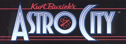
BTW for a similiar(ish) design, as well as a couple of different fonts (both
rather nice), what about the Astro City logo (a rather enjoyable comic):
Post a reply to this message
Attachments:
Download 'aclogo2.jpg' (24 KB)
Preview of image 'aclogo2.jpg'
|
|
| |
| |
|
|
|
|
| |
| |
|
|
"Tom Melly" wrote:
> You seem to be under the impression that the artist
> gets to decide on the meaning and/or intent of his work
> - what a strange idea, don't you know that's what
> post-modern critics and social commentators are for? ;)
Of course, you're right! ;)
> BTW for a similiar(ish) design, as well as a couple of
> different fonts (both rather nice), what about the
> Astro City logo (a rather enjoyable comic):
It's very nice, but it's not the feel I'm going for.
It says very much "cartoon" to me (quite naturally).
Though the logo for my site may look a bit cartoonish, the overall
impression is not meant to be particularly cartoonish.
Rune
--
\ Include files, tutorials, 3D images, raytracing jokes,
/ The POV Desktop Theme, and The POV-Ray Logo Contest can
\ all be found at http://rsj.mobilixnet.dk (updated March 29)
/ Also visit http://www.povrayusers.org
Post a reply to this message
|
|
| |
| |
|
|
|
|
| |
| |
|
|
I thought Retro meant "Futuristic." As in "Retrofit." It looked kinda spacey
(in a GOOD way) to me.
Post a reply to this message
|
|
| |
| |
|
|
|
|
| |
| |
|
|
Tom Melly scripsit
> > > It generally means design based around 1950's US design.
> > > Powerpuff Girls springs to mind.
Geoff Wedig added
> > Or earlier. Retro as in "retroactive".
> > It's a look built out of old-fashioned elements.
J Charter wrote
> "retrograde" might be better
> And it is relative isn't it? It means looking "backward"
> in time from whatever vantage you assume to take. Mimicking
> sixties clothing styles today is "retro"
James Lileks, whose site (http://lileks.com/) is worth exploring,
commented somewhere that before 1970 or so there was no such thing as
`retro' as we know it. Thirties style doesn't turn up much in Fifties
designs.
Dunno whether I buy his claim, but it's thought-provoking anyway!
The first example that comes to mind of paleo-retro ;) is the use of
`wood' typefaces to suggest either the Wild West or the circus.
--
Anton Sherwood -- br0### [at] p0b0xcom -- http://ogre.nu/
Post a reply to this message
|
|
| |
| |
|
|
|
|
| |