 |
 |
|
 |
|
 |
|  |
|  |
|
 |
|
 |
|  |
|  |
|
 |
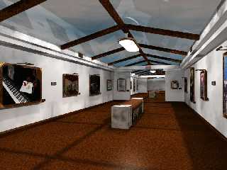
I've updated my art gallery
1) made it daytime
2) fixed the radiosity
Any suggestions, advice or opinions are welcome.
Post a reply to this message
Attachments:
Download 'gallery.jpg' (84 KB)
Preview of image 'gallery.jpg'

|
 |
|  |
|  |
|
 |
|
 |
|  |
|  |
|
 |
kane wrote:
>
> I've updated my art gallery
> 1) made it daytime
> 2) fixed the radiosity
>
> Any suggestions, advice or opinions are welcome.
>
Looks good, with some smell of very slow rendering :-)
The floor was better in the first version, it's to monotoneus now IMO. I wonder
about the sky/glass, the sky itself looks very dark, even though there is much
light coming from outside. The glass does not seem to have variable reflection,
furthermore it seems to lie on top of the frame while it probably should be
between.
I also would not give up the nighttime version, the lights at the single
pictures look very nice.
Christoph
--
Christoph Hormann <chr### [at] gmx de>
Homepage: http://www.schunter.etc.tu-bs.de/~chris/ de>
Homepage: http://www.schunter.etc.tu-bs.de/~chris/
Post a reply to this message
|
 |
|  |
|  |
|
 |
|
 |
|  |
|  |
|
 |
Christoph Hormann wrote:
> Looks good, with some smell of very slow rendering :-)
>
> I wonder about the sky/glass, the sky itself looks very dark,
> even though there is much light coming from outside. The glass
> does not seem to have variable reflection, furthermore it seems
> to lie on top of the frame while it probably should be between.
ditto
--
David Fontaine <dav### [at] faricy net> ICQ 55354965
Please visit my website: http://davidf.faricy.net/ net> ICQ 55354965
Please visit my website: http://davidf.faricy.net/
Post a reply to this message
|
 |
|  |
|  |
|
 |
|
 |
|  |
|  |
|
 |
On Tue, 22 Aug 2000 12:15:43 -0600, kane wrote:
>I've updated my art gallery
>1) made it daytime
>2) fixed the radiosity
>
>Any suggestions, advice or opinions are welcome.
I'd ask for my money back, those wall lights do nithing but cast
shadows and the frames themselves do the same.
Maybe go for tube lighting on that alcove just below the ceiling.
The day time looks good.
--
Cheers
Steve email mailto:ste### [at] zeropps uklinux uklinux net
%HAV-A-NICEDAY Error not enough coffee 0 pps.
web http://www.zeropps.uklinux.net/
or http://start.at/zero-pps
11:15pm up 1 day, 3:33, 2 users, load average: 1.05, 1.14, 1.10 net
%HAV-A-NICEDAY Error not enough coffee 0 pps.
web http://www.zeropps.uklinux.net/
or http://start.at/zero-pps
11:15pm up 1 day, 3:33, 2 users, load average: 1.05, 1.14, 1.10
Post a reply to this message
|
 |
|  |
|  |
|
 |
|
 |
|  |
|  |
|
 |
> Looks good, with some smell of very slow rendering :-)
>
Yes, it was a bit slow, around 4 hours.
> The floor was better in the first version, it's to monotoneus now IMO.
Same floor, didn't change that...but I'll look into it.
> I wonder about the sky/glass, the sky itself looks very dark, even though
> there is much light coming from outside. The glass does not seem to have
> variable reflection, furthermore it seems to lie on top of the frame while
it
> probably should be between.
>
The glass is tinted, or slightly darker and thus gives it the darker sky.
I didn't alter the reflections of the glass but again I'll look into that.
I looked and the glass actually passes thru the frame, there is a slight
line you can see about half way up the side beams.
> I also would not give up the nighttime version, the lights at the single
> pictures look very nice.
>
> Christoph
>
Thanks...I'm currently rendering the Nighttime scene again, with radiosity
fixed, its at 28% done so far at 8 hours and 30 minutes time.
Also, one thing of note...in the daytime view the single lights above each
picture the light is OFF thats why it appears like the there is no lights
coming from them, and so of course the lights are just going to cast
shadows...as are the picture frames themselves casue they don't give off any
light.
Post a reply to this message
|
 |
|  |
|  |
|
 |
|
 |
|  |
|  |
|
 |
And forgive me if I have typing errors...I've only gotten 2 hours sleep.
Post a reply to this message
|
 |
|  |
|  |
|
 |
|
 |
|  |
|  |
|
 |
It's looking good, but the floor is too dark for my tastes. All the
museums up here have very light colored floors, except for those artists
who do really strange things with the floor in their exhibits.
Josh
kane wrote:
> I've updated my art gallery
> 1) made it daytime
> 2) fixed the radiosity
>
> Any suggestions, advice or opinions are welcome.
>
> [Image]
--
Josh English -- Lexiphanic Lethomaniac
eng### [at] spiritone com
The POV-Ray Cyclopedia http://www.spiritone.com/~english/cyclopedia/ com
The POV-Ray Cyclopedia http://www.spiritone.com/~english/cyclopedia/
Post a reply to this message
|
 |
|  |
|  |
|
 |
|
 |
|  |
|  |
|
 |
> Any suggestions, advice or opinions are welcome.
that is much better, excellent work on the rad and general lighting - i know
hoe enclosed spaces can be a real nightmare!
Rick
Post a reply to this message
|
 |
|  |
|  |
|
 |
|
 |
|  |


![]()