 |
|
|
|
|
|
| |
| |
|
|
|
|
| |
| |
|
|
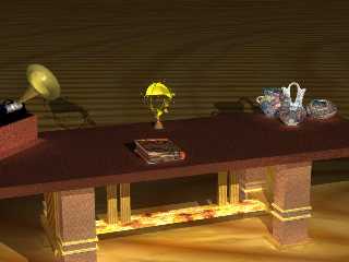
darkened wood, added texture to the pots, and took out all but 1
light. will do tweak the radiosity later.
Psy
Post a reply to this message
Attachments:
Download 'test2apost.jpg' (50 KB)
Preview of image 'test2apost.jpg'
|
|
| |
| |
|
|
|
|
| |
| |
|
|
"Psychomek" <psy### [at] home com> wrote in message
news:39B1DB84.F2B1894F@home.com...
> darkened wood, added texture to the pots, and took out all but 1
> light. will do tweak the radiosity later.
>
> Psy
>
[image]
Hi Psy, I hate this crit bit! :o) But here goes. The vertical struts,
(underneath the table top), to the left are too forward compared to the
other ones on the right. The book doesn't look right now, compared to
before. I don't think a book would 'glow' like that.
Other than that, I really like this image, but prefered it as it was,
with the extra lights.
~Steve~ com> wrote in message
news:39B1DB84.F2B1894F@home.com...
> darkened wood, added texture to the pots, and took out all but 1
> light. will do tweak the radiosity later.
>
> Psy
>
[image]
Hi Psy, I hate this crit bit! :o) But here goes. The vertical struts,
(underneath the table top), to the left are too forward compared to the
other ones on the right. The book doesn't look right now, compared to
before. I don't think a book would 'glow' like that.
Other than that, I really like this image, but prefered it as it was,
with the extra lights.
~Steve~
Post a reply to this message
|
|
| |
| |
|
|
|
|
| |
| |
|
|
the book "glow is radiosity. Been trying my best to fix the problem. and
haven't messed with the slats. they are as is from the 3ds file. could be
the camera angle.
25ct wrote:
> "Psychomek" <psy### [at] homecom> wrote in message
> news:39B1DB84.F2B1894F@home.com...
> > darkened wood, added texture to the pots, and took out all but 1
> > light. will do tweak the radiosity later.
> >
> > Psy
> >
> [image]
>
> Hi Psy, I hate this crit bit! :o) But here goes. The vertical struts,
> (underneath the table top), to the left are too forward compared to the
> other ones on the right. The book doesn't look right now, compared to
> before. I don't think a book would 'glow' like that.
>
> Other than that, I really like this image, but prefered it as it was,
> with the extra lights.
>
> ~Steve~
Post a reply to this message
|
|
| |
| |
|
|
|
|
| |
| |
|
|
I take back what i just said about the slats... the left ones are forward
from the middle of the "base board" but if you look closely you can tell
that the right ones are further back. i think it is supposed to be a kind
of symmetry.
25ct wrote:
> "Psychomek" <psy### [at] homecom> wrote in message
> news:39B1DB84.F2B1894F@home.com...
> > darkened wood, added texture to the pots, and took out all but 1
> > light. will do tweak the radiosity later.
> >
> > Psy
> >
> [image]
>
> Hi Psy, I hate this crit bit! :o) But here goes. The vertical struts,
> (underneath the table top), to the left are too forward compared to the
> other ones on the right. The book doesn't look right now, compared to
> before. I don't think a book would 'glow' like that.
>
> Other than that, I really like this image, but prefered it as it was,
> with the extra lights.
>
> ~Steve~
Post a reply to this message
|
|
| |
| |
|
|
|
|
| |
| |
|
|
To be honest Psy, I think they are both out of line. Bring the slats on
the right forwards a bit, and the ones on the left backwards a bit, I think
that will sort it out.
The book.... I'm not into radiosity yet. As I understand it, it is the
light that is reflected from another source, (esp. colours, etc). Maybe,
tweak it down a touch?
Good image though.. ~Steve~
"Psychomek" <psy### [at] homecom> wrote in message
news:39B20C70.717423FE@home.com...
> I take back what i just said about the slats... the left ones are forward
> from the middle of the "base board" but if you look closely you can tell
> that the right ones are further back. i think it is supposed to be a
kind
> of symmetry.
>
> 25ct wrote:
>
> > "Psychomek" <psy### [at] homecom> wrote in message
> > news:39B1DB84.F2B1894F@home.com...
> > > darkened wood, added texture to the pots, and took out all but 1
> > > light. will do tweak the radiosity later.
> > >
> > > Psy
> > >
> > [image]
> >
> > Hi Psy, I hate this crit bit! :o) But here goes. The vertical struts,
> > (underneath the table top), to the left are too forward compared to the
> > other ones on the right. The book doesn't look right now, compared to
> > before. I don't think a book would 'glow' like that.
> >
> > Other than that, I really like this image, but prefered it as it was,
> > with the extra lights.
> >
> > ~Steve~
>
Post a reply to this message
|
|
| |
| |
|
|
|
|
| |
| |
|
|
have you tried any of the settings from the recent tests in this group?
i liked xplo's settings, but changed them just a little to make it
brighter.
Psychomek wrote:
>
> the book "glow is radiosity. Been trying my best to fix the problem. and
> haven't messed with the slats. they are as is from the 3ds file. could be
> the camera angle.
>
> 25ct wrote:
>
> > "Psychomek" <psy### [at] homecom> wrote in message
> > news:39B1DB84.F2B1894F@home.com...
> > > darkened wood, added texture to the pots, and took out all but 1
> > > light. will do tweak the radiosity later.
> > >
> > > Psy
> > >
> > [image]
> >
> > Hi Psy, I hate this crit bit! :o) But here goes. The vertical struts,
> > (underneath the table top), to the left are too forward compared to the
> > other ones on the right. The book doesn't look right now, compared to
> > before. I don't think a book would 'glow' like that.
> >
> > Other than that, I really like this image, but prefered it as it was,
> > with the extra lights.
> >
> > ~Steve~
Post a reply to this message
|
|
| |
| |
|
|
|
|
| |
| |
|
|
Still working on the book.... might have to change the book completely....
maybe to a desk calendar....
25ct wrote:
> To be honest Psy, I think they are both out of line. Bring the slats on
> the right forwards a bit, and the ones on the left backwards a bit, I think
> that will sort it out.
> The book.... I'm not into radiosity yet. As I understand it, it is the
> light that is reflected from another source, (esp. colours, etc). Maybe,
> tweak it down a touch?
>
> Good image though.. ~Steve~
>
> "Psychomek" <psy### [at] homecom> wrote in message
> news:39B20C70.717423FE@home.com...
> > I take back what i just said about the slats... the left ones are forward
> > from the middle of the "base board" but if you look closely you can tell
> > that the right ones are further back. i think it is supposed to be a
> kind
> > of symmetry.
> >
> > 25ct wrote:
> >
> > > "Psychomek" <psy### [at] homecom> wrote in message
> > > news:39B1DB84.F2B1894F@home.com...
> > > > darkened wood, added texture to the pots, and took out all but 1
> > > > light. will do tweak the radiosity later.
> > > >
> > > > Psy
> > > >
> > > [image]
> > >
> > > Hi Psy, I hate this crit bit! :o) But here goes. The vertical struts,
> > > (underneath the table top), to the left are too forward compared to the
> > > other ones on the right. The book doesn't look right now, compared to
> > > before. I don't think a book would 'glow' like that.
> > >
> > > Other than that, I really like this image, but prefered it as it was,
> > > with the extra lights.
> > >
> > > ~Steve~
> >
Post a reply to this message
|
|
| |
| |
|
|
|
|
| |
|
|


