|
 |
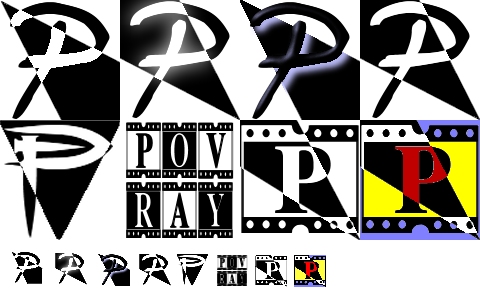
couldn't find where to submit these. obviously they are variations on a
theme. most if not all could easily be done in pov although these were
done in PSP. if there is any interest, i'll do the favored one(s) in
pov. in my opinion, the big 'povray' one should have the same style
small 'p' as its smaller version since the actual small version of
'povray' is basically unreadable. i'm also posting an example of using
some of these images as watermarks.
Post a reply to this message
Attachments:
Download 'rclogos.jpg' (92 KB)
Download '12.jpg' (9 KB)
Download 'xwingwatermarks.jpg' (240 KB)
Preview of image 'rclogos.jpg'
Preview of image '12.jpg'
Preview of image 'xwingwatermarks.jpg'

|
|
|
|
"ryan constantine" wrote:
> couldn't find where to submit these.
You're not supposed to submit the logos like that. :-)
First narrow the different logos down to one (or a few) logo. Then improve
that logo as much as you can, possible using feedback from the newsgroup.
When you think it can't get any better, then you can submit it by sending it
to me in the formats specified in the rules. You can also make some
presentations of it - for details and inspiration, see the rules and the
already presubmitted logos.
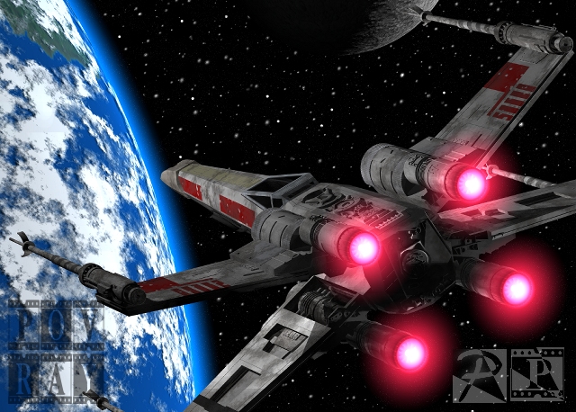
> i'm also posting an example of using some of these images as watermarks.
Please ask yourself if it was necessary to post such a big image just to
show the logos as watermarks.
And now to the feedback...
Logo 2 and logo 4 seems to be the same logo, just with different effects.
So does logo 7 and 8.
Among the logos you posted, logo 2/4 and logo 7/8 are my favorites.
I think logo 7/8 is a bit too detailed. Logos generally shouldn't be too
detailed. Of course logo 6 is much worse, but that wasn't one of my
favorites anyway. :-)
Logo 2/4 is nice and simple, but it also looks a bit unoriginal. The "P" is
for "POV-Ray", but anything else about it than that?
Suggestions for improvement - hmm, all the logos seem to fit nicely into a
square making them look a bit boring. Try tilting or sharing the various
shapes to make the logos appear more interesting!
Anyway, you seem to be able to come up with a lot of ideas - keep trying,
and the perfect logo just might present itself for you! :-)
Rune
--
\ Include files, tutorials, 3D images, raytracing jokes,
/ The POV Desktop Theme, and The POV-Ray Logo Contest can
\ all be found at http://rsj.mobilixnet.dk (updated July 23)
/ Also visit http://www.povrayusers.org
Post a reply to this message
|
|
|
|
You need to smooth out the bowl on the "P" in that first row. The third one is
very successful to work as an image brand. It has a hint of space coming off
the page, which makes this one the better choice. The shape of the black area
works much better in the lower right hand corner of the image in the second
and fourth images than in the first and third images.
The second row has some problems. The first one has too many small areas that
are seperated and will disappear at a smaller size. The second one is going to
become a black mass of pixels at a smaller size, but the last two hint at
animation. The bars on the top and bottom hint at a strip of film. Experiment
with putting them on the sides, but I like them on the top and bottom. It
would work best with animations.
Josh
ryan constantine wrote:
> couldn't find where to submit these. obviously they are variations on a
> theme. most if not all could easily be done in pov although these were
> done in PSP. if there is any interest, i'll do the favored one(s) in
> pov. in my opinion, the big 'povray' one should have the same style
> small 'p' as its smaller version since the actual small version of
> 'povray' is basically unreadable. i'm also posting an example of using
> some of these images as watermarks.
>
> ------------------------------------------------------------------------
> [Image] [Image] [Image]
--
Josh English -- Lexiphanic Lethomaniac
eng### [at] spiritone com
The POV-Ray Cyclopedia http://www.spiritone.com/~english/cyclopedia/ com
The POV-Ray Cyclopedia http://www.spiritone.com/~english/cyclopedia/
Post a reply to this message
|
|