 |
 |
|
 |
|
 |
|  |
|  |
|
 |
|
 |
|  |
|  |
|
 |
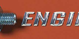
Metal texture test. Nut & bolt: reflect_metallic,reflection_blur.
______________________________________________________________________
Kari Kivisalo http://www.kivisalo.net
Post a reply to this message
Attachments:
Download 'engineer_pov.gif' (40 KB)
Preview of image 'engineer_pov.gif'

|
 |
|  |
|  |
|
 |
|
 |
|  |
|  |
|
 |
Woooaaahhh! Kari, fair play, that is good!! To someone with not much
knowledge of this, I find that this looks very real! Brilliant!!
You have given me a different insight into this world of POV! Thanks!
Well done! ~Steve~ :o)
"Kari Kivisalo" <kar### [at] kivisalo net> wrote in message
news:3999DA28.ED649404@kivisalo.net...
>
> Metal texture test. Nut & bolt: reflect_metallic,reflection_blur.
>
> ______________________________________________________________________
> Kari Kivisalo http://www.kivisalo.net
----------------------------------------------------------------------------
---- net> wrote in message
news:3999DA28.ED649404@kivisalo.net...
>
> Metal texture test. Nut & bolt: reflect_metallic,reflection_blur.
>
> ______________________________________________________________________
> Kari Kivisalo http://www.kivisalo.net
----------------------------------------------------------------------------
----
Post a reply to this message
|
 |
|  |
|  |
|
 |
|
 |
|  |
|  |
|
 |
On Wed, 16 Aug 2000 03:02:48 +0300, Kari Kivisalo wrote:
>
>Metal texture test. Nut & bolt: reflect_metallic,reflection_blur.
>
This looks so real. But the bolt looks ever so slightly bent, the
head doesn't seem to be paralel to the nut, maybe the camera angle
needs tweaking just a touch.
--
Cheers
Steve email mailto:ste### [at] zeropps uklinux uklinux net
%HAV-A-NICEDAY Error not enough coffee 0 pps.
web http://www.zeropps.uklinux.net/
or http://start.at/zero-pps
1:12am up 31 days, 23:39, 2 users, load average: 1.63, 1.61, 1.46 net
%HAV-A-NICEDAY Error not enough coffee 0 pps.
web http://www.zeropps.uklinux.net/
or http://start.at/zero-pps
1:12am up 31 days, 23:39, 2 users, load average: 1.63, 1.61, 1.46
Post a reply to this message
|
 |
|  |
|  |
|
 |
|
 |
|  |
|  |
|
 |
In article <3999DA28.ED649404@kivisalo.net>, Kari Kivisalo
<kar### [at] kivisalo net> wrote:
> Metal texture test. Nut & bolt: reflect_metallic,reflection_blur.
This is astoundingly realistic...I can't find any flaws, at least with
the nut and bolt.
How did you do the threads? An isosurface?
--
Christopher James Huff - Personal e-mail: chr### [at] mac net> wrote:
> Metal texture test. Nut & bolt: reflect_metallic,reflection_blur.
This is astoundingly realistic...I can't find any flaws, at least with
the nut and bolt.
How did you do the threads? An isosurface?
--
Christopher James Huff - Personal e-mail: chr### [at] mac com
TAG(Technical Assistance Group) e-mail: chr### [at] tag com
TAG(Technical Assistance Group) e-mail: chr### [at] tag povray povray org
Personal Web page: http://homepage.mac.com/chrishuff/
TAG Web page: http://tag.povray.org/ org
Personal Web page: http://homepage.mac.com/chrishuff/
TAG Web page: http://tag.povray.org/
Post a reply to this message
|
 |
|  |
|  |
|
 |
|
 |
|  |
|  |
|
 |
Chris Huff wrote:
>
> I can't find any flaws, at least with
> the nut and bolt.
The text is just reflection 0.8 for comparison.
> How did you do the threads? An isosurface?
Nuts & Bolts macros: http://www.ica.uni-stuttgart.de/~marc/nuts.html
______________________________________________________________________
Kari Kivisalo http://www.kivisalo.net
Post a reply to this message
|
 |
|  |
|  |
|
 |
|
 |
|  |
|  |
|
 |
Kari Kivisalo wrote:
>
> Metal texture test. Nut & bolt: reflect_metallic,reflection_blur.
You have captured the zinc plating colors perfectly. A rare talent.
--
Ken Tyler - 1400+ POV-Ray, Graphics, 3D Rendering, and Raytracing Links:
http://home.pacbell.net/tylereng/index.html http://www.povray.org/links/
Post a reply to this message
|
 |
|  |
|  |
|
 |
|
 |
|  |
|  |
|
 |
What I'm wondering is what is behind the camera (being reflected). That is
an element that is usually lacking in rendered images. Reflection is
pointless if there's nothing to reflect, but yours looks outstanding. Great
job.
-Nathan
"Kari Kivisalo" <kar### [at] kivisalo net> wrote...
>
> Metal texture test. Nut & bolt: reflect_metallic,reflection_blur.
>
> ______________________________________________________________________
> Kari Kivisalo http://www.kivisalo.net net> wrote...
>
> Metal texture test. Nut & bolt: reflect_metallic,reflection_blur.
>
> ______________________________________________________________________
> Kari Kivisalo http://www.kivisalo.net
Post a reply to this message
|
 |
|  |
|  |
|
 |
|
 |
|  |
|  |
|
 |
Very nice indeed. I like the manufacturing flaws on the nut... All the
little details really trick the eye. Too bad I'm color-blind or I'd probably
have something nice to say about that, too. :)
"Kari Kivisalo" <kar### [at] kivisalo net> wrote in message
news:3999DA28.ED649404@kivisalo.net...
>
> Metal texture test. Nut & bolt: reflect_metallic,reflection_blur.
>
> ______________________________________________________________________
> Kari Kivisalo http://www.kivisalo.net
----------------------------------------------------------------------------
---- net> wrote in message
news:3999DA28.ED649404@kivisalo.net...
>
> Metal texture test. Nut & bolt: reflect_metallic,reflection_blur.
>
> ______________________________________________________________________
> Kari Kivisalo http://www.kivisalo.net
----------------------------------------------------------------------------
----
Post a reply to this message
|
 |
|  |
|  |
|
 |
|
 |
|  |
|  |
|
 |
Hmm with looks too good! I don't mean to insult you or anything but there are
some off things about the edges that make me wonder, they seem all together
too sharp and crisp. Also the Engineer label looks very much like it was done
in Photoshop. If you could post the code for this I would retract all my
skepticism's, and if this really is POV then GREAT WORK! Again I don't mean to
hurt your feelings, just that we have seen some other stuff in here once in a
while.
Kari Kivisalo wrote:
> Metal texture test. Nut & bolt: reflect_metallic,reflection_blur.
>
> ______________________________________________________________________
> Kari Kivisalo http://www.kivisalo.net
>
> ------------------------------------------------------------------------
> [Image]
--
Come visit my web site:-) : http://www.geocities.com/~thomaslake/
Post a reply to this message
|
 |
|  |
|  |
|
 |
|
 |
|  |
|  |
|
 |
That's the best metal texture I've seen so far !
Fabien.
Post a reply to this message
|
 |
|  |
|  |
|
 |
|
 |
|  |


![]()