 |
 |
|
 |
|
 |
|  |
|  |
|
 |
|
 |
|  |
|  |
|
 |
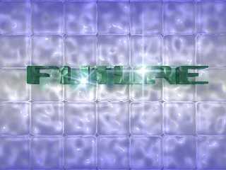
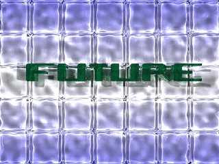
Some weeks ago I posted an Image with lots of glass objects and I was
wondering if it could be improved by using MegaPov with its photons.
So now here it is and I think it is much better now (not perfect
though).
Render time: about 1,5 hrs on Celeron 600@900 (sorry I deleted the
complete stats 8-( just in case someone really is interested I'll do a
rerender)
For comparison I added a small pic of the previous version.
Karl
Post a reply to this message
Attachments:
Download 'futurglasslogo.jpg' (21 KB)
Download 'futurglasslogo2.jpg' (92 KB)
Preview of image 'futurglasslogo.jpg'

Preview of image 'futurglasslogo2.jpg'

|
 |
|  |
|  |
|
 |
|
 |
|  |
|  |
|
 |
Karl Pelzer wrote:
>
> Some weeks ago I posted an Image with lots of glass objects and I was
> wondering if it could be improved by using MegaPov with its photons.
> So now here it is and I think it is much better now (not perfect
> though).
> Render time: about 1,5 hrs on Celeron 600@900 (sorry I deleted the
> complete stats 8-( just in case someone really is interested I'll do a
> rerender)
> For comparison I added a small pic of the previous version.
>
> Karl
>
> ------------------------------------------------------------------------
> [Image] [Image]
This is very nice looking. Looks like your typical commercial quality
logo. A 16 frame animation with moving light sources would be nice as a
gif, perhaps.
Post a reply to this message
|
 |
|  |
|  |
|
 |
|
 |
|  |
|  |
|
 |
> This is very nice looking. Looks like your typical commercial quality
> logo. A 16 frame animation with moving light sources would be nice as a
> gif, perhaps.
I'll think about it. But it will then surely be a MPEG and not GIF.
Karl
Post a reply to this message
|
 |
|  |
|  |
|
 |
|
 |
|  |
|  |
|
 |
In article <398737DF.F887AA4B@t-online.de>, Kar### [at] t-online de
says...
> Some weeks ago I posted an Image with lots of glass objects and I was
> wondering if it could be improved by using MegaPov with its photons.
> So now here it is and I think it is much better now (not perfect
> though).
> Render time: about 1,5 hrs on Celeron 600@900 (sorry I deleted the
> complete stats 8-( just in case someone really is interested I'll do a
> rerender)
> For comparison I added a small pic of the previous version.
>
> Karl
> [image/jpeg]
>
> [image/jpeg]
>
I like the new one hugely; the only remark I have is that the horizontal
stroke of the letter T is too short (remember: I am a typographer's
son!). A very pleasing picture on the whole.
--
---------
Regards, Sander de
says...
> Some weeks ago I posted an Image with lots of glass objects and I was
> wondering if it could be improved by using MegaPov with its photons.
> So now here it is and I think it is much better now (not perfect
> though).
> Render time: about 1,5 hrs on Celeron 600@900 (sorry I deleted the
> complete stats 8-( just in case someone really is interested I'll do a
> rerender)
> For comparison I added a small pic of the previous version.
>
> Karl
> [image/jpeg]
>
> [image/jpeg]
>
I like the new one hugely; the only remark I have is that the horizontal
stroke of the letter T is too short (remember: I am a typographer's
son!). A very pleasing picture on the whole.
--
---------
Regards, Sander
Post a reply to this message
|
 |
|  |
|  |
|
 |
|
 |
|  |
|  |
|
 |
Sander Stols wrote:
> I like the new one hugely; the only remark I have is that the horizontal
> stroke of the letter T is too short (remember: I am a typographer's
> son!). A very pleasing picture on the whole.
> --
> ---------
> Regards, Sander
Thanks Sander. I used the font as is, so I didn't think about
typographical correctness.
Karl
Post a reply to this message
|
 |
|  |
|  |
|
 |
|
 |
|  |
|  |
|
 |
Sander is right.. now that I look at it, the bar of the "T" is too thin. I
didn't look to closely at it before...
Perhaps you could edit the font or recreate the "T" of it seperately.
Josh
Karl Pelzer wrote:
> Sander Stols wrote:
> > I like the new one hugely; the only remark I have is that the horizontal
> > stroke of the letter T is too short (remember: I am a typographer's
> > son!). A very pleasing picture on the whole.
> > --
> > ---------
> > Regards, Sander
>
> Thanks Sander. I used the font as is, so I didn't think about
> typographical correctness.
>
> Karl
--
Josh English -- Lexiphanic Lethomaniac
eng### [at] spiritone com
The POV-Ray Cyclopedia http://www.spiritone.com/~english/cyclopedia/ com
The POV-Ray Cyclopedia http://www.spiritone.com/~english/cyclopedia/
Post a reply to this message
|
 |
|  |
|  |
|
 |
|
 |
|  |


![]()