 |
 |
|
 |
|
 |
|  |
|  |
|
 |
|
 |
|  |
|  |
|
 |
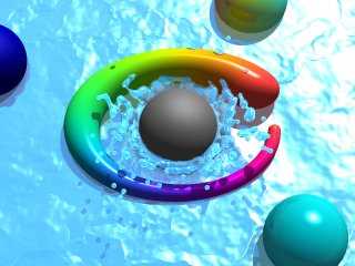
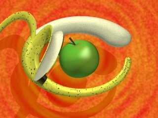
I've made a couple of presentations of TonyB's Eye Logo.
What do you think of them?
Rune
--
Updated July 10: http://rsj.mobilixnet.dk
3D images, include files, stereograms, tutorials,
The POV Desktop Theme, The POV-Ray Logo Contest,
music, 350+ raytracing jokes, and much more!
Post a reply to this message
Attachments:
Download 'eyelogosplash.jpg' (21 KB)
Download 'eyelogofruit.jpg' (18 KB)
Preview of image 'eyelogosplash.jpg'

Preview of image 'eyelogofruit.jpg'

|
 |
|  |
|  |
|
 |
|
 |
|  |
|  |
|
 |
They're great! Although I just can't see the banana version making it too
far without POV-Ray becoming a laughing-stock of the ray tracing community.
Bob
Post a reply to this message
|
 |
|  |
|  |
|
 |
|
 |
|  |
|  |
|
 |
i think your just showing off now !!
Rick
Post a reply to this message
|
 |
|  |
|  |
|
 |
|
 |
|  |
|  |
|
 |
I think the first image (the spectrum&splash one) would make an excellent
POV logo :) Perhaps the droplets could be made a little larger and fewer,
but certainly the best suggestion I've seen by some way.
Matt
"Rune" <run### [at] iname com> wrote in message
news:3978f54c@news.povray.org...
> I've made a couple of presentations of TonyB's Eye Logo.
>
> What do you think of them?
>
> Rune
> --
> Updated July 10: http://rsj.mobilixnet.dk
> 3D images, include files, stereograms, tutorials,
> The POV Desktop Theme, The POV-Ray Logo Contest,
> music, 350+ raytracing jokes, and much more!
>
>
>
>
> com> wrote in message
news:3978f54c@news.povray.org...
> I've made a couple of presentations of TonyB's Eye Logo.
>
> What do you think of them?
>
> Rune
> --
> Updated July 10: http://rsj.mobilixnet.dk
> 3D images, include files, stereograms, tutorials,
> The POV Desktop Theme, The POV-Ray Logo Contest,
> music, 350+ raytracing jokes, and much more!
>
>
>
>
>
Post a reply to this message
|
 |
|  |
|  |
|
 |
|
 |
|  |
|  |
|
 |
"Rick [Kitty5]" wrote:
> i think your just showing off now !!
To show (off) the potential of the logo is what
the logo presentations are meant for... :-)
Rune
--
Updated July 10: http://rsj.mobilixnet.dk
3D images, include files, stereograms, tutorials,
The POV Desktop Theme, The POV-Ray Logo Contest,
music, 350+ raytracing jokes, and much more!
Post a reply to this message
|
 |
|  |
|  |
|
 |
|
 |
|  |
|  |
|
 |
"Matthew Bennett" wrote:
> I think the first image (the spectrum&splash one) would make
> an excellent POV logo :) Perhaps the droplets could be made
> a little larger and fewer, but certainly the best suggestion
> I've seen by some way.
I'm glad you like the image! :-)
However, there's a difference between a logo and a *presentation* of a logo.
The images I posted are both presentations of the Eye Logo. To see the Eye
Logo itself, you can go to this page...
http://rsj.mobilixnet.dk/logo/submitted/submitted.html
...where the presubmitted logos so far are shown.
A good logo is simple, but can be presented in many different ways, which
doesn't have to be simple.
Greetings,
Rune
--
Updated July 10: http://rsj.mobilixnet.dk
3D images, include files, stereograms, tutorials,
The POV Desktop Theme, The POV-Ray Logo Contest,
music, 350+ raytracing jokes, and much more!
Post a reply to this message
|
 |
|  |
|  |
|
 |
|
 |
|  |
|  |
|
 |
"Bob Hughes" wrote:
> They're great!
Thanks!
> Although I just can't see the banana version making it too
> far without POV-Ray becoming a laughing-stock of the ray
> tracing community.
It's not like I expected it to be shown on the front page of the official
POV-Ray website! ;-)
But when seen among other versions of the logo, for example on the
presubmissions page, or as a part of a desktop theme, I think it will work
well, and add a refreshing bit of humor to its surroundings. :-)
Rune
--
Updated July 10: http://rsj.mobilixnet.dk
3D images, include files, stereograms, tutorials,
The POV Desktop Theme, The POV-Ray Logo Contest,
music, 350+ raytracing jokes, and much more!
Post a reply to this message
|
 |
|  |
|  |
|
 |
|
 |
|  |
|  |
|
 |
These are exactly what TonyB needs to add to match the logo Chris
Colefax submitted a while back. Very nice. I even like the still life
Apple and Banana.
Josh
Rune wrote:
> I've made a couple of presentations of TonyB's Eye Logo.
>
> What do you think of them?
>
> Rune
> --
> Updated July 10: http://rsj.mobilixnet.dk
> 3D images, include files, stereograms, tutorials,
> The POV Desktop Theme, The POV-Ray Logo Contest,
> music, 350+ raytracing jokes, and much more!
>
> [Image]
>
> [Image]
Post a reply to this message
|
 |
|  |
|  |
|
 |
|
 |
|  |
|  |
|
 |
"Joshua English" wrote:
> These are exactly what TonyB needs to add to match the logo
> Chris Colefax submitted a while back. Very nice.
Thank you!
> I even like the still life Apple and Banana.
I personally *prefer* the fruit version, because of the colors, lightning,
composition, originality, and humor. The splash one is more plain I think.
Maybe I'll come up with some more presentations later.
Greetings,
Rune
--
Updated July 10: http://rsj.mobilixnet.dk
3D images, include files, stereograms, tutorials,
The POV Desktop Theme, The POV-Ray Logo Contest,
music, 350+ raytracing jokes, and much more!
Post a reply to this message
|
 |
|  |
|  |
|
 |
|
 |
|  |
|  |
|
 |
Rune wrote in message <3978f54c@news.povray.org>...
>I've made a couple of presentations of TonyB's Eye Logo.
>
>What do you think of them?
The fruit version is....how shall I put this....original :-)
Mark
Post a reply to this message
|
 |
|  |
|  |
|
 |
|
 |
|  |
|
 |


![]()