 |
 |
|
 |
|
 |
|  |
|  |
|
 |
|
 |
|  |
|  |
|
 |
... for my sister who is working on a thesis. She's working on her masters
in Special Education and Family Development. uhg... the things she goes
through on a day to day basis working with severly handicaped children, some
of who have very litte chance of ever leading a normal life and some with a
small chance of living. So she's working on a program (not a computer
program) sort of like a daily planner with visual cues to help the parents
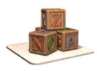
and the kids. She needs a bunch of little images of things (like building
blocks, childrens books, rubber duckies, t.v., an a ton more) and was having
a really hard time finding anything usable online. she went and bought a
clipart cd at the store and it was full of 40,000 poorly made, unusable
sketches. so that ticked her off. I told her i could help, so i made her
this. next on my list is a shopping cart and a cartoony looking childrens
book.
i havn't posted anything here in a while, so i thought i'd just post this. i
need to make some changes so it looks better in black and white when
printed. i don't know why she's doing it all in black and white. ah well...
bye!
ross
Post a reply to this message
Attachments:
Download 'large-blocks.jpg' (46 KB)
Preview of image 'large-blocks.jpg'

|
 |
|  |
|  |
|
 |
|
 |
|  |
|  |
|
 |
If you want it all in black and white, the best thing you can do is make the
colors very dark and very light, so the contrast will be visible when
printed.
Very good picture...
For the shopping cart, you might want to check www.3dcafe.com or
www.3dlinks.com , unless you want to model it. (just trying to save you
some time)
Andre
Post a reply to this message
|
 |
|  |
|  |
|
 |
|
 |
|  |
|  |
|
 |
They're nice chunky blocks, nice mouse mat too.
--
Cheers
Steve email mailto:sjl### [at] ndirect co co uk
%HAV-A-NICEDAY Error not enough coffee 0 pps.
web http://www.ndirect.co.uk/~sjlen/
or http://start.at/zero-pps
6:50pm up 5 days, 5:44, 1 user, load average: 2.00, 2.00, 1.93 uk
%HAV-A-NICEDAY Error not enough coffee 0 pps.
web http://www.ndirect.co.uk/~sjlen/
or http://start.at/zero-pps
6:50pm up 5 days, 5:44, 1 user, load average: 2.00, 2.00, 1.93
Post a reply to this message
|
 |
|  |
|  |
|
 |
From: Christoph Hormann
Subject: Re: just a little something... (55k)
Date: 30 May 2000 16:22:02
Message: <393422E7.75EE4135@gmx.de>
|
|
 |
|  |
|  |
|
 |
Ross Litscher wrote:
>
> ...
>
> i havn't posted anything here in a while, so i thought i'd just post this. i
> need to make some changes so it looks better in black and white when
> printed. i don't know why she's doing it all in black and white. ah well...
> bye!
>
> ross
>
> [Image]
Have you tried without the wood(?) pattern on the cubes, just plain
colors? would be more calm and probably better for b/w print.
For printing you should try both paint program dither and printer
raster. I don't know what is better in this case.
--
Christoph Hormann <chr### [at] gmx de>
Homepage: http://www.schunter.etc.tu-bs.de/~chris/ de>
Homepage: http://www.schunter.etc.tu-bs.de/~chris/
Post a reply to this message
|
 |
|  |
|  |
|
 |
|
 |
|  |
|  |
|
 |
Those look expensive for childrens' letter blocks! Nicely done.
For B&W printing you can just use a paint program and increase contrast.
--
David Fontaine <dav### [at] faricy net> ICQ 55354965
Please visit my website: http://www.faricy.net/~davidf/ net> ICQ 55354965
Please visit my website: http://www.faricy.net/~davidf/
Post a reply to this message
|
 |
|  |
|  |
|
 |
|
 |
|  |
|  |
|
 |
David Fontaine <dav### [at] faricy net> wrote in message
news:39342C39.B45DE668@faricy.net...
> Those look expensive for childrens' letter blocks! Nicely done.
> For B&W printing you can just use a paint program and increase contrast.
>
>
yeah, i tried that. it didn't work out so peachy. i just made the wood
color lighter and the letters all dark bl, then made the thing grayscale. net> wrote in message
news:39342C39.B45DE668@faricy.net...
> Those look expensive for childrens' letter blocks! Nicely done.
> For B&W printing you can just use a paint program and increase contrast.
>
>
yeah, i tried that. it didn't work out so peachy. i just made the wood
color lighter and the letters all dark bl, then made the thing grayscale.
Post a reply to this message
|
 |
|  |
|  |
|
 |
|
 |
|  |


![]()