 |
 |
|
 |
|
 |
|  |
|  |
|
 |
|
 |
|  |
|  |
|
 |
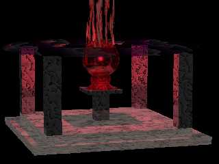
Just looking for Comments, suggestions.
This is my 1st attempt with POV and Moray. I admit,
I still have a lot to learn in POV, just downloaded it
this weekend.
Thanks,
Me
Post a reply to this message
|
 |
|  |
|  |
|
 |
|
 |
|  |
|  |
|
 |
Post a reply to this message
Attachments:
Download 'evilsphere.jpg' (110 KB)
Preview of image 'evilsphere.jpg'

|
 |
|  |
|  |
|
 |
|
 |
|  |
|  |
|
 |
Kinda freaky. For one of your "firsts" you're well on your way compared
to what mine I guess, tough to remember that far back.
I was thinking the vertical smoke stuff might have been interesting if
it went into the sphere instead of stopping there at top. Would have
surrounded the light source then. Oh well :-)
Bob
Post a reply to this message
|
 |
|  |
|  |
|
 |
|
 |
|  |
|  |
|
 |
nice, the stuff entering / leaving the speher need some work (just soften
the edges up a touch)
Rick
Post a reply to this message
|
 |
|  |
|  |
|
 |
|
 |
|  |
|  |
|
 |
For a beginner you are well on your way to becoming a lighting expert.
If you want to push this mood, I'd suggest adding a fade_distance and
fade_power into your light.
Josh
Dave Rich wrote:
> [Image]
--
Josh English
eng### [at] spiritone com
"May your hopes, dreams, and plans not be destroyed by a few zeros." com
"May your hopes, dreams, and plans not be destroyed by a few zeros."
Post a reply to this message
|
 |
|  |
|  |
|
 |
|
 |
|  |
|  |
|
 |
One suggestion for images you post on this newsgroup: try to keep the image
dimensions to 800x600 or smaller. Some of us don't have monitors that go up
to higher resolutions.
Mark
Post a reply to this message
|
 |
|  |
|  |
|
 |
|
 |
|  |
|  |
|
 |
Yeah, I thought of that right after I posted it. I am so used to
Cable access and 1280x1024 that I really didn't think otherwise.
From now on, though, I will try to post at 800x600 or so,
and i'll also try to keep the size down a bit.
Thanks
On Thu, 25 May 2000 01:50:25 -0400, "Mark Wagner"
<mar### [at] gte net> wrote:
>One suggestion for images you post on this newsgroup: try to keep the image
>dimensions to 800x600 or smaller. Some of us don't have monitors that go up
>to higher resolutions.
>
>Mark
>
> net> wrote:
>One suggestion for images you post on this newsgroup: try to keep the image
>dimensions to 800x600 or smaller. Some of us don't have monitors that go up
>to higher resolutions.
>
>Mark
>
>
Post a reply to this message
|
 |
|  |
|  |
|
 |
|
 |
|  |
|  |
|
 |
Nice for a first image, lighting looks good, maybe the colour
map used for the upright posts at the corners could be a bit
smother, maybe just ad a bigger scale to it, or something
to make the colours blend into eachother a little bit more
such as make the first and last colour in the map the same.
--
Cheers
Steve email mailto:sjl### [at] ndirect co co uk
%HAV-A-NICEDAY Error not enough coffee 0 pps.
web http://www.ndirect.co.uk/~sjlen/
or http://start.at/zero-pps
9:17pm up 1 day, 8:11, 2 users, load average: 2.31, 2.14, 2.09 uk
%HAV-A-NICEDAY Error not enough coffee 0 pps.
web http://www.ndirect.co.uk/~sjlen/
or http://start.at/zero-pps
9:17pm up 1 day, 8:11, 2 users, load average: 2.31, 2.14, 2.09
Post a reply to this message
|
 |
|  |
|  |
|
 |
|
 |
|  |


![]()