|
|
|
|
|
|
| |
| |
|
|
|
|
| |
| |
|
|
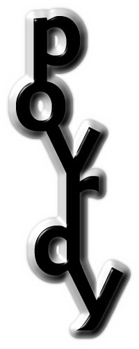
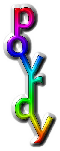
Greetings!
Attempt 2 sees me play with chaining the letters, instead of overlaying
them. I also decided to go for a white background, just for a change.
And I went vertical, instead of horizontal.
The colour schemes and effects are cliche'd, I know, but like attempt 1,
it's the structure that I'm more interested in exploring.
Henry.
Post a reply to this message
Attachments:
Download 'POVlogo2GRAY.jpg' (12 KB)
Download 'POVlogo2RGB.jpg' (18 KB)
Preview of image 'POVlogo2GRAY.jpg'
Preview of image 'POVlogo2RGB.jpg'
|
|
| |
| |
|
|
|
|
| |
| |
|
|
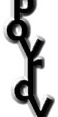
The A looks like a D. Nice, though.
Post a reply to this message
|
|
| |
| |
|
|
|
|
| |
| |
|
|
I prefer the first version.
From a distance, it said more "POV-RAY" than this one. You have to
'struggle' to get the meaning.
> Greetings!
>
> Attempt 2 sees me play with chaining the letters, instead of overlaying
> them. I also decided to go for a white background, just for a change.
> And I went vertical, instead of horizontal.
>
> The colour schemes and effects are cliche'd, I know, but like attempt 1,
> it's the structure that I'm more interested in exploring.
>
> Henry.
>
> [Image]
>
> [Image]
Post a reply to this message
|
|
| |
| |
|
|
|
|
| |
| |
|
|
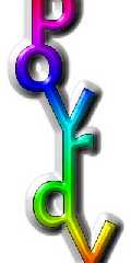
Hey these are the best two I'd recommend! only the shape could be hard to
work with.
"Henry" <htp### [at] mac com> wrote in message
news:htp-A6D8D2.20224606052000@news.povray.org...
> Greetings!
>
> Attempt 2 sees me play with chaining the letters, instead of overlaying
> them. I also decided to go for a white background, just for a change.
> And I went vertical, instead of horizontal.
>
> The colour schemes and effects are cliche'd, I know, but like attempt 1,
> it's the structure that I'm more interested in exploring.
>
> Henry.
>
> com> wrote in message
news:htp-A6D8D2.20224606052000@news.povray.org...
> Greetings!
>
> Attempt 2 sees me play with chaining the letters, instead of overlaying
> them. I also decided to go for a white background, just for a change.
> And I went vertical, instead of horizontal.
>
> The colour schemes and effects are cliche'd, I know, but like attempt 1,
> it's the structure that I'm more interested in exploring.
>
> Henry.
>
>
Post a reply to this message
|
|
| |
| |
|
|
|
|
| |