|
 |
As I have said before I think a logo should be simple. I think a logo should
consist of a few colors only, and it must work in black and white too.
When a good logo is designed you can always present that logo in various
ways. Those presentations of the logo can be as detailed as you like, they
can use special effects, and all the colors you want. It is only the logo
itself that must be simple, not the presentations of it.
Here I have attached an example of a logo. There's a black and white version
and a color version. That is the logo itself.
In a reply to this message I will post examples of how that logo could be
presented.
To discuss this go to povray.general and see the thread "PLC: General
qualities of the logo".
Greetings,
Rune
---
Updated April 25: http://rsj.mobilixnet.dk
Containing 3D images, stereograms, tutorials,
The POV Desktop Theme, 350+ raytracing jokes,
miscellaneous other things, and a lot of fun!
Post a reply to this message
Attachments:
Download 'logocolor.jpg' (5 KB)
Download 'logobw.jpg' (4 KB)
Preview of image 'logocolor.jpg'

Preview of image 'logobw.jpg'

|
 |
|
 |
Definitely a good example, although it seems to say "Cartographer Program".
;-)
Bob
"Rune" <run### [at] iname com> wrote in message news:390dd2e8@news.povray.org...
| As I have said before I think a logo should be simple. I think a logo should
| consist of a few colors only, and it must work in black and white too.
|
| When a good logo is designed you can always present that logo in various
| ways. Those presentations of the logo can be as detailed as you like, they
| can use special effects, and all the colors you want. It is only the logo
| itself that must be simple, not the presentations of it.
|
| Here I have attached an example of a logo. There's a black and white version
| and a color version. That is the logo itself.
|
| In a reply to this message I will post examples of how that logo could be
| presented.
|
| To discuss this go to povray.general and see the thread "PLC: General
| qualities of the logo".
|
| Greetings,
|
| Rune
|
| ---
| Updated April 25: http://rsj.mobilixnet.dk
| Containing 3D images, stereograms, tutorials,
| The POV Desktop Theme, 350+ raytracing jokes,
| miscellaneous other things, and a lot of fun!
|
|
|
|
|
| com> wrote in message news:390dd2e8@news.povray.org...
| As I have said before I think a logo should be simple. I think a logo should
| consist of a few colors only, and it must work in black and white too.
|
| When a good logo is designed you can always present that logo in various
| ways. Those presentations of the logo can be as detailed as you like, they
| can use special effects, and all the colors you want. It is only the logo
| itself that must be simple, not the presentations of it.
|
| Here I have attached an example of a logo. There's a black and white version
| and a color version. That is the logo itself.
|
| In a reply to this message I will post examples of how that logo could be
| presented.
|
| To discuss this go to povray.general and see the thread "PLC: General
| qualities of the logo".
|
| Greetings,
|
| Rune
|
| ---
| Updated April 25: http://rsj.mobilixnet.dk
| Containing 3D images, stereograms, tutorials,
| The POV Desktop Theme, 350+ raytracing jokes,
| miscellaneous other things, and a lot of fun!
|
|
|
|
|
|
Post a reply to this message
|
 |
|
 |
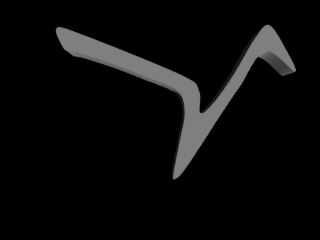
I made this in 5 min. with SplininEditor. Sure, it's only part but it's the
hard part and it might take me an hour to get it right, but an hour
is -incredibly- easy in my book. It took me longer to position the camera
and convert it to .jpg than to make the spline.
#declare Birdlogo01 =
prism{
cubic_spline
0,
0.1,
28,
<0.066189,0.629564>,
<0.163163,0.608014>,
<0.583386,0.437154>,
<0.660349,0.370966>,
<0.666507,0.277070>,
<0.726538,0.326327>,
<0.806581,0.440233>,
<0.892780,0.586464>,
<0.952812,0.643417>,
<1.022079,0.543364>,
<1.060561,0.449469>,
<0.935880,0.535668>,
<0.831209,0.387898>,
<0.748088,0.264755>,
<0.604936,0.046178>,
<0.558757,0.001539>,
<0.554139,0.026168>,
<0.578768,0.155467>,
<0.600318,0.281688>,
<0.566454,0.370966>,
<0.414065,0.437154>,
<0.286305,0.486411>,
<0.153928,0.529511>,
<0.118524,0.537207>,
<0.093896,0.549522>,
<0.066189,0.629564>,
<0.163163,0.608014>,
<0.583386,0.437154>
pigment { rgb 1 }
}
Post a reply to this message
Attachments:
Download 'Birdlogo01.jpg' (5 KB)
Preview of image 'Birdlogo01.jpg'

|
 |


![]()