 |
|
|
|
|
|
| |
| |
|
|
|
|
| |
| |
|
|
Ken wrote:
> This looks to me like something a five year old with crayons would do.
> A logo for POV-Ray should be much more professional and have a lot of
> class.
>
Oh, you mean like:
http://www.lucent.com/images/logo.gif
or
http://www.transmeta.com/images/crusoelogo.jpg
Sorry. Couldn't resist. But that lucent one is a good one. Reminds me of the
Dilbert strip where they hire the Dogbert consulting company to design them a
logo. He's drinking coffee and by the end thay say something like "so, when
do you make us a logo", he looks under his cup and says "I just did".
--
"My new computer's got the clocks, it rocks
But it was obsolete before I opened the box" - W.A.Y.
Post a reply to this message
|
|
| |
| |
|
|
|
|
| |
| |
|
|
"Ken" wrote:
> This looks to me like something a five year old with crayons would do.
> A logo for POV-Ray should be much more professional and have a lot of
> class.
Sounds like a good idea Ken!
You'll be able to vote for any of the submitted logos and
if they haven't got class enough you can submit your own!
Great isn't it? :-)
Greetings,
Rune
---
Updated January 24: http://rsj.mobilixnet.dk
Containing 3D images, stereograms, tutorials,
The POV Desktop Theme, 350+ raytracing jokes,
miscellaneous other things, and a lot of fun!
Post a reply to this message
|
|
| |
| |
|
|
|
|
| |
| |
|
|
On 10 Mar 2000 05:06:36 -0500, Nieminen Juha wrote:
They don't work, they've got mangled or something.
--
Cheers
Steve email mailto:sjl### [at] ndirect couk
%HAV-A-NICEDAY Error not enough coffee 0 pps.
web http://www.ndirect.co.uk/~sjlen/
or http://start.at/zero-pps
5:53pm up 1:39, 3 users, load average: 1.00, 0.99, 0.91 couk
%HAV-A-NICEDAY Error not enough coffee 0 pps.
web http://www.ndirect.co.uk/~sjlen/
or http://start.at/zero-pps
5:53pm up 1:39, 3 users, load average: 1.00, 0.99, 0.91
Post a reply to this message
|
|
| |
| |
|
|
|
|
| |
| |
|
|
Nieminen Juha wrote:
> David Fontaine <dav### [at] faricynet> wrote:
> : They're all smushed! Didn't you change the aspect ratio?
>
> The aspect ratio is right. The torus _is_ elliptical.
> Note the half-torus of the P-letter.
oh. Well, I liked it better the old way. :-/
--
___ _______________________________________________
| \ |_ <dav### [at] faricynet> <ICQ 55354965>
|_/avid |ontaine http://www.faricy.net/~davidf/
"The only difference between me and a madman is that I'm not mad." -Dali
Post a reply to this message
|
|
| |
| |
|
|
|
|
| |
| |
|
|
Heh, that speaks volumes.
The sphere is now overwhelming the plane in that one I think. I had an art
teacher who once said art needs to never be symmetrical and yet still have
balance.
Bob
"Bill DeWitt" <the### [at] earthlinknet> wrote in message
news:38cb96bc@news.povray.org...
| "Bob Hughes" <omn### [at] hotmailcom?subject=PoV-News:> wrote
| > I think the sphere needs to be lower on that plane so there is more
| reflection.
| > I like this one.
| >
|
| Then you might like one I rejected. I also include one I am working on...
|
|
|
|
|
|
Post a reply to this message
|
|
| |
| |
|
|
|
|
| |
| |
|
|
David Fontaine <dav### [at] faricynet> wrote:
: oh. Well, I liked it better the old way. :-/
What old way? I haven't modified it since I made it.
--
main(i,_){for(_?--i,main(i+2,"FhhQHFIJD|FQTITFN]zRFHhhTBFHhhTBFysdB"[i]
):5;i&&_>1;printf("%s",_-70?_&1?"[]":" ":(_=0,"\n")),_/=2);} /*- Warp -*/
Post a reply to this message
|
|
| |
| |
|
|
|
|
| |
| |
|
|
And so you did...
Post a reply to this message
|
|
| |
| |
|
|
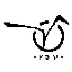
From: vaihtoehto
Subject: my logo competition entry (not too late i hope :)
Date: 17 Mar 2000 08:32:29
Message: <38d233ed@news.povray.org>
|
|
|
| |
| |
|
|
circle is Persistence, joined with Vision. (lame, yes?)
i tried to make it smooth, easy to remember and recognize.
bw -version is not very finished. i was in hurry as i found whole
competition yesterday :)
any comments?
-alt
Post a reply to this message
Attachments:
Download 'vpov128true.png' (6 KB)
Download 'vpov64bwaa.png' (2 KB)
Download 'vpov64bwnoaa.png' (1 KB)
Preview of image 'vpov128true.png'

Preview of image 'vpov64bwaa.png'

Preview of image 'vpov64bwnoaa.png'
|
|
| |
| |
|
|
|
|
| |
| |
|
|
vaihtoehto wrote:
>
> circle is Persistence, joined with Vision. (lame, yes?)
No. I like it.
Post a reply to this message
|
|
| |
| |
|
|
From: Rune
Subject: Re: my logo competition entry (not too late i hope :)
Date: 17 Mar 2000 15:31:23
Message: <38d2961b@news.povray.org>
|
|
|
| |
| |
|
|
"vaihtoehto" wrote:
> circle is Persistence, joined with Vision. (lame, yes?)
>
> i tried to make it smooth, easy to remember and recognize.
>
> bw -version is not very finished. i was in hurry as i found whole
> competition yesterday :)
>
> any comments?
It's nice!
I'll put it on the webpage soon:
http://rsj.mobilixnet.dk/povlogos/
You say the b/w version isn't very finished.
If you want to improve it you are welcome to send me a new versions in one
of the next couple of days :-)
Greetings,
Rune
---
Updated January 24: http://rsj.mobilixnet.dk
Containing 3D images, stereograms, tutorials,
The POV Desktop Theme, 350+ raytracing jokes,
miscellaneous other things, and a lot of fun!
Post a reply to this message
|
|
| |
| |
|
|
|
|
| |


