 |
 |
|
 |
|
 |
|  |
|  |
|
 |
|
 |
|  |
|  |
|
 |
I really like Justin Whitton's POV-Ray logo.
If POV-Ray should have an official logo I think that should be it.
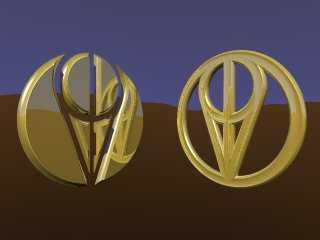
Attached are two versions of the logo that I've made. I've changed the
tangents so that they only just touches the little circle. In the original
version they intersected a little.
Do you think this should be the official POV-Ray logo? I mean not
necessarily these versions, but the basic design Justin Whitton came up
with?
Greetings,
Rune
---
Updated January 24: http://rsj.mobilixnet.dk
Containing 3D images, stereograms, tutorials,
The POV Desktop Theme, 350+ raytracing jokes,
miscellaneous other things, and a lot of fun!
Post a reply to this message
Attachments:
Download 'povlogo.jpg' (11 KB)
Preview of image 'povlogo.jpg'

|
 |
|  |
|  |
|
 |
|
 |
|  |
|  |
|
 |
This looks very similar to the Marathon logo...
http://marathon.bungie.org/story/_images/whiteicon.gif
--
Chris Huff
e-mail: chr### [at] yahoo com
Web page: http://chrishuff.dhs.org/ com
Web page: http://chrishuff.dhs.org/
Post a reply to this message
|
 |
|  |
|  |
|
 |
|
 |
|  |
|  |
|
 |
Personally I don't like it much but I also have to admit that it has many of
the qualities of a good logo (BTW, I have been known not to like many good
and popular things...) It is clear, balanced and simple while having a kind
of obscurity that means that those in the know will get more out of it.
Because of the simplicity it can be put on a variety of objects without
interfering with the look of the object. If it or something like it becomes
accepted generally, it could help to improve the knowledge and use of
POV-Ray by using it to 'brand' images before distribution. Not a bad idea
in general, for those interested...
"Rune" <run### [at] iname com> wrote in message
news:38af21d2@news.povray.org...
> I really like Justin Whitton's POV-Ray logo.
> If POV-Ray should have an official logo I think that should be it.
>
> Attached are two versions of the logo that I've made. I've changed the
> tangents so that they only just touches the little circle. In the original
> version they intersected a little.
>
> Do you think this should be the official POV-Ray logo? I mean not
> necessarily these versions, but the basic design Justin Whitton came up
> with?
>
> Greetings,
>
> Rune
>
> ---
> Updated January 24: http://rsj.mobilixnet.dk
> Containing 3D images, stereograms, tutorials,
> The POV Desktop Theme, 350+ raytracing jokes,
> miscellaneous other things, and a lot of fun!
>
>
> com> wrote in message
news:38af21d2@news.povray.org...
> I really like Justin Whitton's POV-Ray logo.
> If POV-Ray should have an official logo I think that should be it.
>
> Attached are two versions of the logo that I've made. I've changed the
> tangents so that they only just touches the little circle. In the original
> version they intersected a little.
>
> Do you think this should be the official POV-Ray logo? I mean not
> necessarily these versions, but the basic design Justin Whitton came up
> with?
>
> Greetings,
>
> Rune
>
> ---
> Updated January 24: http://rsj.mobilixnet.dk
> Containing 3D images, stereograms, tutorials,
> The POV Desktop Theme, 350+ raytracing jokes,
> miscellaneous other things, and a lot of fun!
>
>
>
Post a reply to this message
|
 |
|  |
|  |
|
 |
|
 |
|  |
|  |
|
 |
Chris Huff wrote:
> This looks very similar to the Marathon logo...
> http://marathon.bungie.org/story/_images/whiteicon.gif
I would say they look a little alike only.
A little ASCII art:
_____
// | \\
/ \_|_/ \
\ \|/ /
\__V__/
POV-Ray
_____
// \\
/ \_ _/ \
\ | /
\__|__/
Marathon
If there isn't anything closer than that
I would say the POV-Ray logo is "safe".
Greetings,
Rune
---
Updated January 24: http://rsj.mobilixnet.dk
Containing 3D images, stereograms, tutorials,
The POV Desktop Theme, 350+ raytracing jokes,
miscellaneous other things, and a lot of fun!
Post a reply to this message
|
 |
|  |
|  |
|
 |
|
 |
|  |
|  |
|
 |
Hmmm, hmmmmm.... okay, but drop the large outer circle part and use differing
textures (pigments or whatever) on the intended letters, otherwise it's too
obscure I'm afraid and won't stand out as recognizable to those unfamiliar with
POV-Ray.
Sorry, but that's how my opinion goes on it.
Bob
"Rune" <run### [at] iname com> wrote in message
news:38af21d2@news.povray.org...
| I really like Justin Whitton's POV-Ray logo.
| If POV-Ray should have an official logo I think that should be it.
|
| Attached are two versions of the logo that I've made. I've changed the
| tangents so that they only just touches the little circle. In the original
| version they intersected a little.
|
| Do you think this should be the official POV-Ray logo? I mean not
| necessarily these versions, but the basic design Justin Whitton came up
| with?
|
| Greetings,
|
| Rune
|
| ---
| Updated January 24: http://rsj.mobilixnet.dk
| Containing 3D images, stereograms, tutorials,
| The POV Desktop Theme, 350+ raytracing jokes,
| miscellaneous other things, and a lot of fun!
|
|
| com> wrote in message
news:38af21d2@news.povray.org...
| I really like Justin Whitton's POV-Ray logo.
| If POV-Ray should have an official logo I think that should be it.
|
| Attached are two versions of the logo that I've made. I've changed the
| tangents so that they only just touches the little circle. In the original
| version they intersected a little.
|
| Do you think this should be the official POV-Ray logo? I mean not
| necessarily these versions, but the basic design Justin Whitton came up
| with?
|
| Greetings,
|
| Rune
|
| ---
| Updated January 24: http://rsj.mobilixnet.dk
| Containing 3D images, stereograms, tutorials,
| The POV Desktop Theme, 350+ raytracing jokes,
| miscellaneous other things, and a lot of fun!
|
|
|
Post a reply to this message
|
 |
|  |
|  |
|
 |
|
 |
|  |
|  |
|
 |
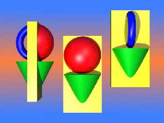
This might better show what I was getting at about the lettering visualization.
Or maybe just mess up the whole idea for that matter.
Bob
Post a reply to this message
Attachments:
Download 'povsymbol1.jpg' (22 KB)
Preview of image 'povsymbol1.jpg'

|
 |
|  |
|  |
|
 |
|
 |
|  |
|  |
|
 |
This looks remarkably like some of the symbols found in the game RIVEN!
Rune wrote:
> I really like Justin Whitton's POV-Ray logo.
> If POV-Ray should have an official logo I think that should be it.
>
> Attached are two versions of the logo that I've made. I've changed the
> tangents so that they only just touches the little circle. In the original
> version they intersected a little.
>
> Do you think this should be the official POV-Ray logo? I mean not
> necessarily these versions, but the basic design Justin Whitton came up
> with?
>
> Greetings,
>
> Rune
>
> ---
> Updated January 24: http://rsj.mobilixnet.dk
> Containing 3D images, stereograms, tutorials,
> The POV Desktop Theme, 350+ raytracing jokes,
> miscellaneous other things, and a lot of fun!
>
> [Image]
--
Come visit my web site:-) : http://www.geocities.com/~thomaslake/
Post a reply to this message
|
 |
|  |
|  |
|
 |
|
 |
|  |
|  |
|
 |
I like it, the right one at least. It looks "catchy" in some way - it's a
symbol, and looks quite professional. It could need some more job on the
textures and the lightning (maybe another background as well), but it's in the
right direction.
----------------------------------------------------
Mikael Carneholm
Dep. of Computer Science and Business Administration
Personal home page:
http://www.studenter.hb.se/~arch
E-mail:
sa9### [at] ida utb utb hb hb se se
Post a reply to this message
|
 |
|  |
|  |
|
 |
|
 |
|  |
|  |
|
 |
"Rune" <run### [at] iname com> wrote:
> I really like Justin Whitton's POV-Ray logo.
> If POV-Ray should have an official logo I
> think that should be it.
>
> Do you think this should be the official
> POV-Ray logo? I mean not necessarily these
> versions, but the basic design Justin Whitton
> came up with?
It's important for all logos that they are
simple, so that they can be presented in many
different ways.
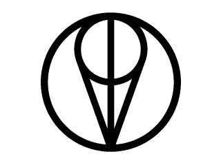
The image attached here shows the same logo,
only presented in a simpler way.
What I'm asking you is if you like the logo,
not if you like the way it's presented.
(just to avoid confusion)
Greetings,
Rune
---
Updated January 24: http://rsj.mobilixnet.dk
Containing 3D images, stereograms, tutorials,
The POV Desktop Theme, 350+ raytracing jokes,
miscellaneous other things, and a lot of fun! com> wrote:
> I really like Justin Whitton's POV-Ray logo.
> If POV-Ray should have an official logo I
> think that should be it.
>
> Do you think this should be the official
> POV-Ray logo? I mean not necessarily these
> versions, but the basic design Justin Whitton
> came up with?
It's important for all logos that they are
simple, so that they can be presented in many
different ways.
The image attached here shows the same logo,
only presented in a simpler way.
What I'm asking you is if you like the logo,
not if you like the way it's presented.
(just to avoid confusion)
Greetings,
Rune
---
Updated January 24: http://rsj.mobilixnet.dk
Containing 3D images, stereograms, tutorials,
The POV Desktop Theme, 350+ raytracing jokes,
miscellaneous other things, and a lot of fun!
Post a reply to this message
Attachments:
Download 'povlogosimple.gif' (4 KB)
Preview of image 'povlogosimple.gif'

|
 |
|  |
|  |
|
 |
|
 |
|  |
|  |
|
 |
So where is the simple, compact scene code that we can add to our
images if we want to...?
Post a reply to this message
|
 |
|  |
|  |
|
 |
|
 |
|  |


![]()