|
 |
And lo On Tue, 28 Sep 2010 14:55:18 +0100, Invisible <voi### [at] dev null> did
spake thusly:
> On 28/09/2010 01:23 PM, Mike Raiford wrote:
>
>> Google CSS Media. That should at least get you started.
>
> OK, so adding
>
> @media print
> {
> img {max-width: 100%;}
> }
>
> causes all images to be scaled to fit the width of the paper.
> Unfortunately the image height remains completely unchanged, wildly
> distorting the image aspect ratio. (!)
>
> You'd think there would be an option for "preserve aspect ratio", but as
> far as I can tell, there isn't...
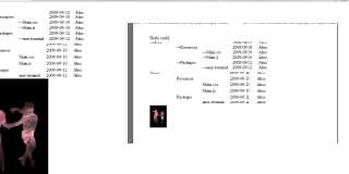
Not sure what you're trying to do as
img {width: 20%;}
@media print {img {width: 100%;}}
Takes a 50% screen width image and fills the width of my print preview up
whilst retaining the proportions of the height. Modifying the print style
width adjusts to the page and the height shifts accordingly. This works in
Firefox, Opera, and hey Chrome doesn't have a preview... nope that printed
out fine.
The attachment is for a width of 20% and 10% respectively.
--
Phil Cook
--
I once tried to be apathetic, but I just couldn't be bothered
http://flipc.blogspot.com null> did
spake thusly:
> On 28/09/2010 01:23 PM, Mike Raiford wrote:
>
>> Google CSS Media. That should at least get you started.
>
> OK, so adding
>
> @media print
> {
> img {max-width: 100%;}
> }
>
> causes all images to be scaled to fit the width of the paper.
> Unfortunately the image height remains completely unchanged, wildly
> distorting the image aspect ratio. (!)
>
> You'd think there would be an option for "preserve aspect ratio", but as
> far as I can tell, there isn't...
Not sure what you're trying to do as
img {width: 20%;}
@media print {img {width: 100%;}}
Takes a 50% screen width image and fills the width of my print preview up
whilst retaining the proportions of the height. Modifying the print style
width adjusts to the page and the height shifts accordingly. This works in
Firefox, Opera, and hey Chrome doesn't have a preview... nope that printed
out fine.
The attachment is for a width of 20% and 10% respectively.
--
Phil Cook
--
I once tried to be apathetic, but I just couldn't be bothered
http://flipc.blogspot.com
Post a reply to this message
Attachments:
Download 'printwidth.png' (19 KB)
Preview of image 'printwidth.png'

|
 |


![]()